Professor Mika Ito
Spatial Sequence/Experience
Abby Hartman
Spatial Sequence/Experience
Spatial Sequence/Experience




Andrew Joint
Spatial Sequence/Experience
Spatial Sequence/Experience

Nathan Heid
Spatial Sequence/Experience
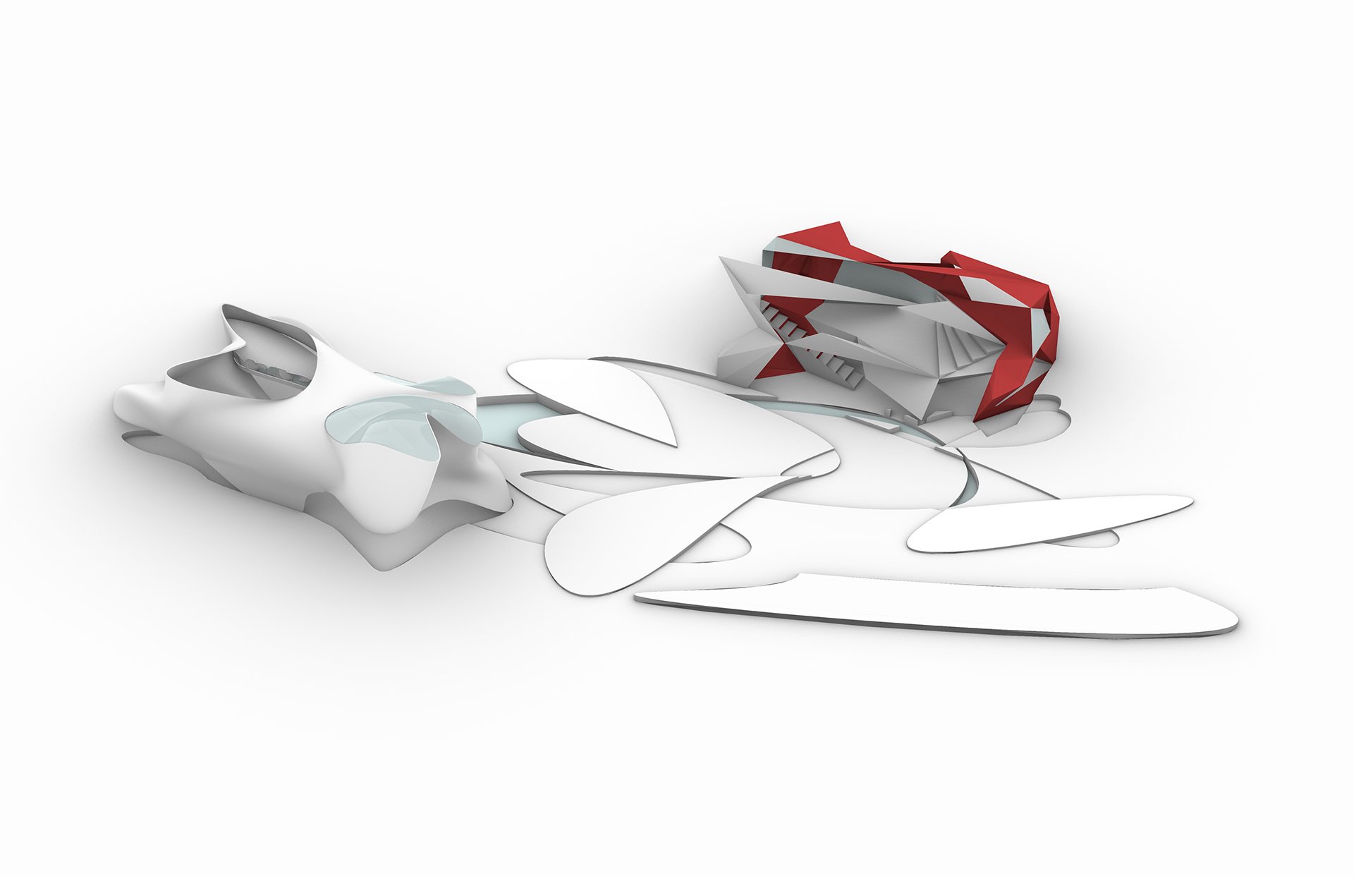
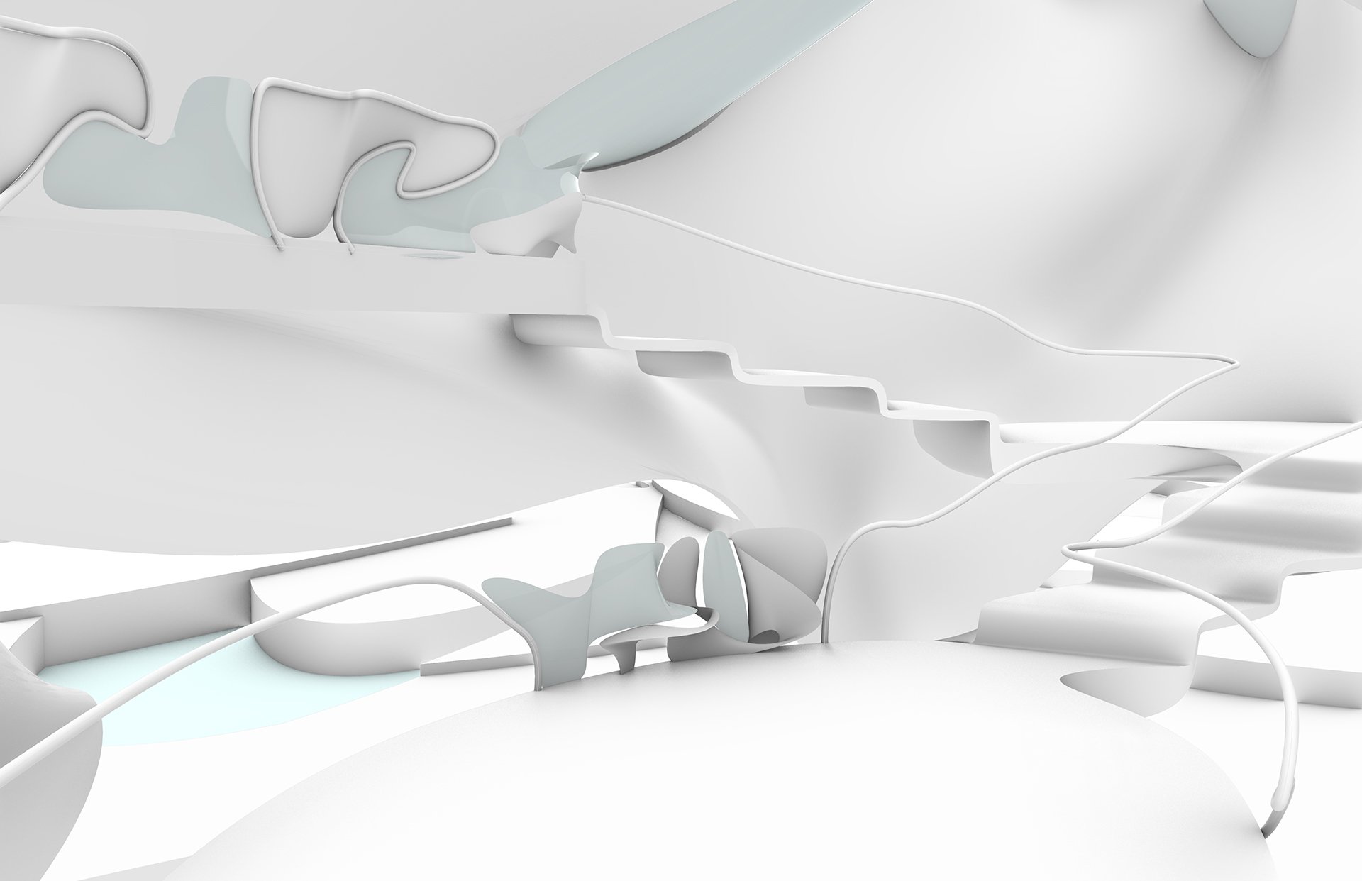
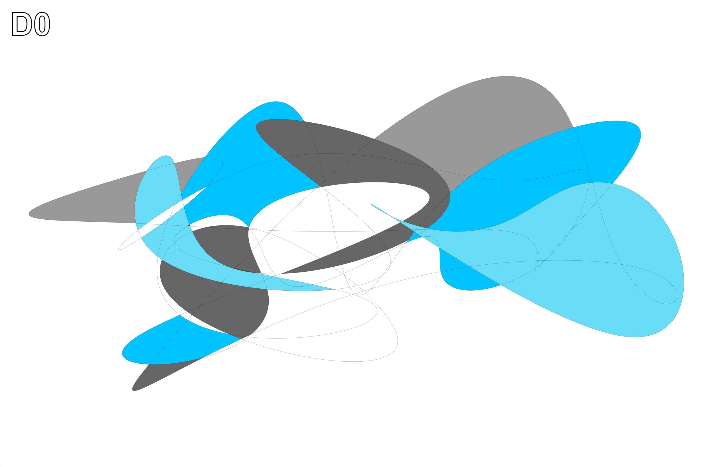
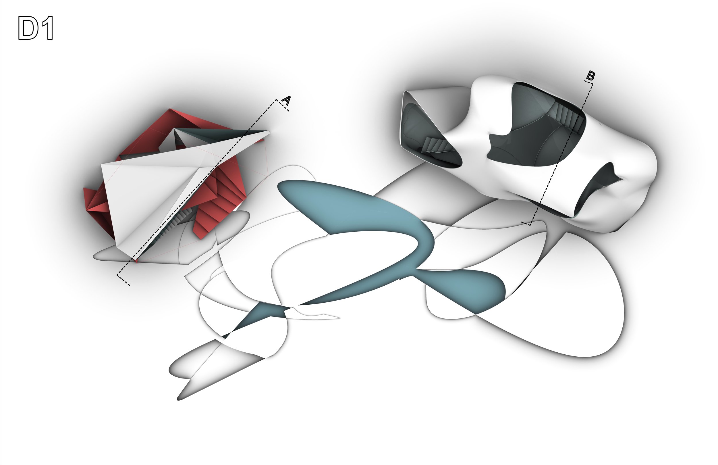
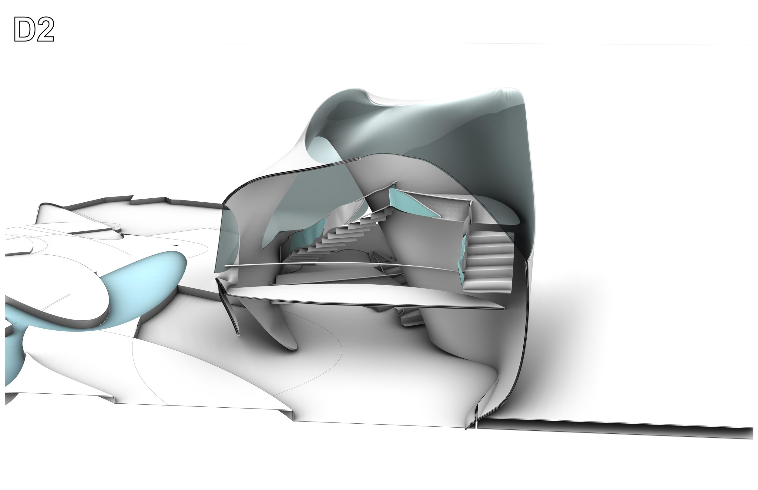
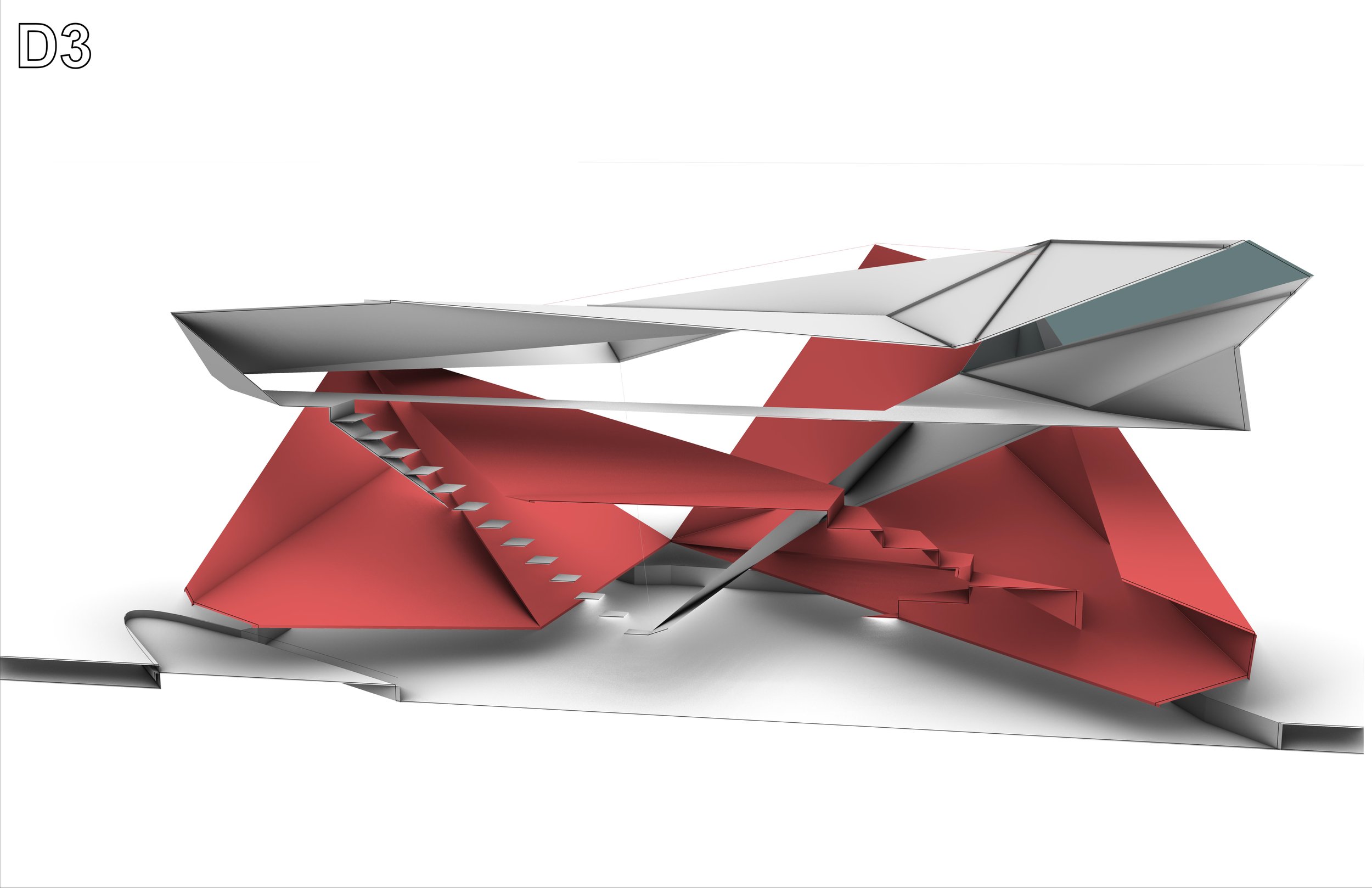
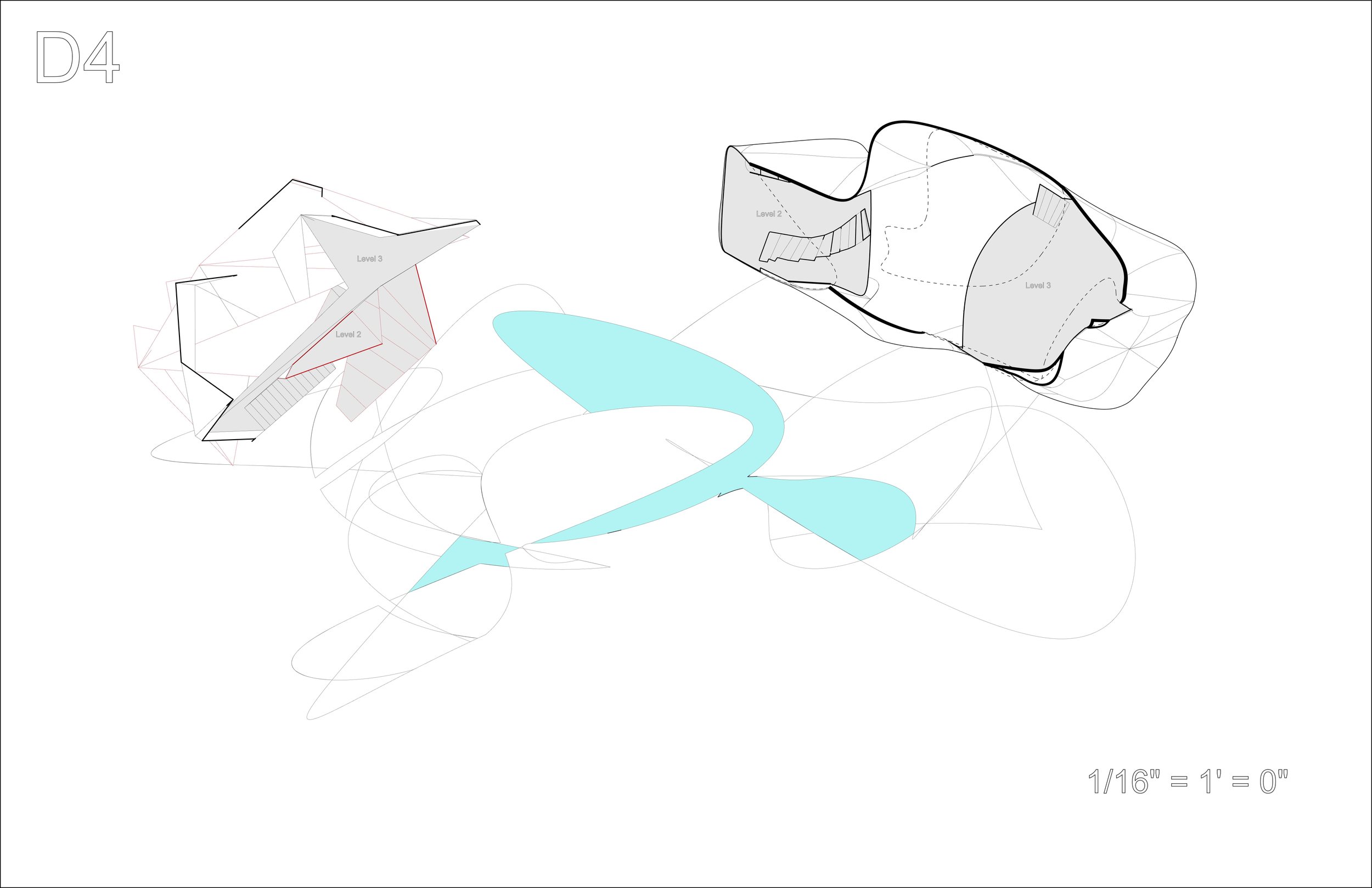
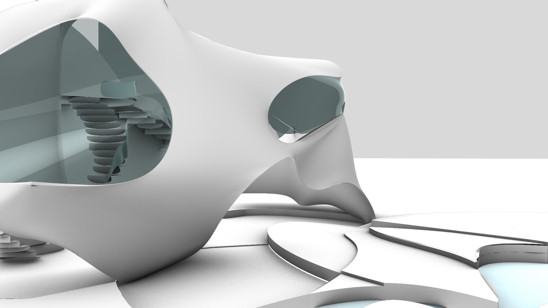
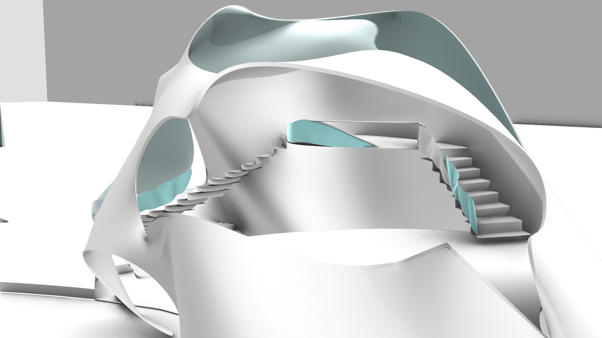
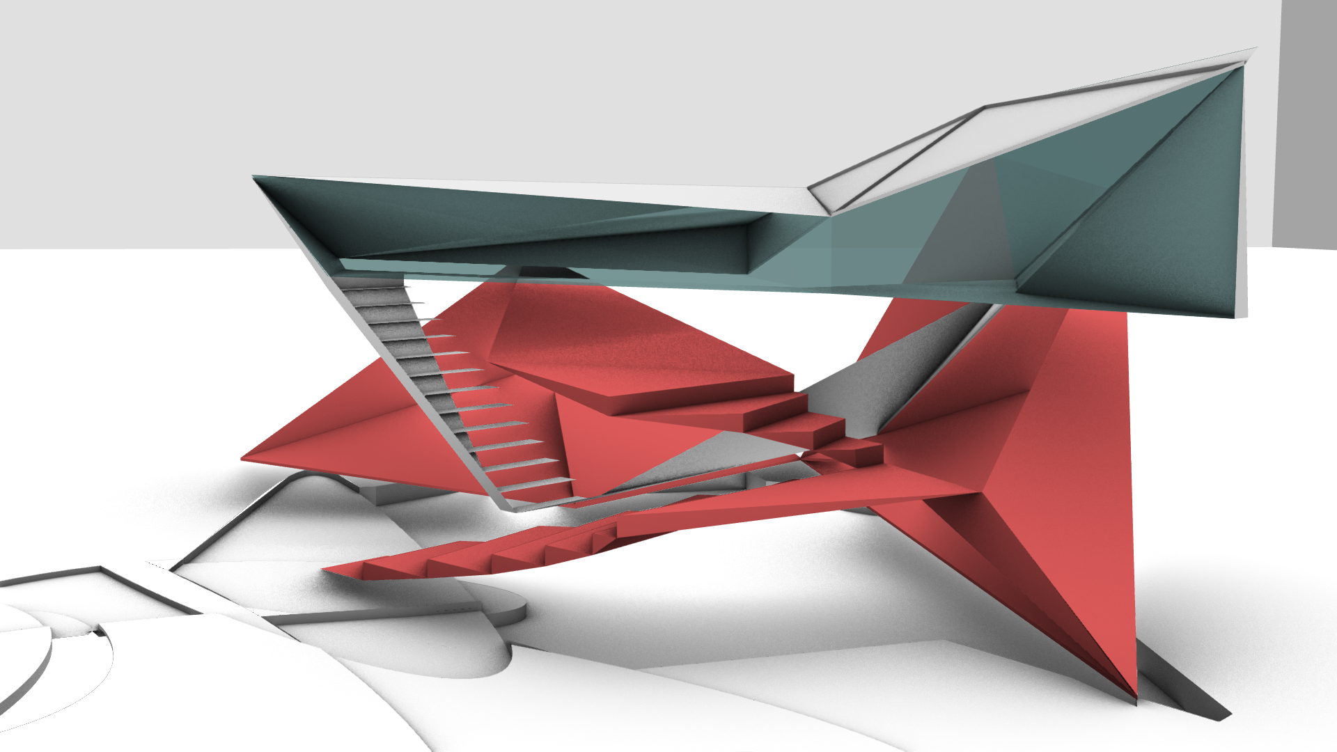
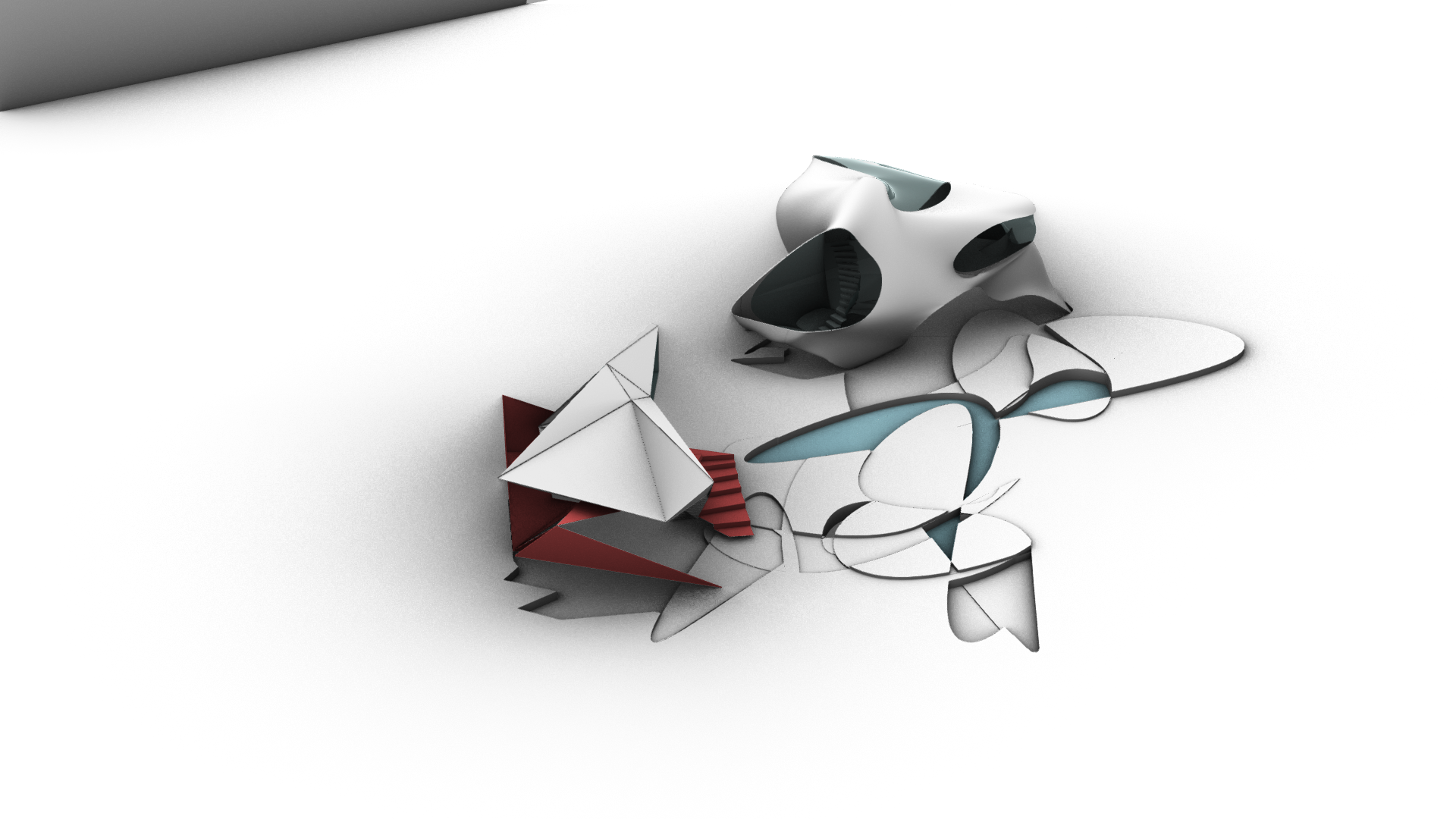
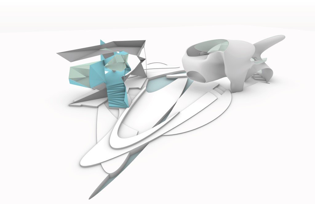
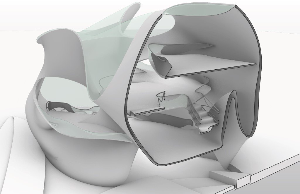
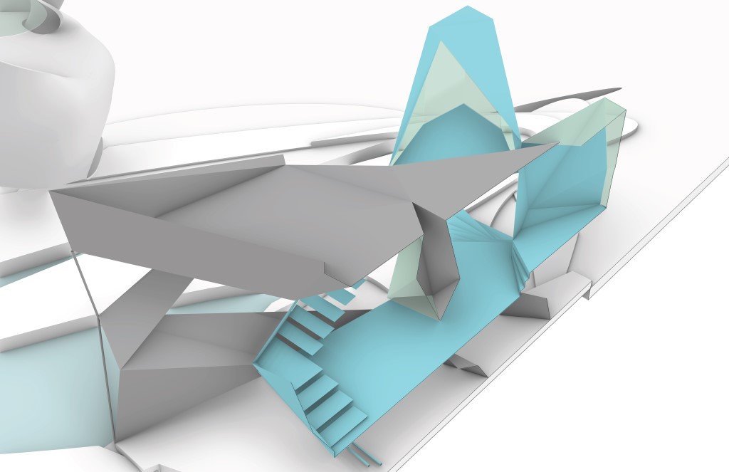
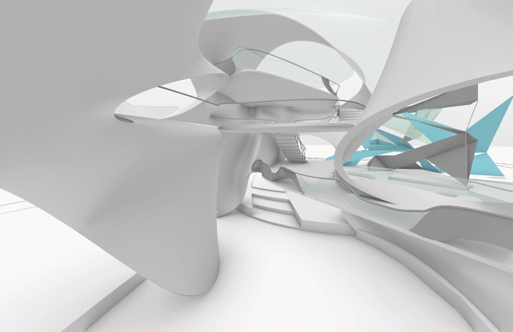
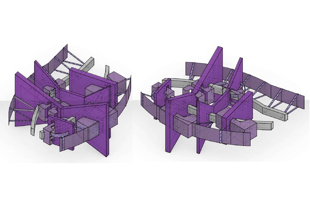
This project was the culmination of the semester's work, bringing together the three main pieces into one cohesive design. Throughout the semester we developed the two structures and site, thinking about how a person would move through them. The triangular surface structure was built with continuity in mind, so that the primary and secondary surfaces would intertwine and play off of one another. The SubD structure focused on the circulation of the interior and the spatial experience it would offer to the user. These were then placed onto the curved line drawing, finding places where they fit like puzzle pieces, then creating elevation changes to not only retain the natural flow and circulation of the site, but to enhance it as well.
Professor Thom Stauffer
Spatial Sequence/Experience
Emma Stahl
Spatial Experience
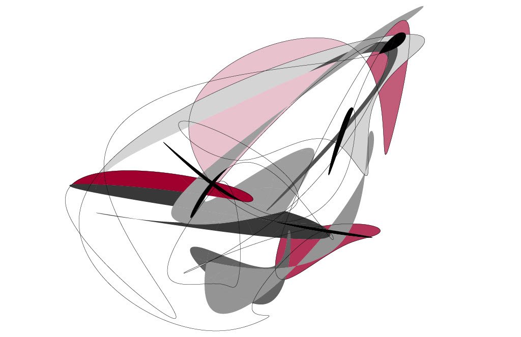
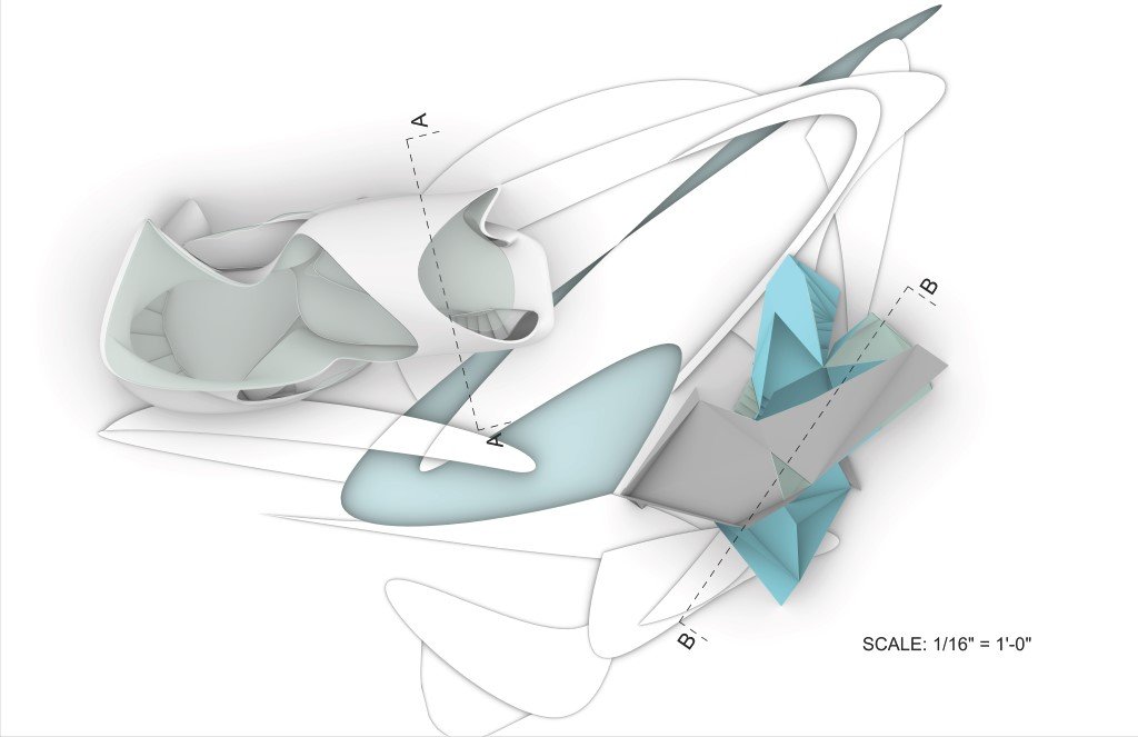
For our final we were asked to develop forms from our previous assignment into spaces that can actually be experienced. My model can be looked at as separate constructs: the organic and the fragmented. There is this rounder, more organic, soft form that has this fragmented, tense, sort of chaos climbing up and impacting it. The constructs create dramatic contrasts between dark and light areas, up and down direction, in and out of the build, and soft or jagged shapes. These elements come together and form the right balance of tension within the model.


Sophia Demetri
The Spatial Sequence and spacial experience
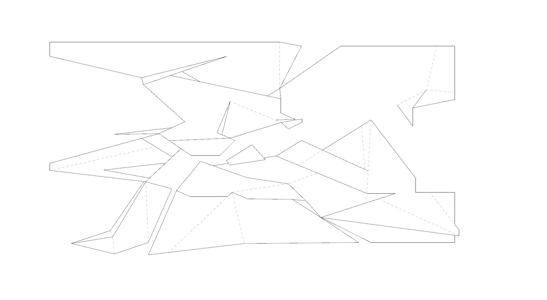
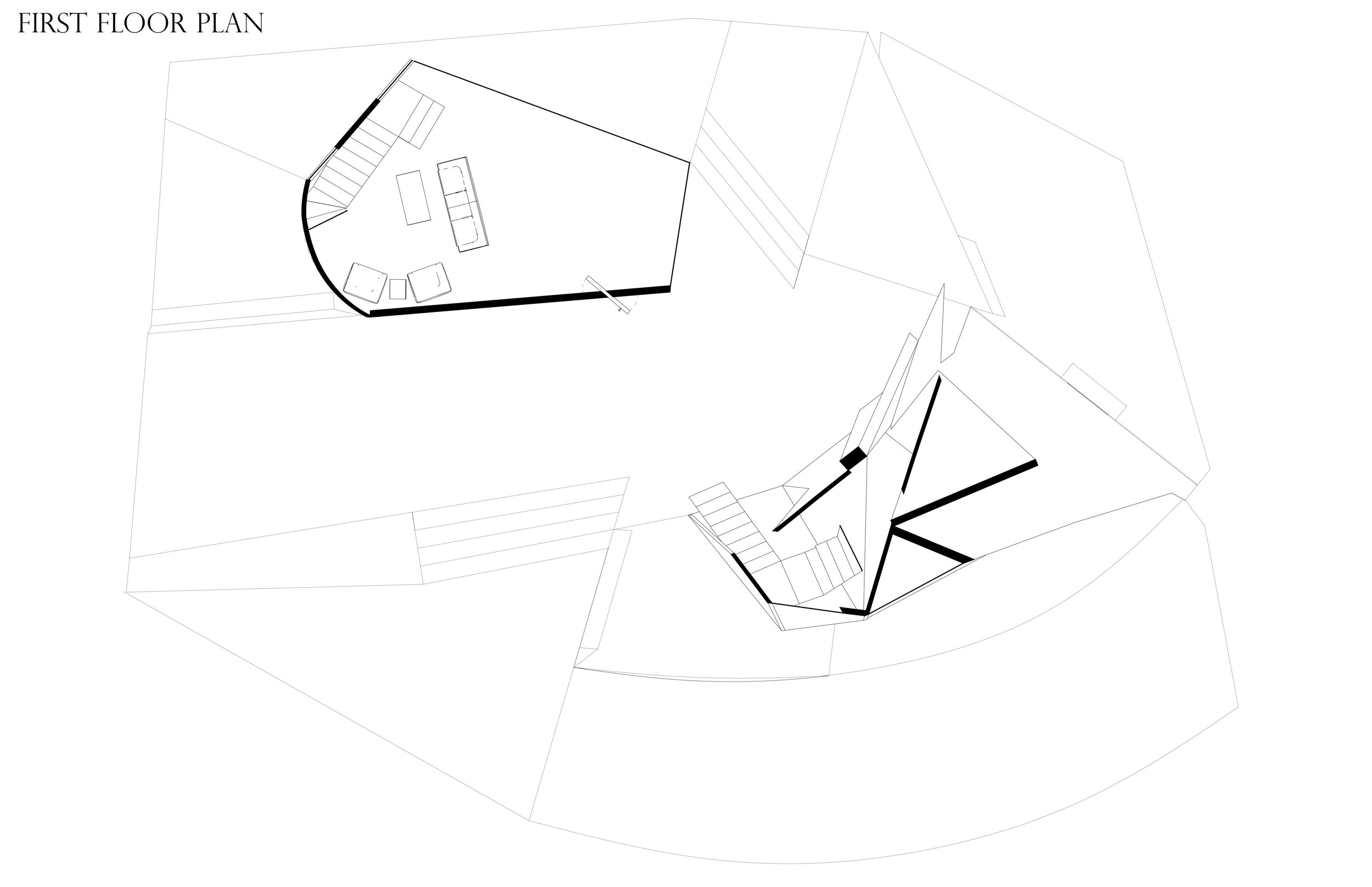
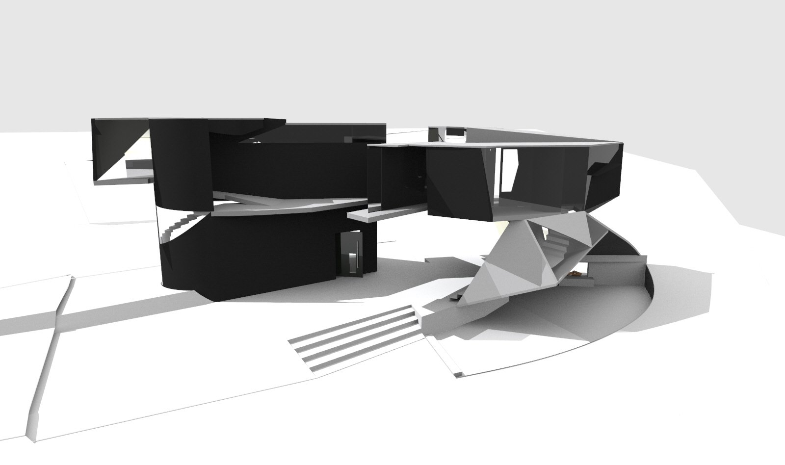
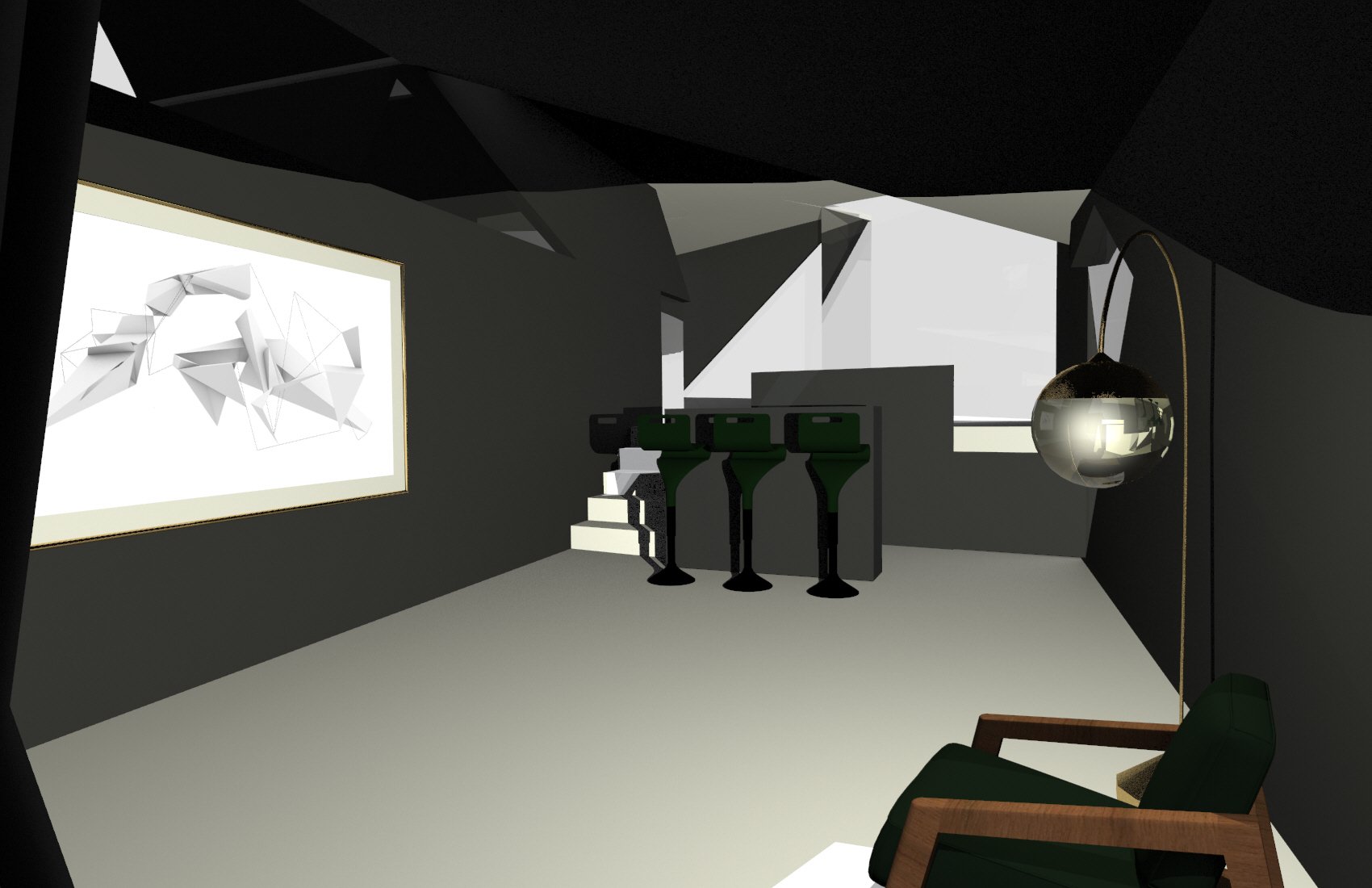
The overall thought process came to together through composition, balance, and form. Form being one of the most important pieces of inspiration throughout the project. I have two primary constructs taken from original linework and models. They appear to be very separate while relational through connectivity, fluidity, and site. Site becomes essential as there is a social space shared below that is bright, solid, and exposed, while the form becomes private, dark, and void. The social space has an increased social experience because of the complexity within the composition. Overall, there is an experience created through social sequence and relationship.






Alena Nguyen
Spatial Experience
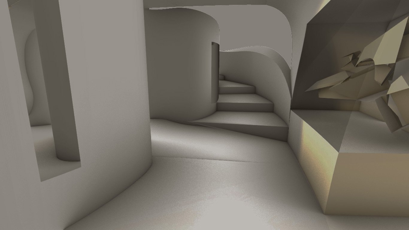
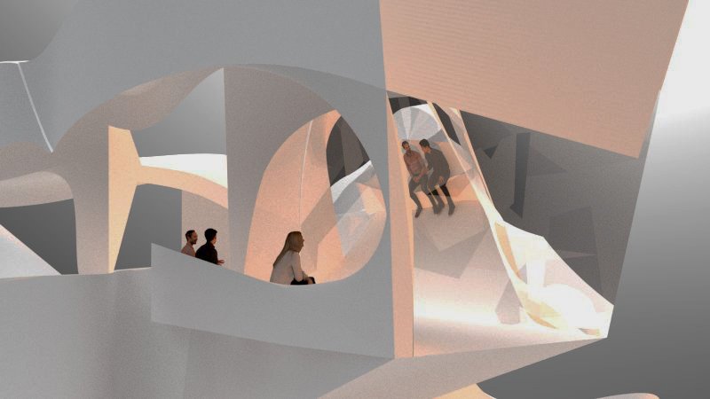
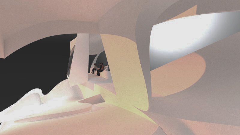
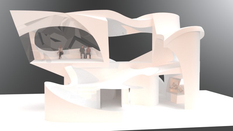
Harmonic Contrast | The main focus in designing this experience was creating areas of distinguishable difference without disrupting the unity of the single, physical structure. The sinuous railings that meander through and around the structure are grounded by the larger, more massive rooms and spaces. The upper floor is more skeletal and has void areas as opposed to walls, creating an expansive and public vista, while the lower floor is secluded and private. Elements of the original relief and model are displayed throughout the building (in the mural and on the ground level) to showcase its definite history. Changes in light, composition, and perspective work to manipulate the views that are perceived, creating an element of soft change and uncertainty within the firm/strictness of a monumental space.


Professor Denver Curtis
ZOOMING IN \\\ Objects, Spaces, + Details | An Introduction to ways of understanding, designing, and representing architecture. Through design exercises, students learn the strategies, principles, theories, and tools that architects use to organize, shape, and interpret the built environment. Emphasis is placed on the multi-scalar analysis and construction of interrelated objects, spaces, and details
Michael Conrad
Project 3
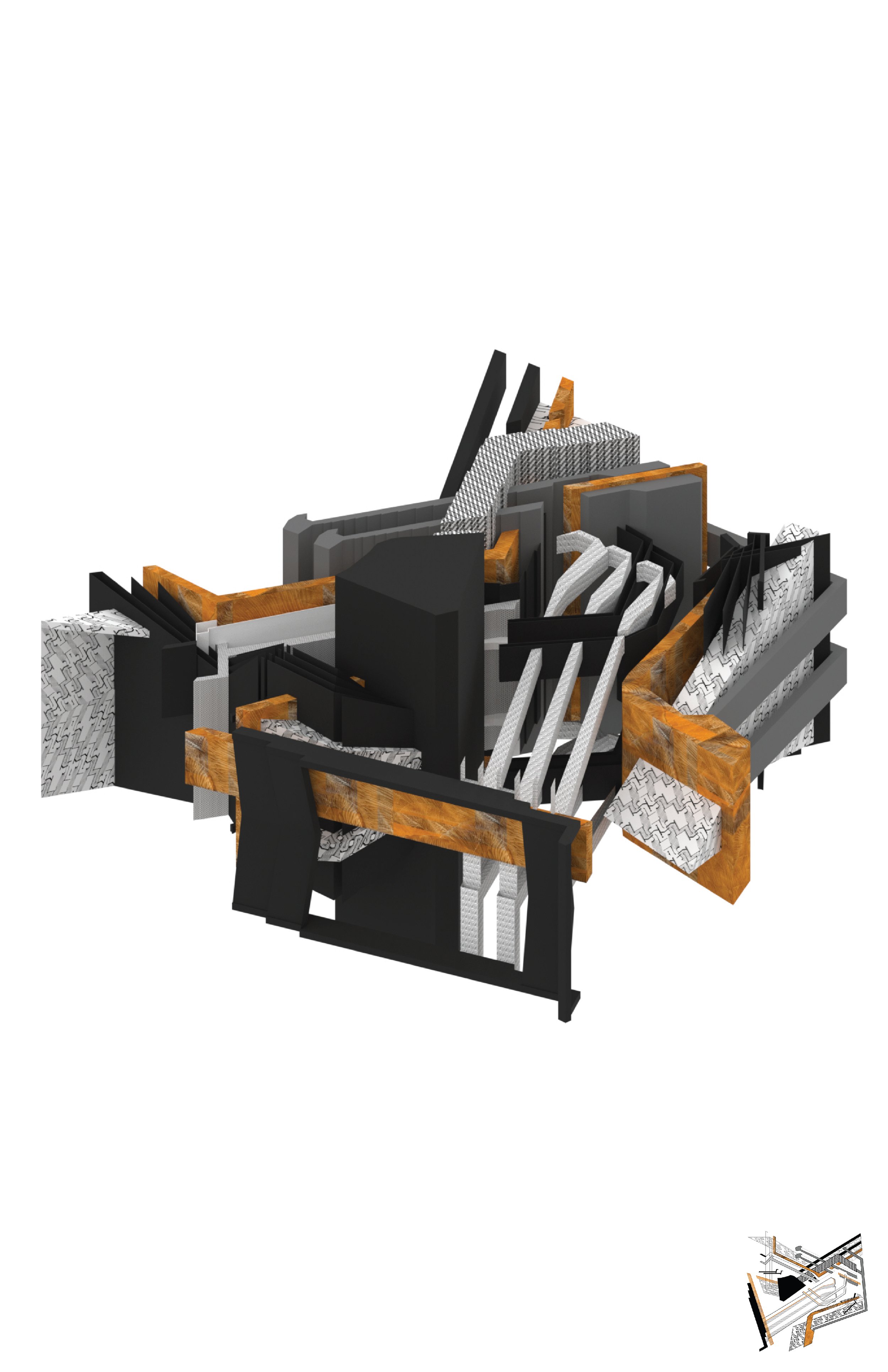
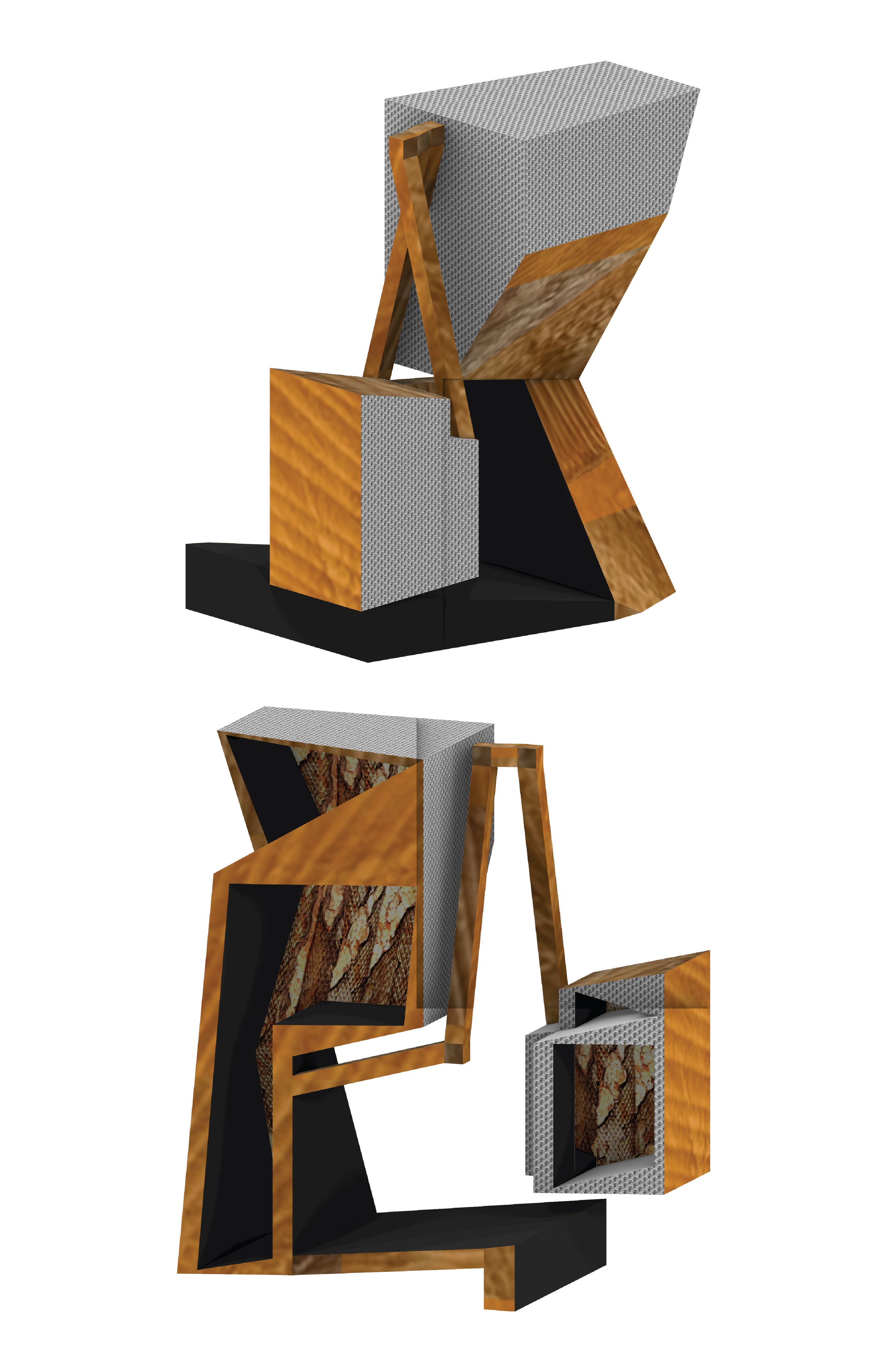
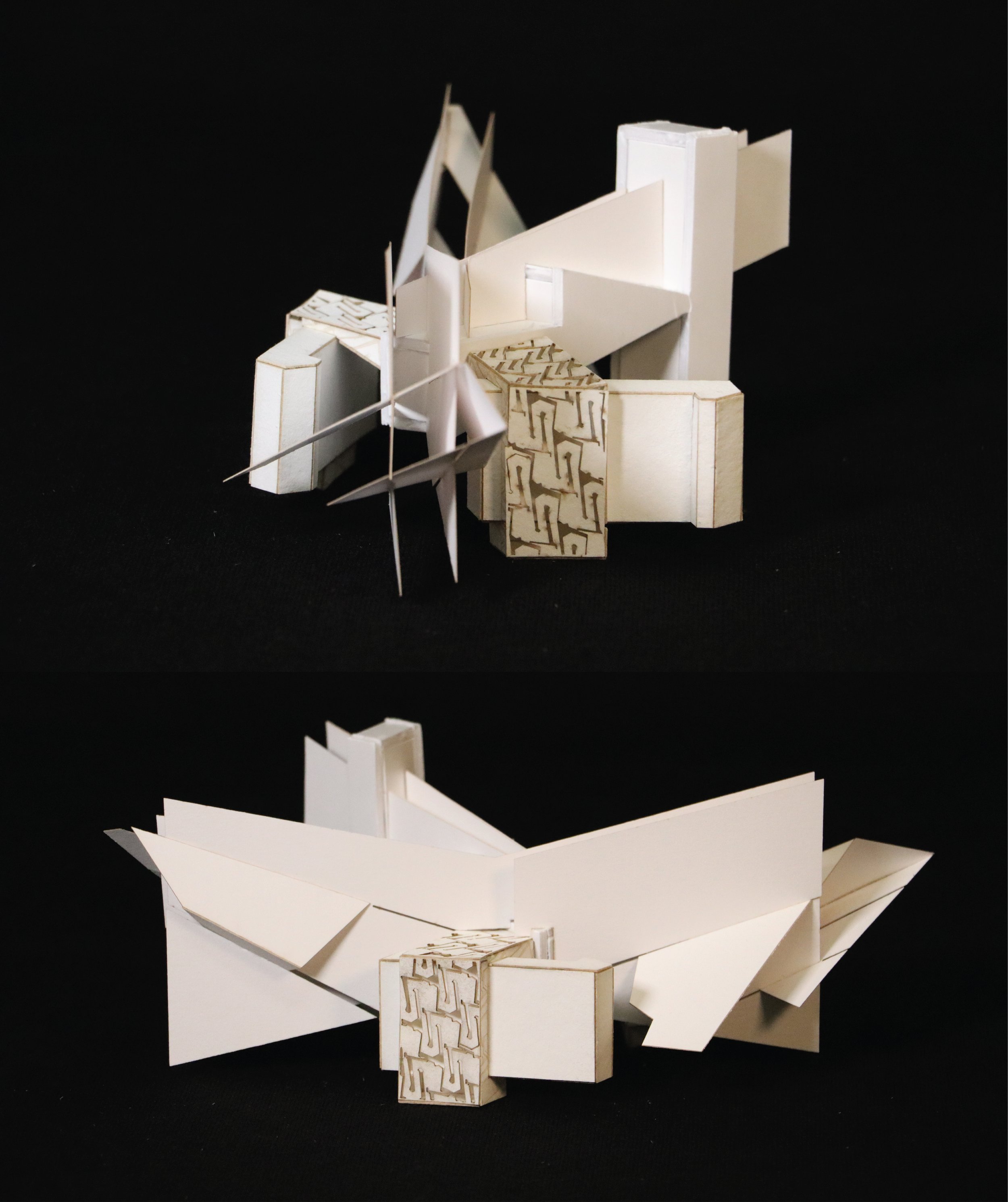
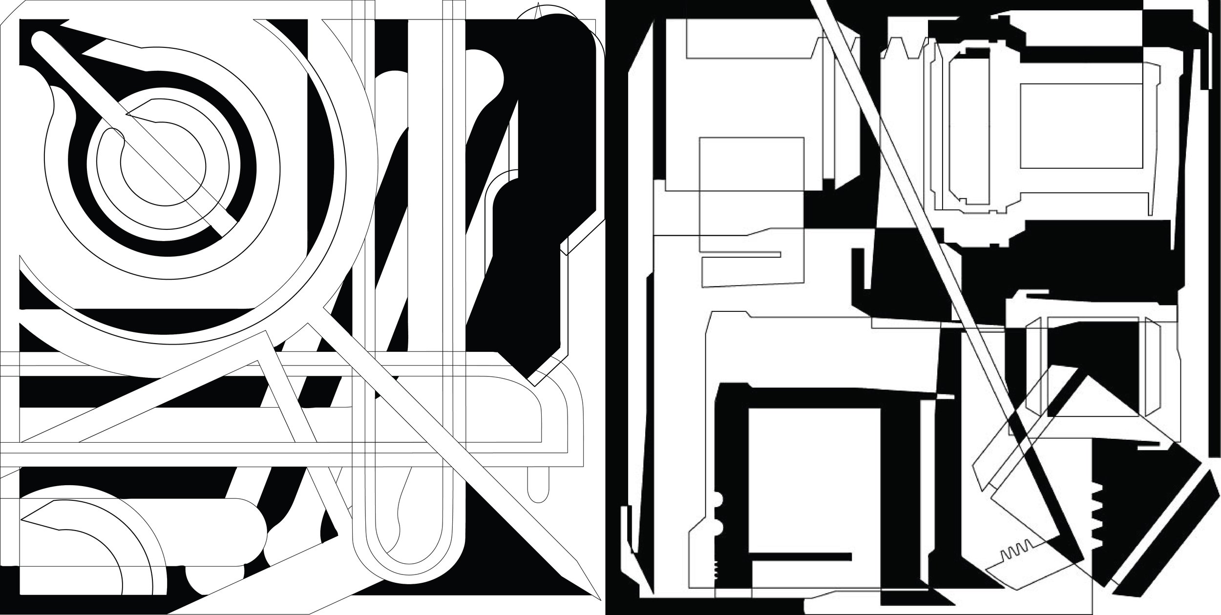
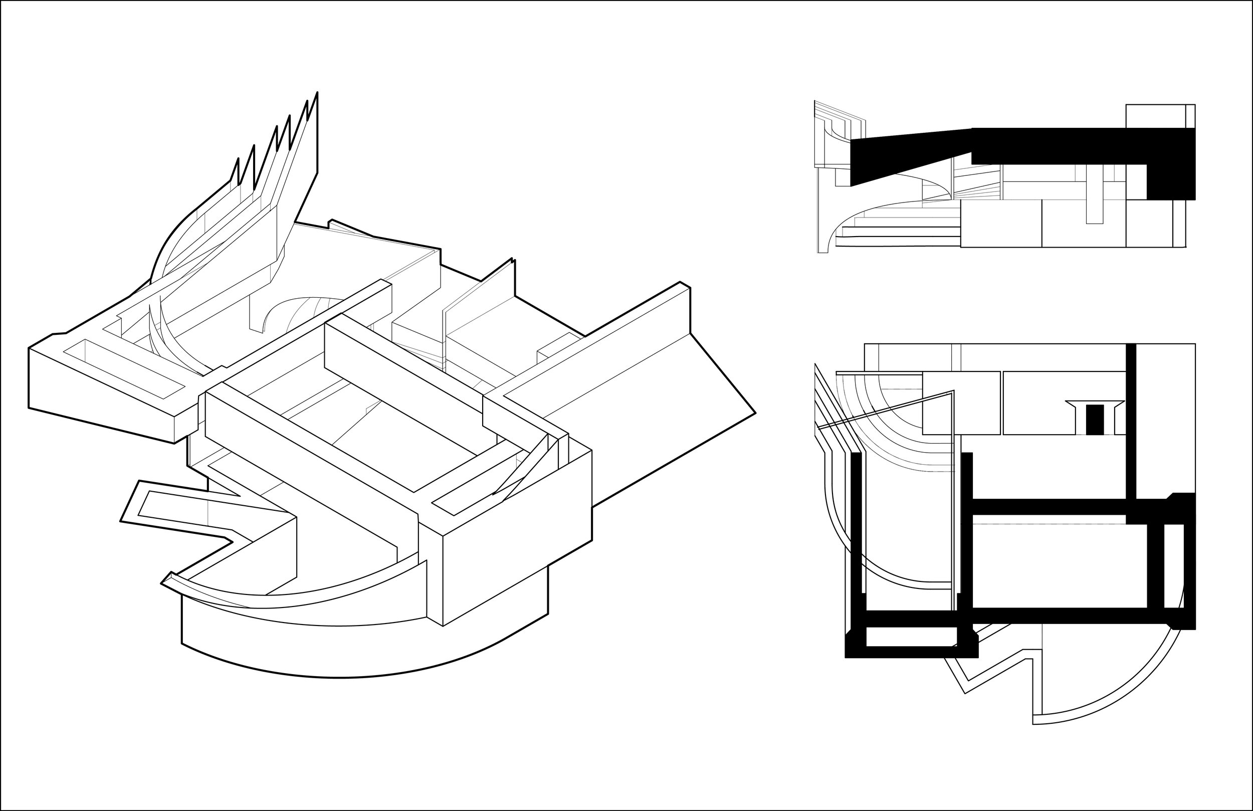
The two models were influenced by previous work in the semester. The process involved pulling chunks away from older drawings to redesign and extend them to create entirely new drawings. These new drawings were the basis for creating our 3D models.


Jacob Newcomer
Final Project
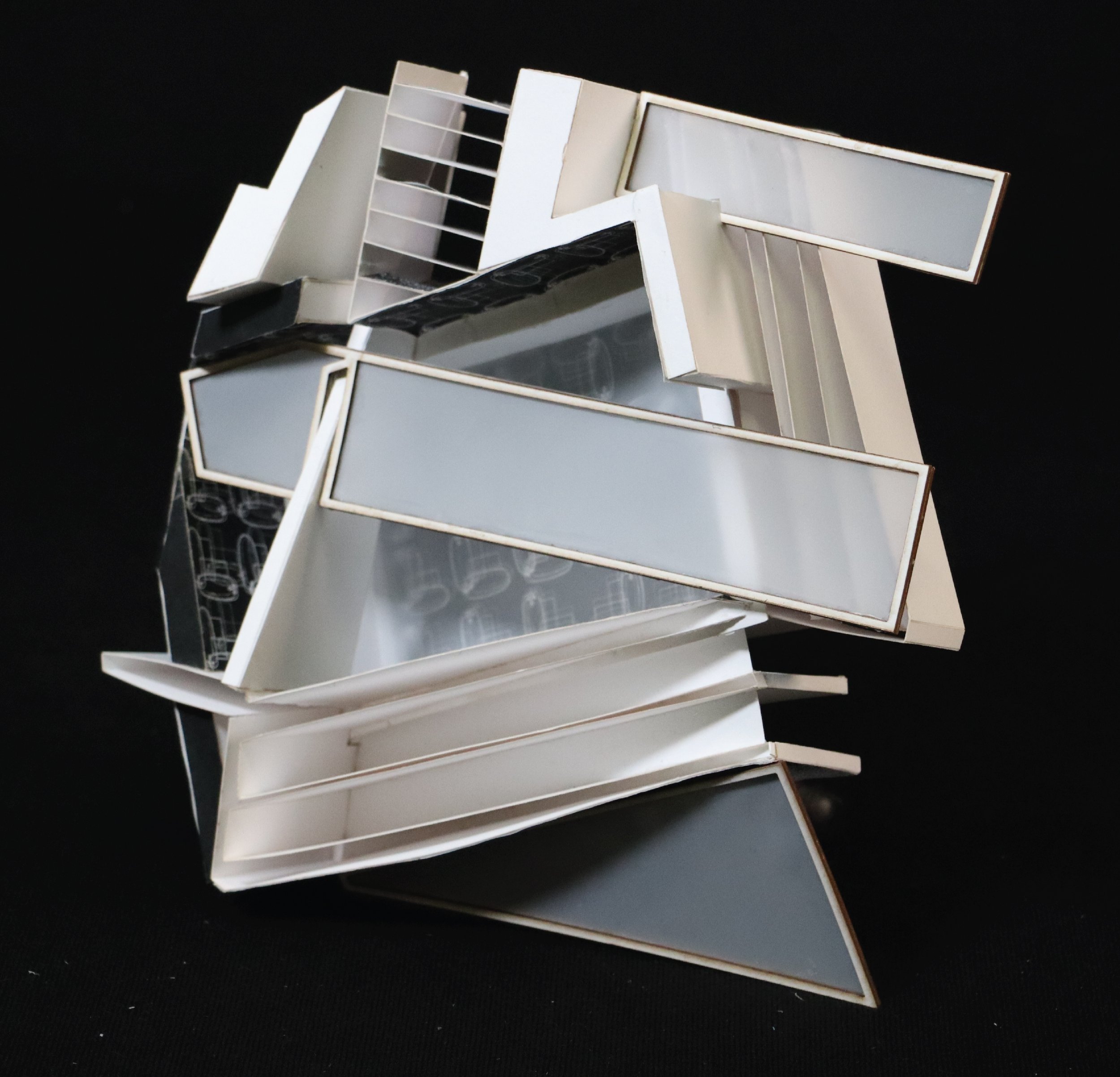
Color, inversion, and materiality: the most essential tools for my explorations throughout the semester. What posed as an interesting challenge was finding color in what little places they existed. Both of my original vessels, a lantern and a box for an apple pencil, contained very little color at all, having predominantly white and gray exteriors. However, things like light blue tones within the shadows, or the warm tones from lights reflecting off the surfaces were present, so experimented with them. For the red and blue model, I decided to use color within interior spaces, emphasizing the transition between the white and black sections of the model. For my black and white model, I limited myself to grayscale, and decided to work specifically on the transition between spaces, and all the different ways in which the interaction could be exemplified; how the form transitions from the center outward, the gradient transition on the walls from the black top to the white bottom, etc. were all meant to convey this transitive action. Application of materiality, specifically application of this frosted translucent material, allowed me to dive deeper into the concept of transition through my models.




Lauren Scott
Final Project
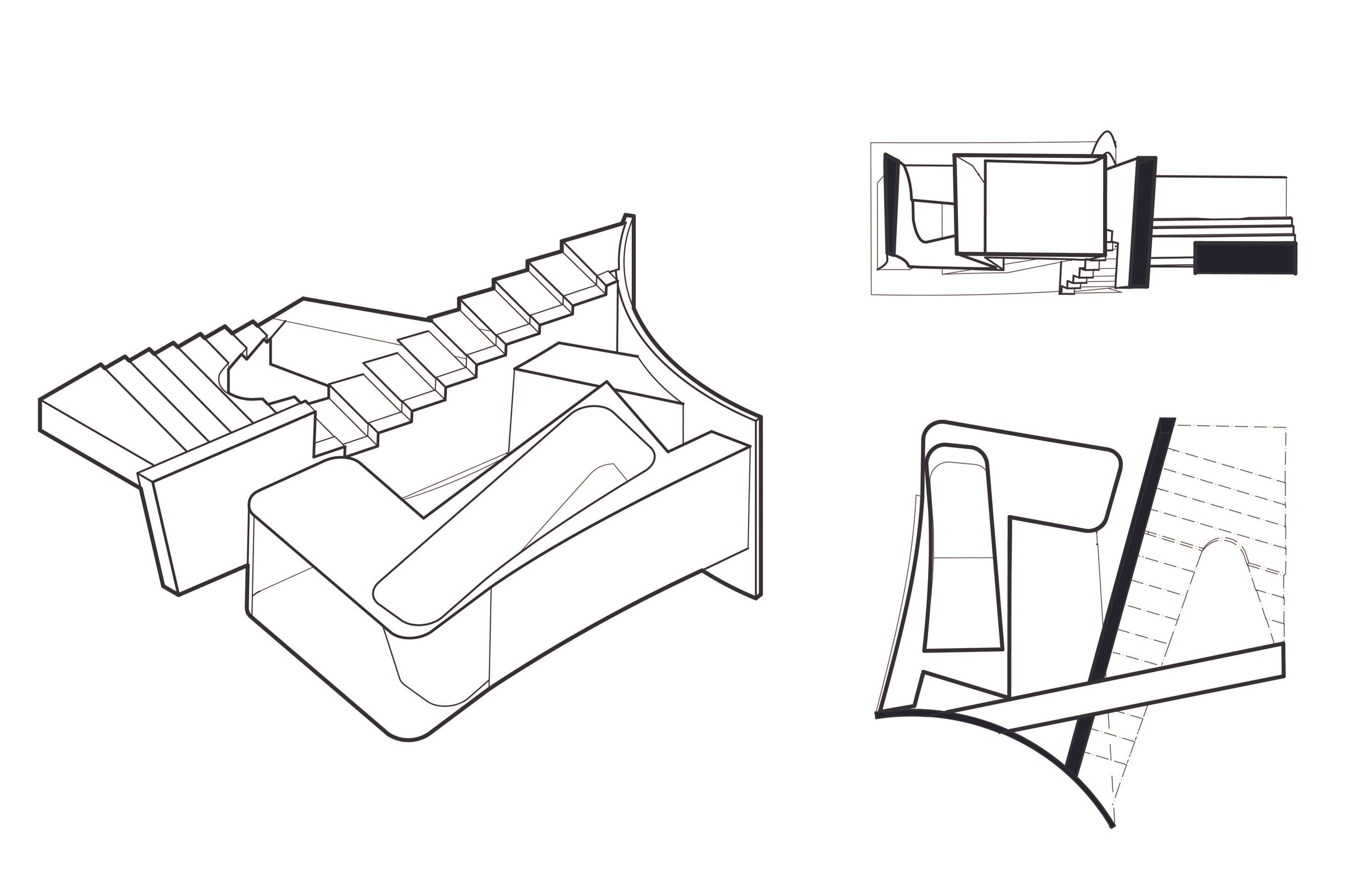
My final project was driven by the discoveries I made during the first assignment, in which I explored the qualities of a glass vase. Through these discoveries, I developed a focus on the difference between interior and exterior spaces and how varying materials and colors can change your perception of what defines each space as “inside” or “outside.” I took this concept into my own designs, making my models appear massive or solid from many angles, but they are actually composed of open, free-flowing spaces. I used color gradients to emphasize the spaces considered to be interior and patterns to create connections and flow between separate pieces.




Professor Beau Bock
ZOOMING IN \\\ Objects, Spaces, + Details
Natalee Tusick
Final Project
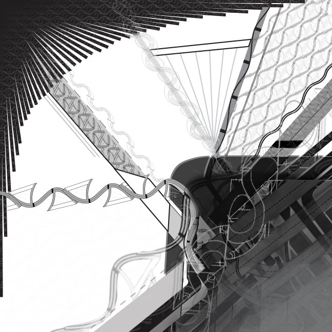
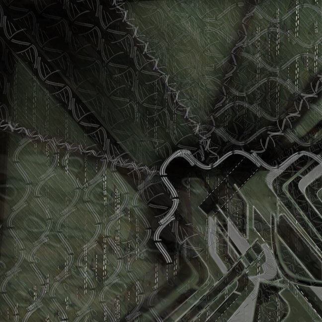
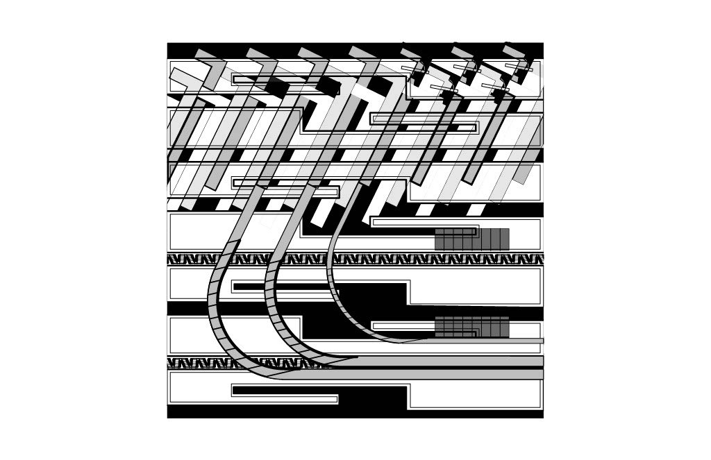
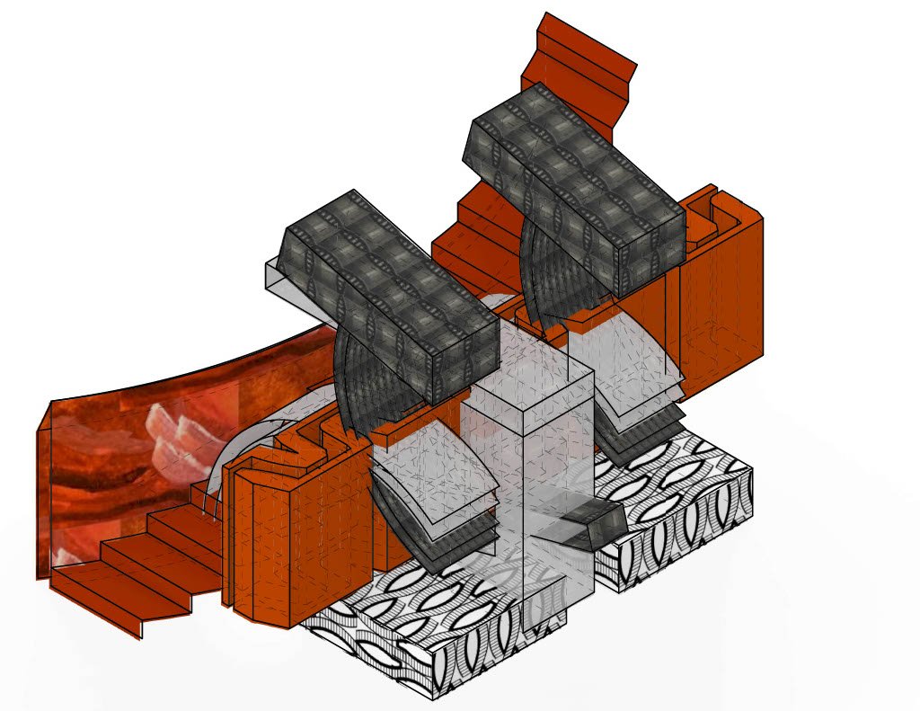
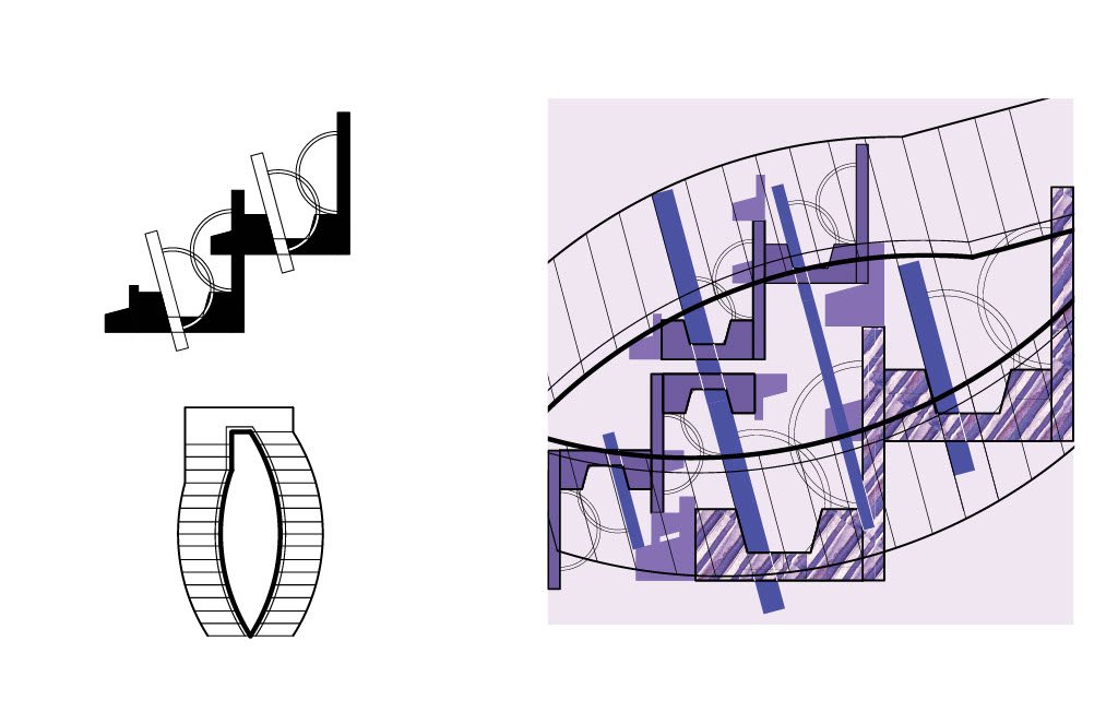
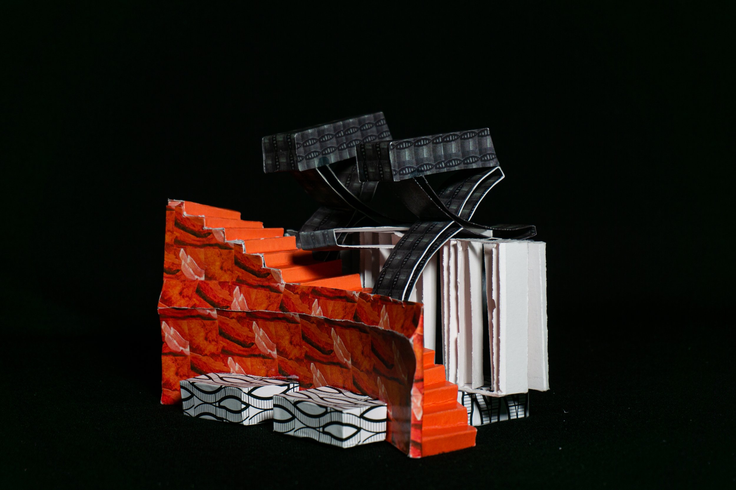
We researched two architects and their standard ways of making conventions in plan drawing. Our study of these standards led us to create our own invented conventions that disassociated from the original program of the standard convention. The conventions I selected were a stair and a window at a changing wall condition. These conventions were then used in a pattern study where we created new edges between multiples of our conventions. These patterns were then incorporated into our aggregate and assembly from before, as well as in our relief model, where I was studying continuity between fields. The new curved edge condition I established in the pattern study allowed me to further emphasize this connection between parts of my model. We then zoomed into a portion of our updated relief model and created a new aggregate which featured one of our invented conventions. This aggregate was studied and crafted three-dimensionally in Rhino and through physical model making. In this, I continued my study of continuity between fields. The addition of materials allowed me to distinguish each field, while a lack of material on the interior walls of the model brought continuity from the inside, out. We then repeated this same process with a different invented convention that we had not pursued previously. The convention I selected was studying framework and how it contains intricacy. I began to study how the two frames in the aggregate could interact through subtraction and containment. Again, the addition of materials allowed me to differentiate these frames and show which parts of the model had been overtaken by each frame.




Beatrice Mohr
First Semester Work
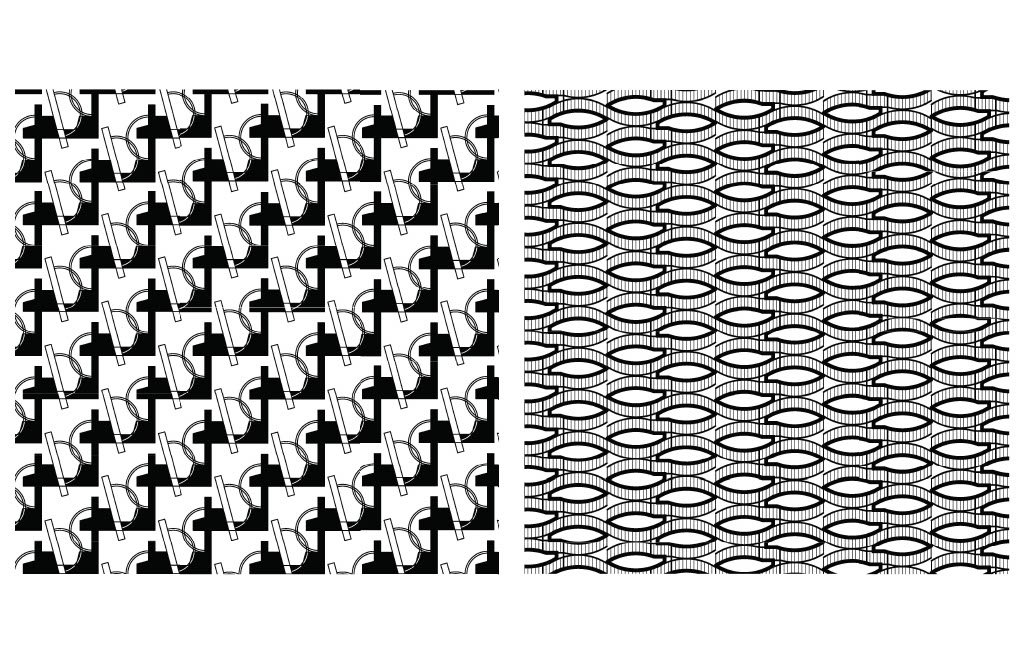
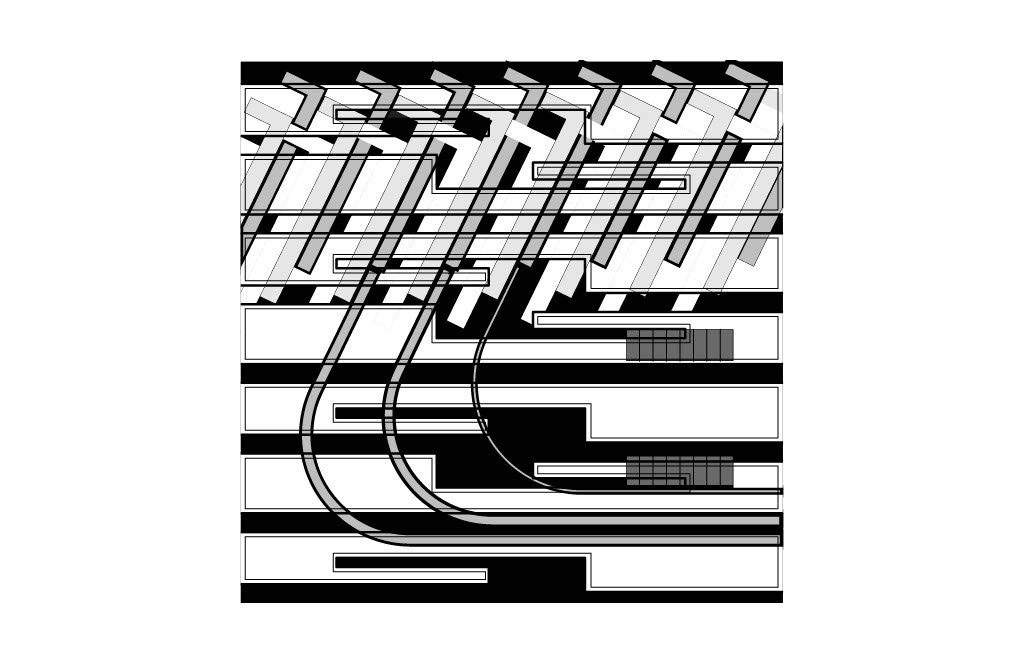
After starting with two vessels, we made many digital and physical models this semester. The key ideas I was working on this semester are linearity, edge and contour, and repetition.


Professor David Thal
Research - Sampling - Zooming In
Our studio's focus was on creating spatial aggregates and assemblages, both through 2D drawings and 3D models.
Zooming in, provides opportunities to uncover new spatial relationships and to construct moments of intricacy.
The exploration of scalar shifts and use of pattern, texture, transparency and color offer ways of articulating/complementing their spatial investigations.
Lauren Leemaster
Opposition
My final project set pulls from two bridge conventions that embody distinct design choices – symmetry, the idea of intertwining parts, uniformity, and an emphasis on curvature. As I began to defamiliarize myself from these conventions, I made an effort to directly oppose the stylistic choices that once defined their attributes.
By implementing a stacking method, the idea of interlocking forms or pieces is challenged. Stacking directly opposes the idea of the weaving figures from the original conventions. Additionally, the components of the final design bear no semblance to the uniform body of the previous design and are composed of stable dimensions that have no curvature.
Despite pulling its main spatial components from the original conventions, by manipulating the orientation and emphasizing opposing attributes, I successfully reinvented the design’s features into a new form.
My second model takes on a theme of discrete openness. While one exterior angle looks solid and foundation, the opposite is completely cut into. This view into the interior space reveals the layering effect that was implemented on the form's inner walls.


Joseph Costianes
Intricacies of Architecture
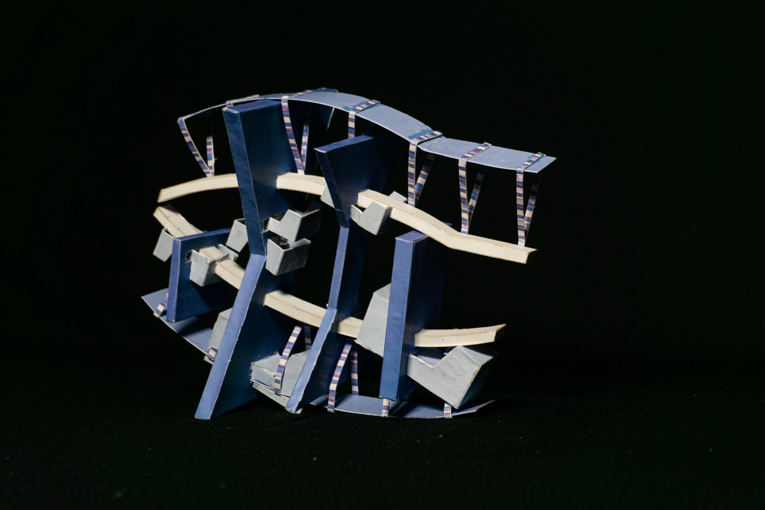
In my work, I wanted to pursue the relationship of triangular forms from an original deviation. These forms were intertwined and weaved within aggregation and assemblage. This created a discordant effect.
Migrating from the discordant 2D into a 3D shape made way for new interpretations of building intricacy. Within these 3-dimensional models, I was able to use the negative space in the 2D into meaningful 3-dimensional spatial relations. These new forms looked to weave together the generic and tangled designs.
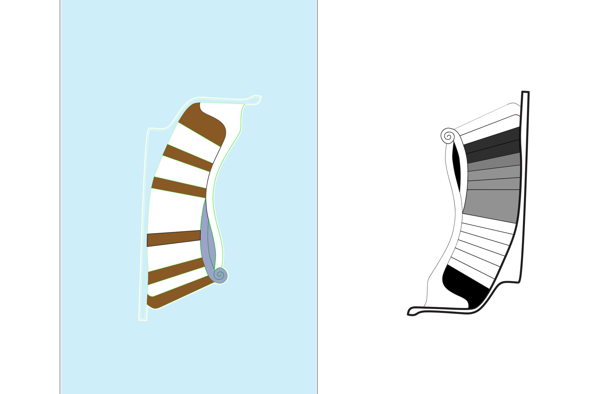
With my conventions from the late Antonio Gaudi, I was able to change the way they are read by dissociating myself from the original source material. I wanted to focus on thin single planar conditions on their boundary curves.
These new forms served as inspiration and source material for my 2D spatial constructs. Pattern and color were used to amplify linkage and form within the new 2D display.




Isabella Correia
Spatial Layering
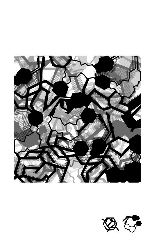
Throughout the semester, I focused on the spatial layering of components, and the network that emerged between them. I first focused on the 2D design, creating new interior and exterior spatial qualities with connected pathways. As I moved on, I allowed color, pattern, and texture to further develop and define the relationship of the parts to the whole; allowing certain areas to recede while others advanced. This experimentation showed itself in the model for this set, as certain areas impacted by color and texture gained greater intricacy and space, while other receded and became more compact.
Zooming in, extracting, and rescaling a section of this model, I was able to further unpack spatial qualities represented in the model with duplication and layering. This model gave me another opportunity to see how color and texture impact the form beneath them.
Aidan Van Dussen
Introduction of Spatial Conditions
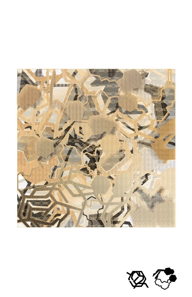
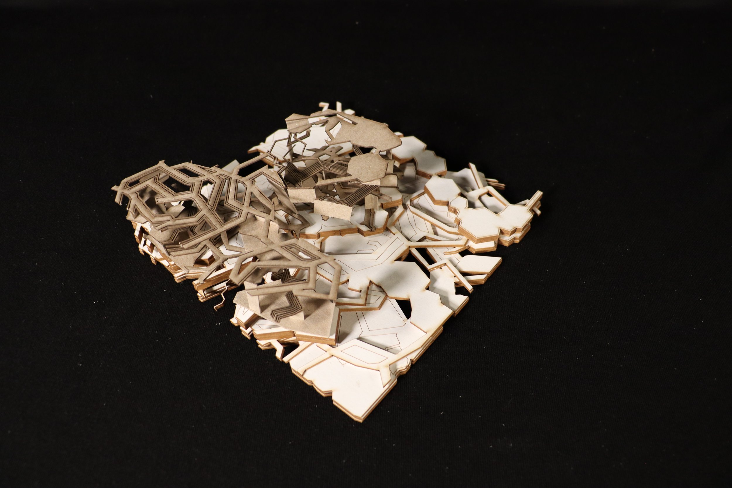
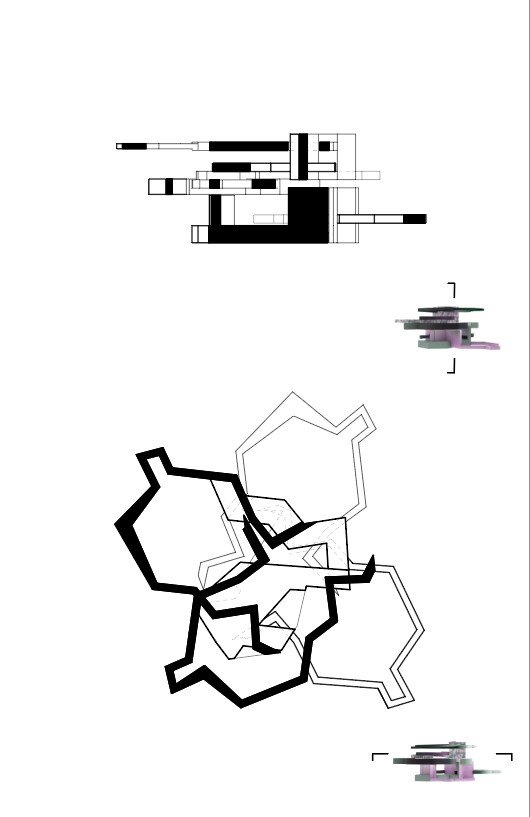
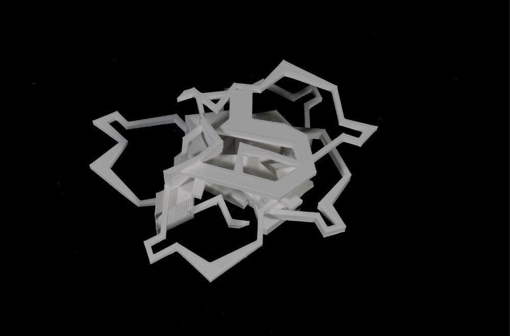
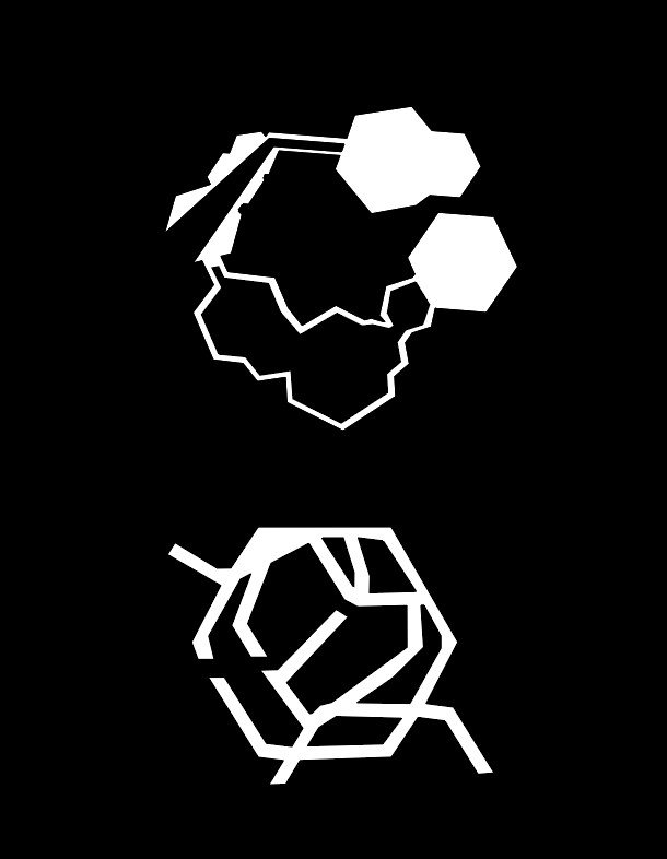
Throughout the semester I sought to explore the potential constructions of spatial conditions and edge relations. Through the process of 2D aggregation and assemblage I was able to comment on the defining features of original forms in a way that explores new perspectives, most notably in the construction of varying depths and masses.
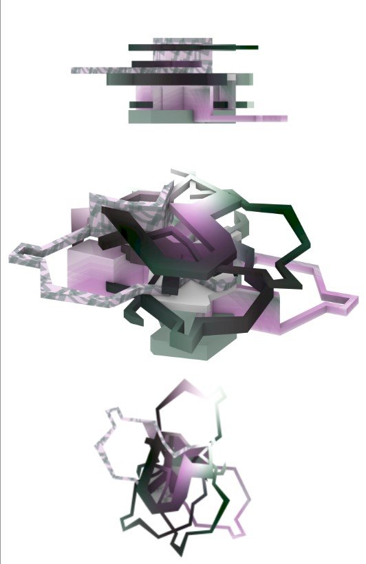
The use of color, texture, and pattern allowed me to showcase gestures and defining components. The creation of tone and movement in these projects does not rely on color but is arguably aided by such. Their inclusion provides further insight into the exploration of concepts and products.
Through 3D expression I was able to truly imbue qualities that I sought to represent, both in the digital and physical spaces. Concepts of revealing spatial conditions through new perspectives, the collaboration between over and under spaces, and the unity as well as disputation that edge relations can build, were all identities that are explored in my projects.


