Professor Stacie Burtelson
Studio investigation of complex formal and spatial constructs addressing the comprehensive concerns of architecture. Special emphasis on understanding the conservation of the natural environment.
Rylie Schoch
The Tube: School of Media and Film Arts
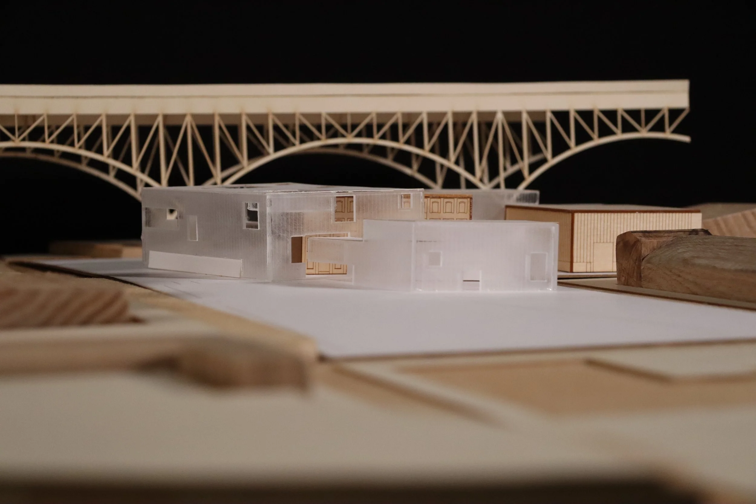
The Tube: School of Film and Media Arts, located on the Flat’s West Bank is an adaptive reuse project that learns to combine new and old by taking inspiration from the surrounding city of Cleveland. It mimics the patterns of urban growth and how new and old infrastructure combine. The idea of unification is especially important with the use of three separate buildings. They created the perfect parallel to the various neighborhoods divided throughout Cleveland in order to study how the city handled their interactions. The main inspiration comes from the Main Ave Bridge that flys overhead, dominating the site. A similar sky bridge is used to connect the buildings. New masses emerge from this central artery of circulation growing around the existing but also breaking some of the grid to take advantages of view sto the skyline and lake shore. The exterior of the site is designed to draw people towards the building; pathways extend from the entrances to the East for predestrians as well as to the West for those coming by automobile or bus. A color changing facade both emphasizes the differences between old and new while also helping to unify the different original materials. The bright colors used refer to the street art and murals adjacent to the site. Controlled by LED lights, they shift and help announce to the public the current events of the school. This building does not attempt to copy the existing. Instead it's designed to respect the old and new as independent parts. Even as they contrast each other strongly, they find ways to unite as a singular entity. This not only applys to the forms of the structure, but also to the users as it provides a space for a variety of people to learn and collaborate.


Timothy Wagner
Connection Through Isolation
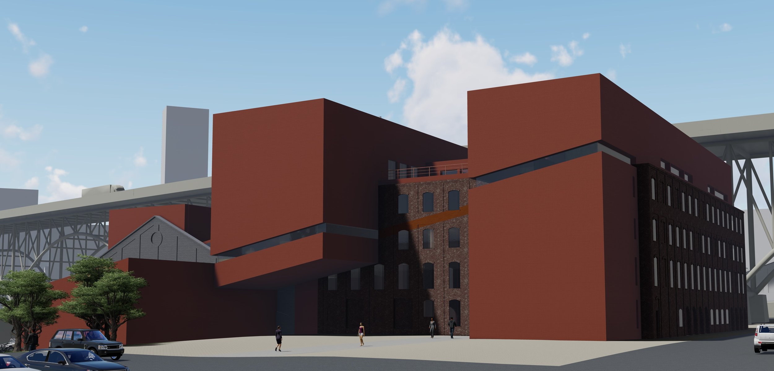
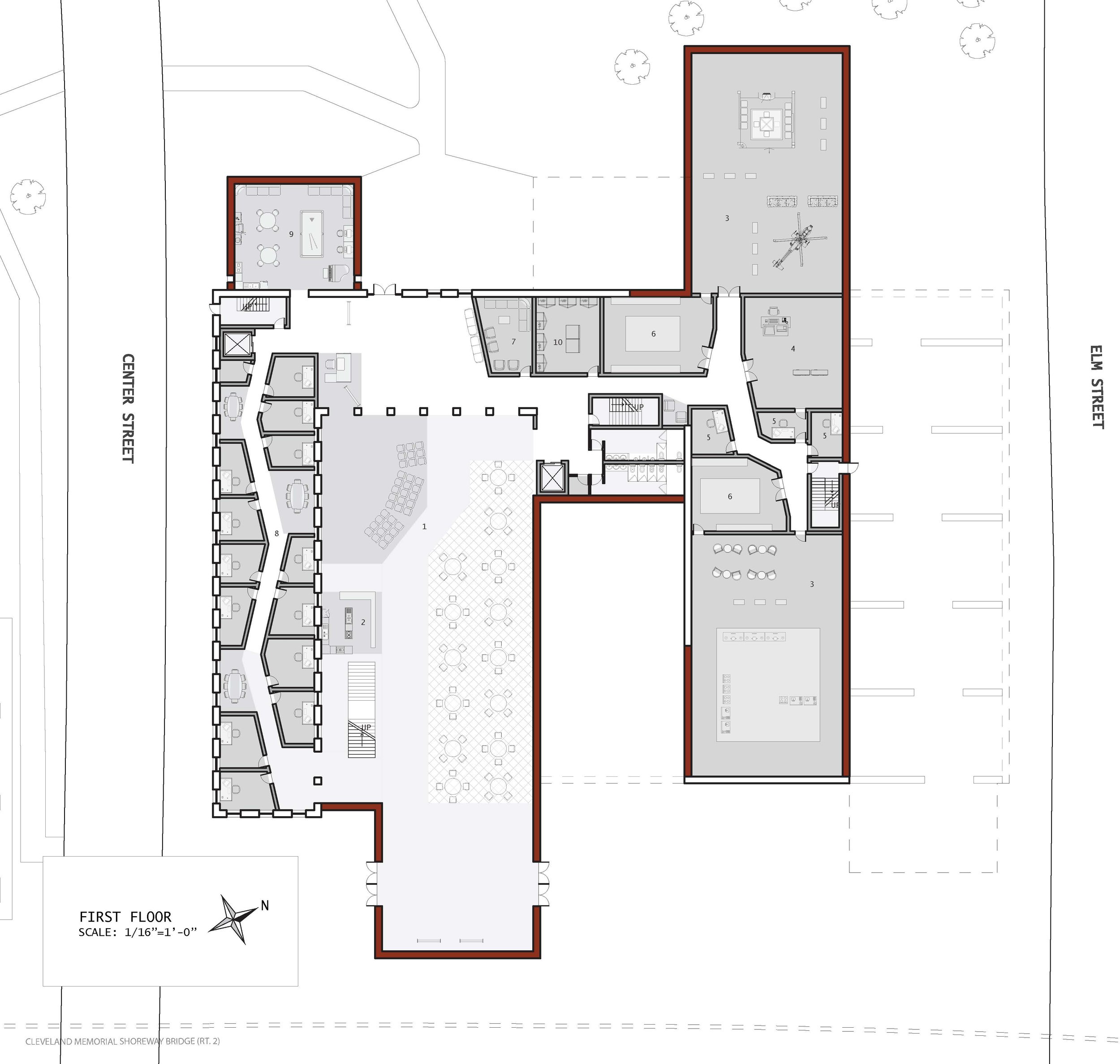
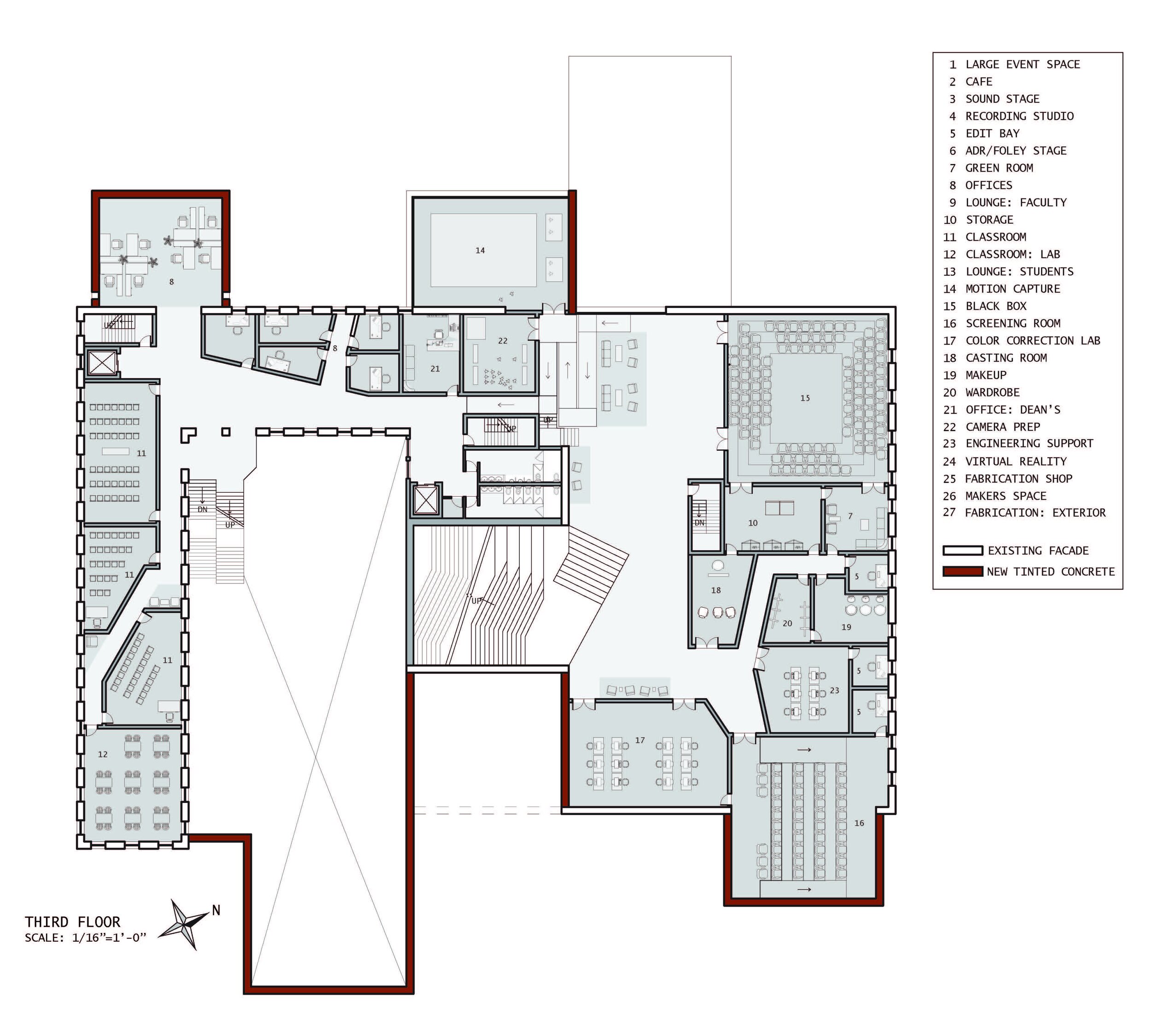
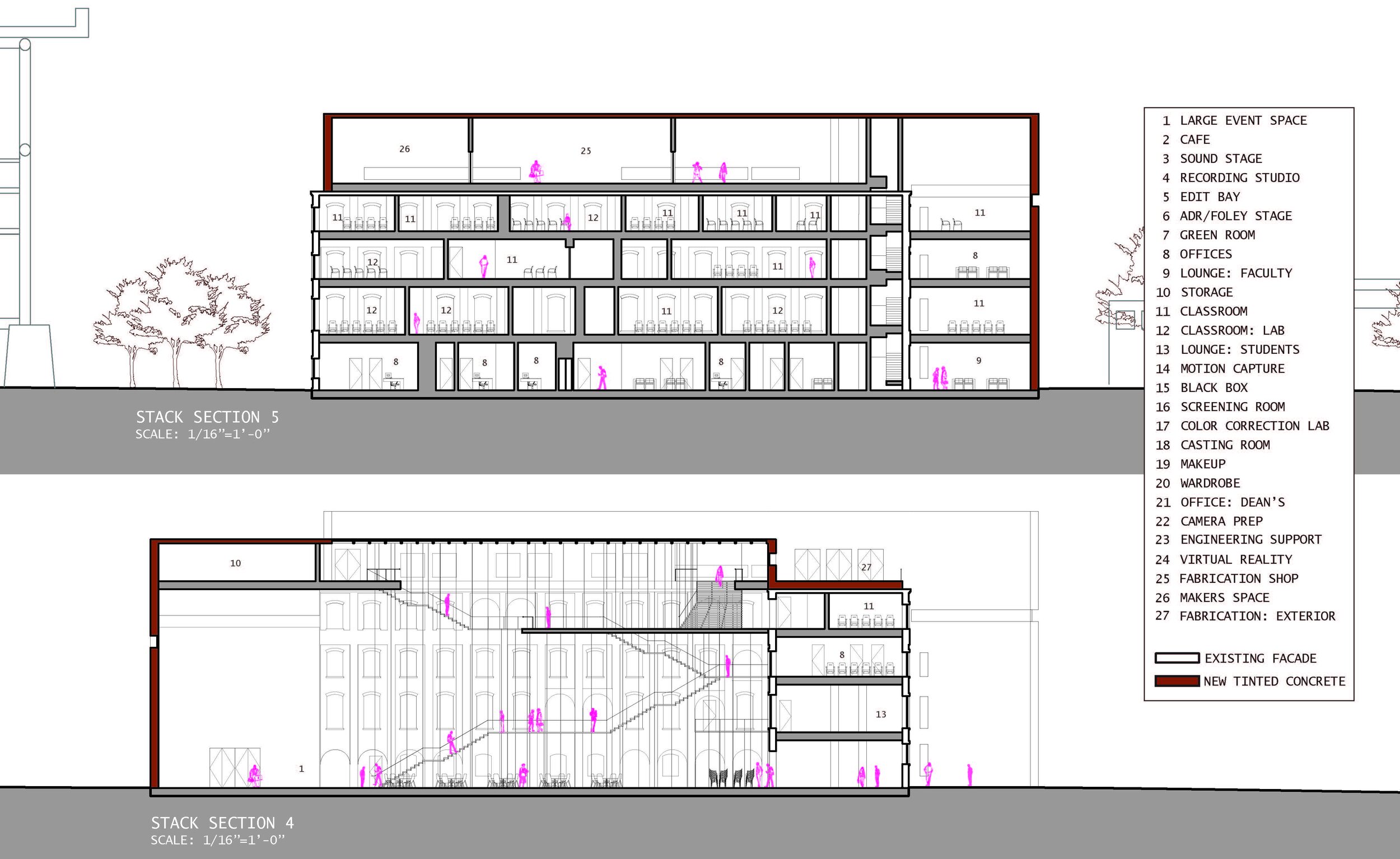
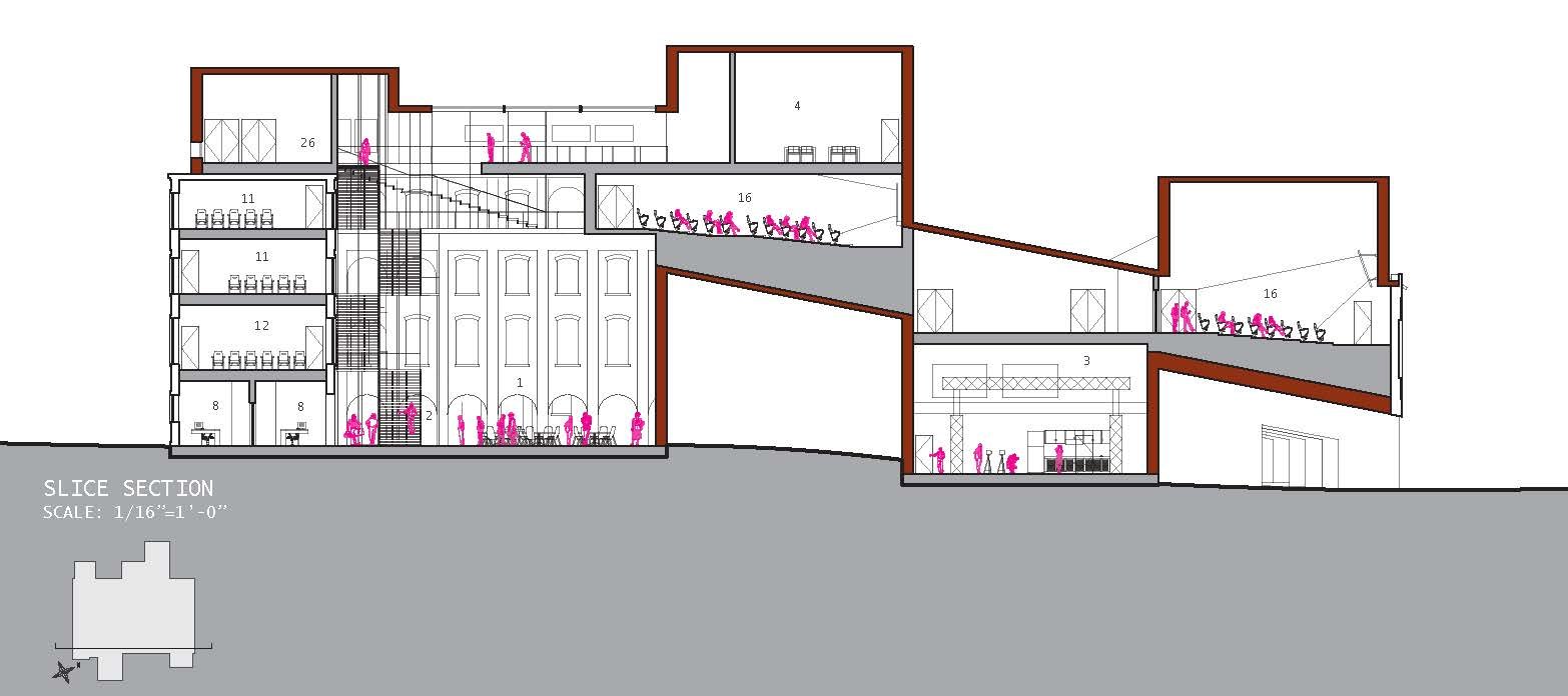
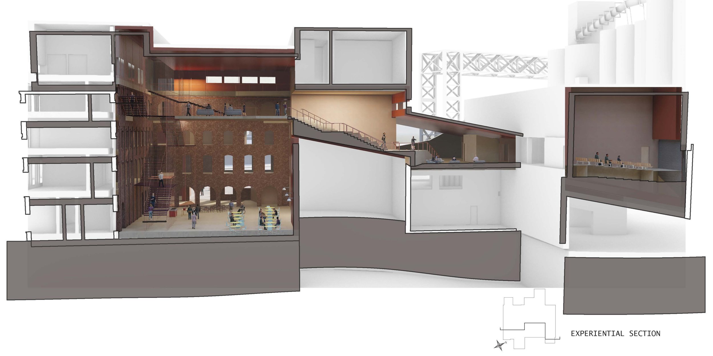
Finding a definitive course of reasoning between old and new requires a distinction between the two. Distinction can be created or found in the environment one resides in. In the West Bank Flats of Cleveland, a distinction is found in the form of a highway. A highway towering over the streets below is a physical isolator of communities with its shear presence within a city even though its process is to connect people through ease of travel. This contradictory definition can be called an oxymoron, a way to bring old and new together in a way that still has differences. The oxymora of connection through isolation can be applied to the Cleveland School of Media Arts to articulate a sense of adaption. The oxymoron was primarily achieved in the form of a slice through the building in section. This slice isolates the interior with its physical presence and the exterior with its material change, yet the slice itself acts a connection of spaces through modes of circulation. The slice is highlighted solely in section while stacked bars inform the plans and exterior form of the building from above. These bars allow for the existing building to be appreciated in how the bars draw back in areas to present the existing materiality as prominent. The bars also extend over parts of the existing façade to showcase the new construction of the school as well as contradict itself and create another idea of oxymora within the film school. Intertwining and adapting of existing and new ideas is necessary, and the Cleveland School of Media Arts creates a connection between old and new through isolation.



Maddie Zaleski
The Reveal
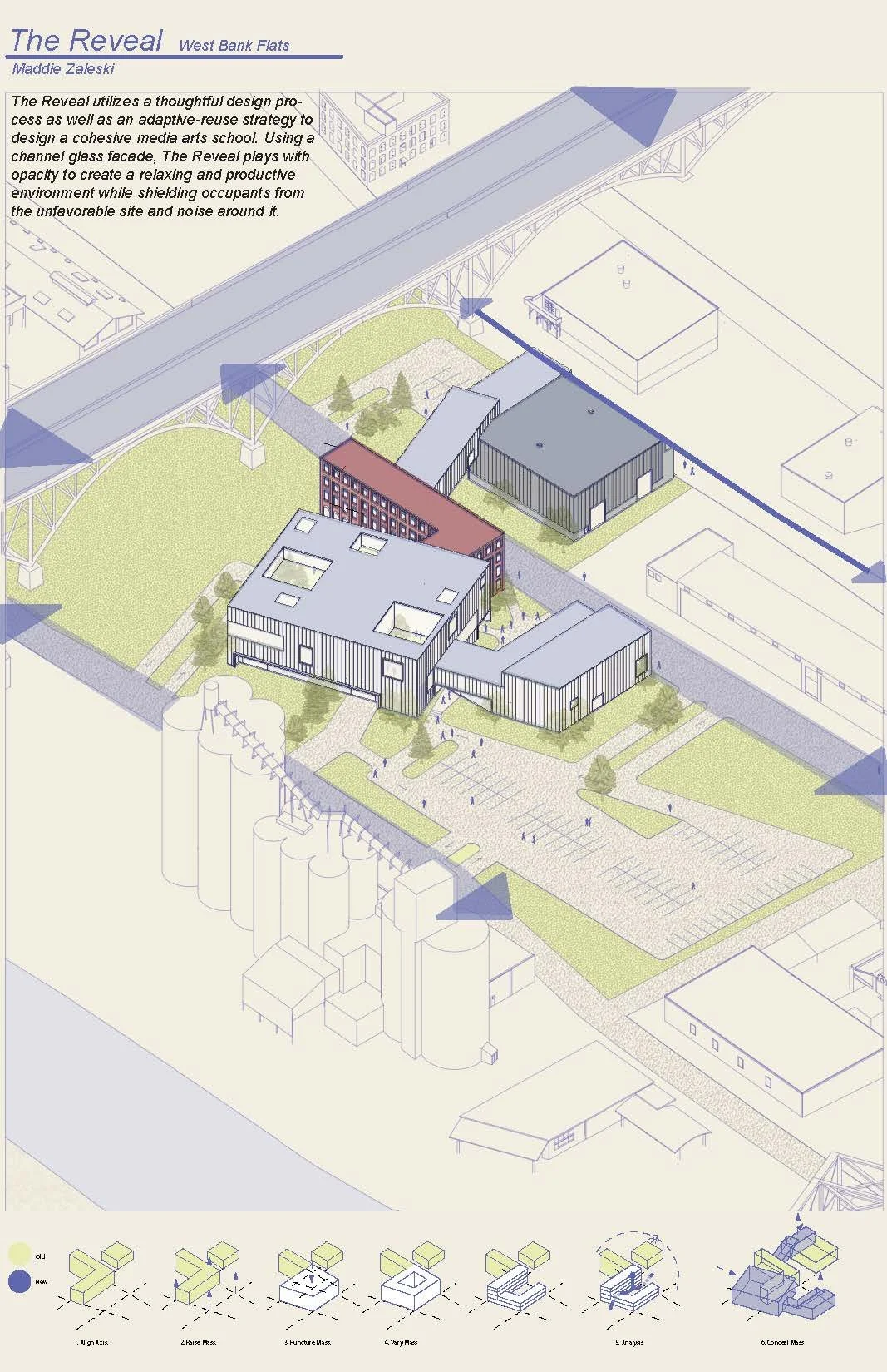
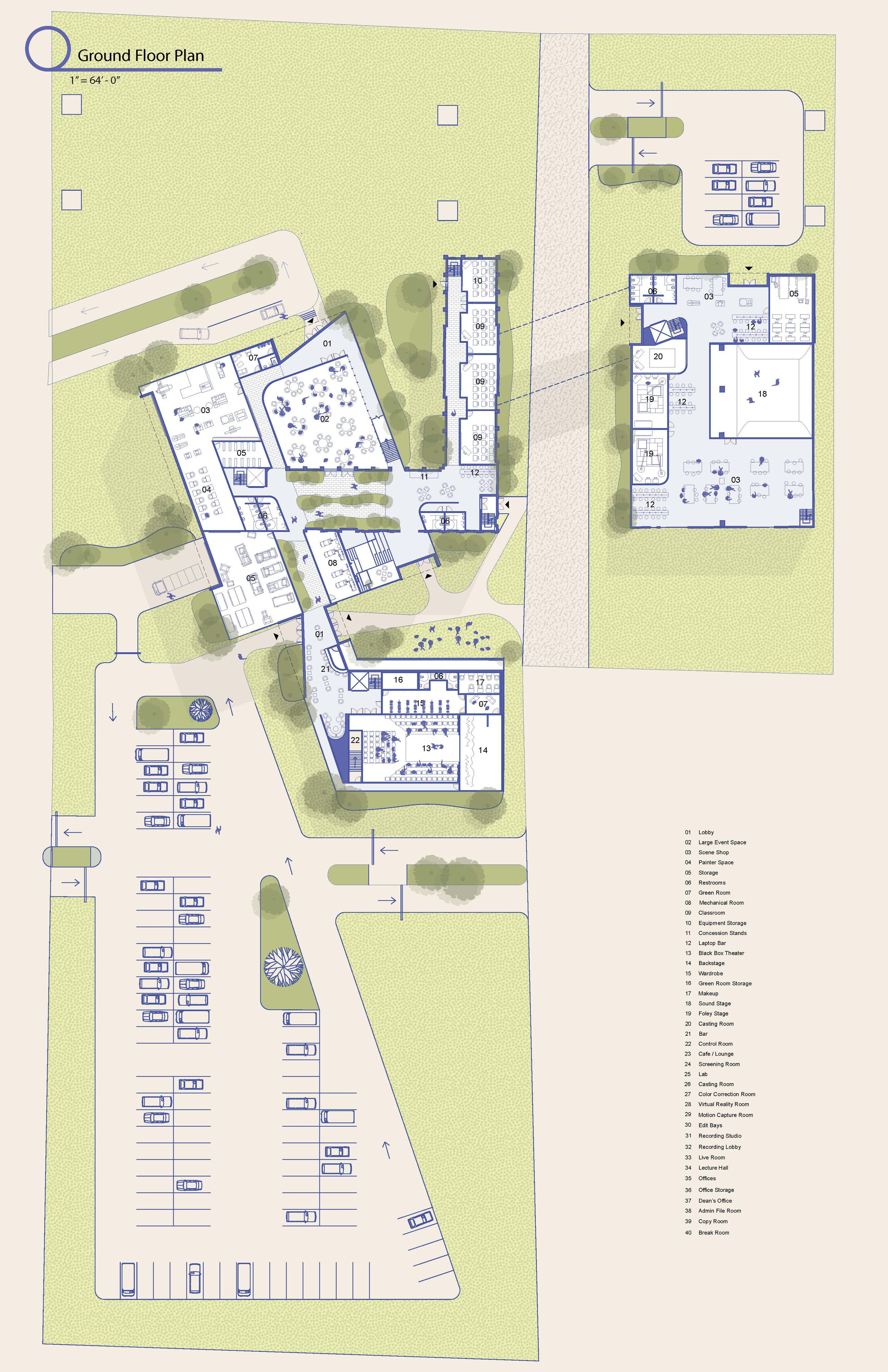
The Reveal utilizes a thoughtful design process as well as an adaptive-reuse strategy to design a cohesive media arts school. Using a channel glass facade, The Reveal plays with opacity to create a relaxing and productive environment while shielding occupants from the unfavorable site and noise around it.



Rees Jones
Cleveland School for Digital Media Production
The Cleveland School for Digital Media Production is an adaptive reuse project of an existing site and structure on the west bank of Cleveland, OH. This project aims to integrate the static existing into a dynamic new composition, creating a new meaning and language via the interaction between the two. Focused on the student and faculty experience, this project pivots on the intermediate, flexible spaces for interpretive, variable use between, before, and after class, in addition to maximizing exterior occupiable space.




Professor Matthew Hutchinson
This studio explores the architectural detail as a means for retrofitting existing structures with speculative architecture. Leveraging the detail as a generative and adaptive tool rather than a static predetermined condition will allow for speculation on the spatial, programmatic and social potentials of novel tectonic assemblies.
Sabrina Pettinato
Versatile Layers
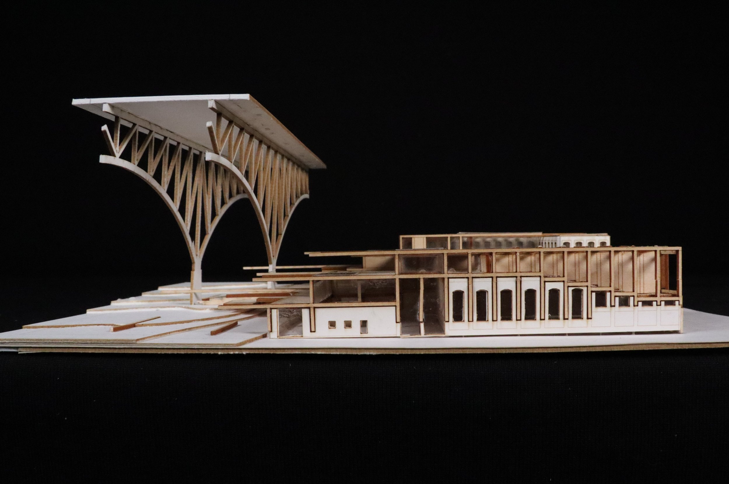
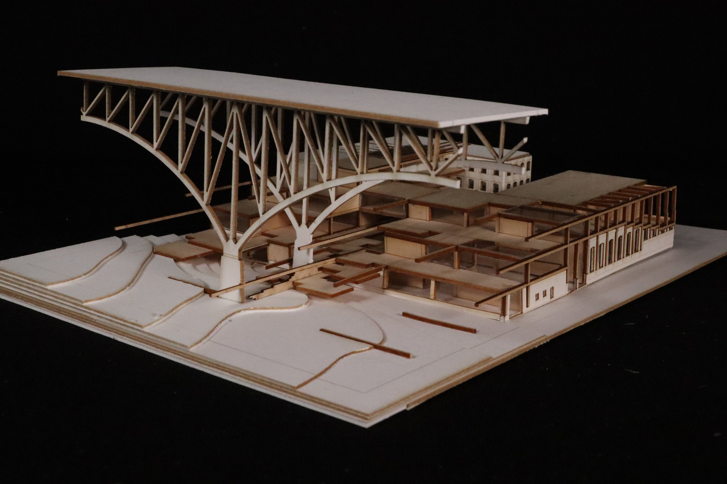
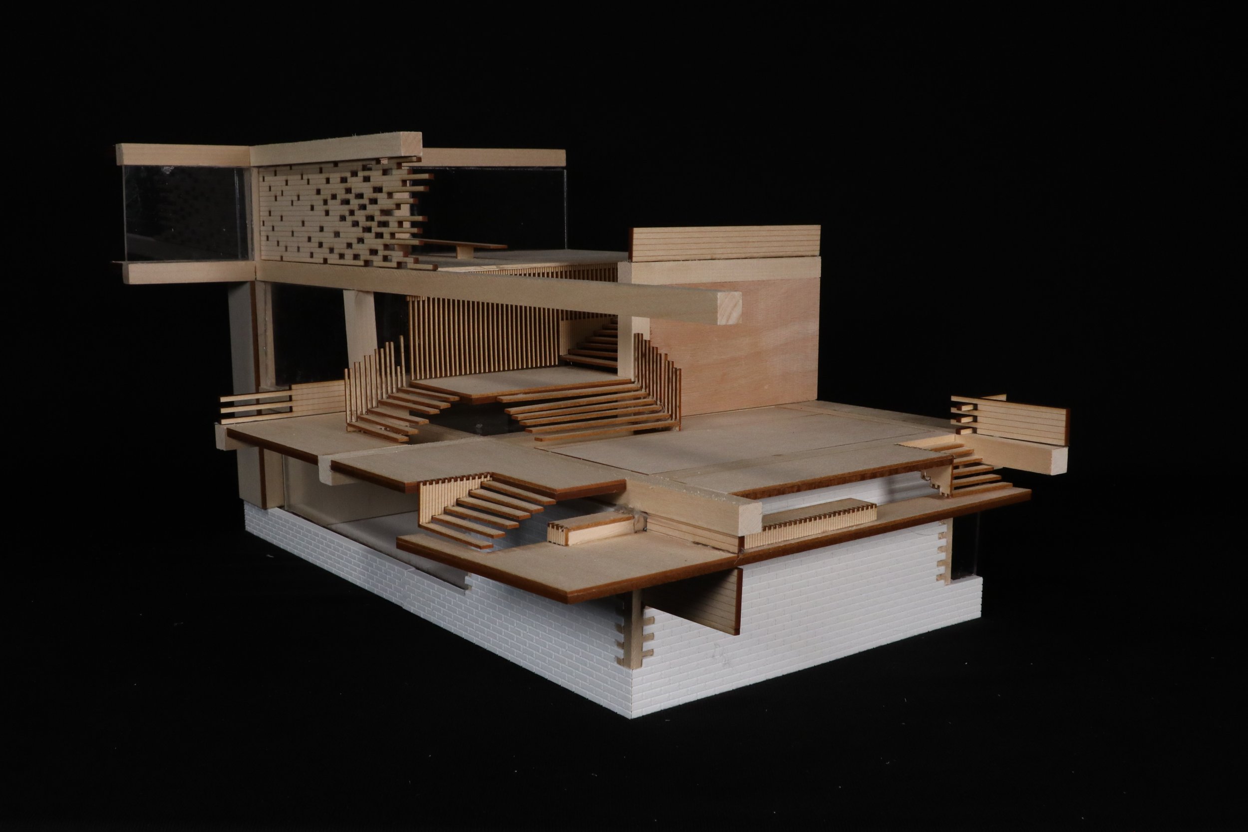
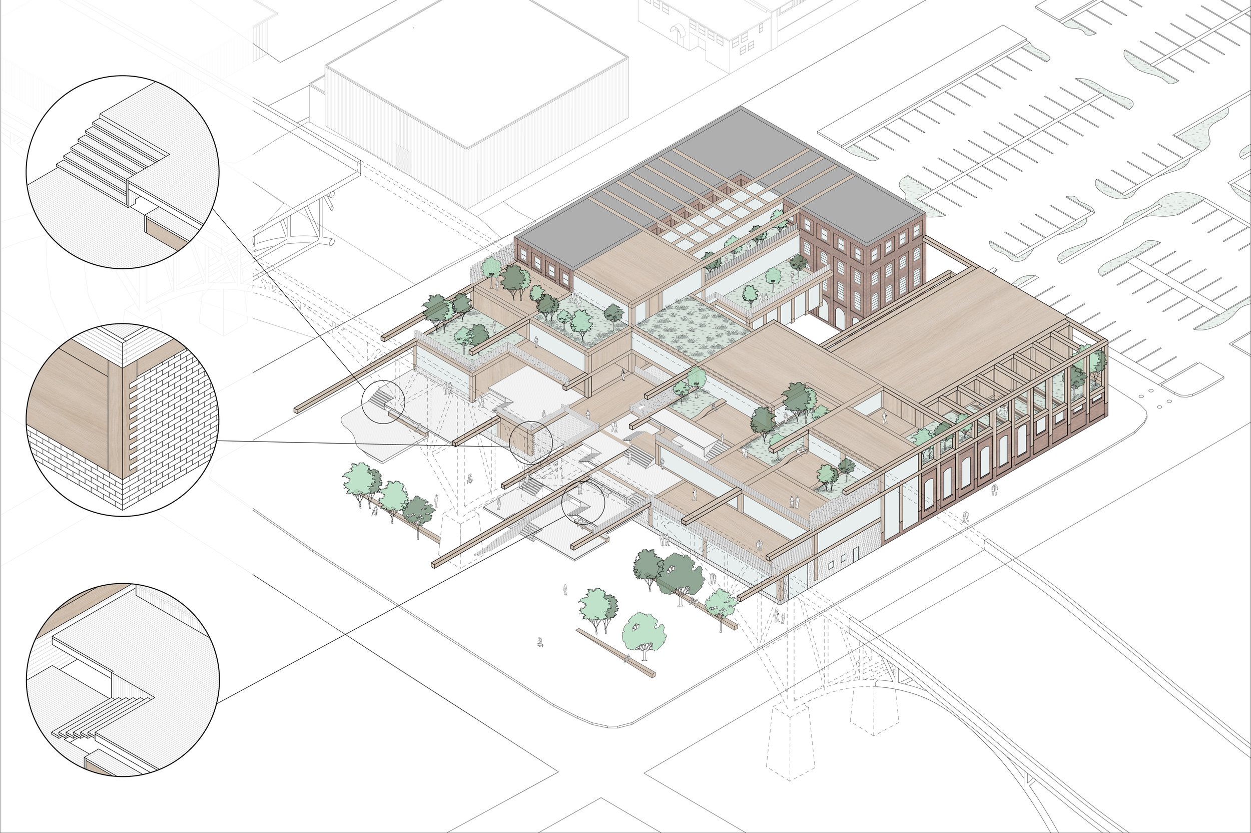
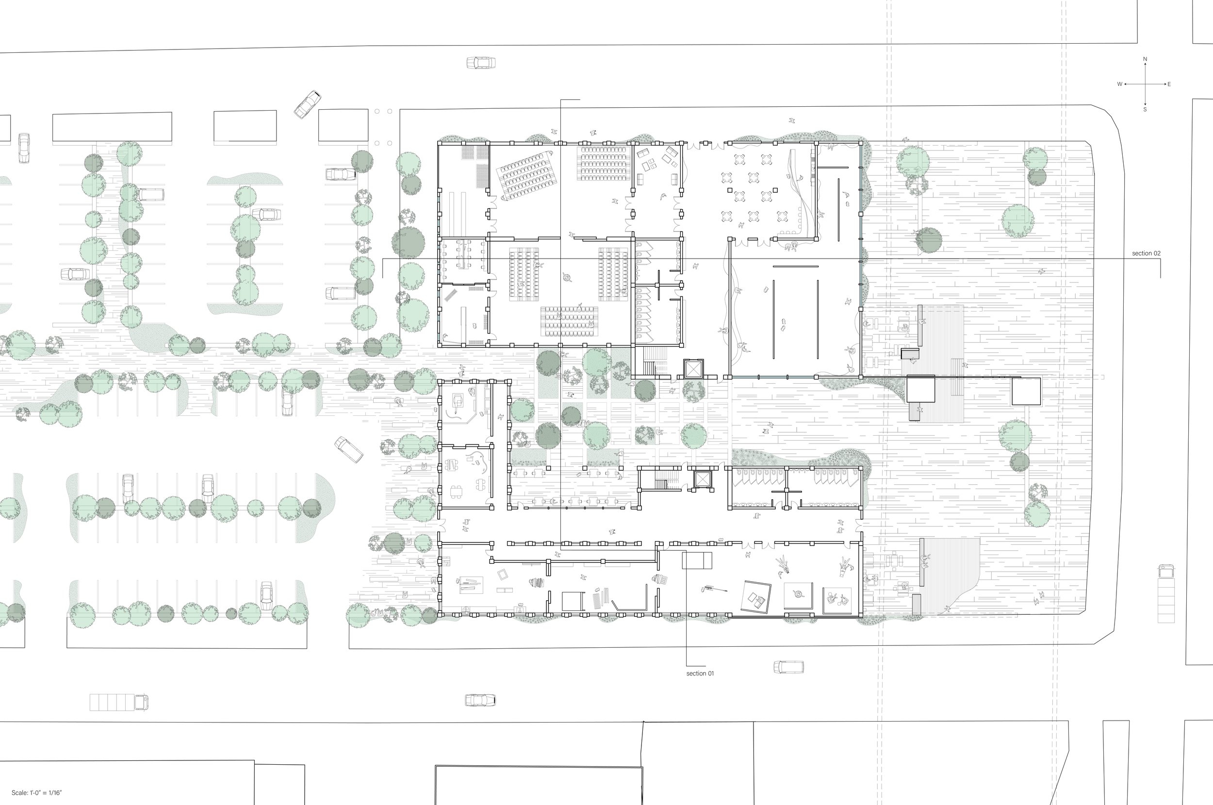
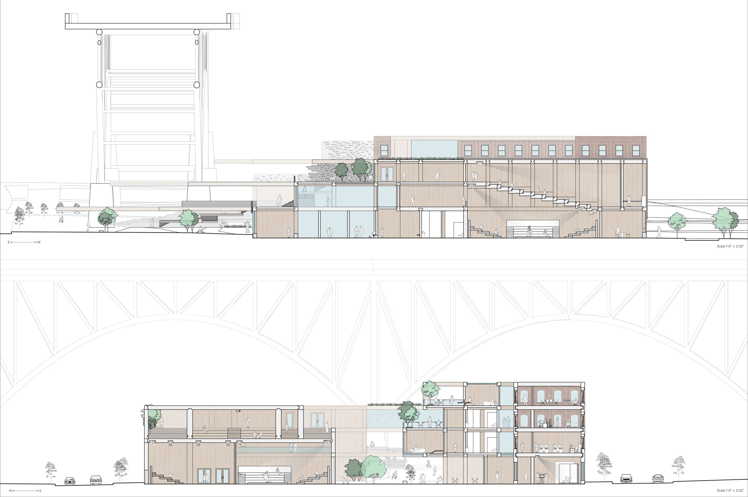
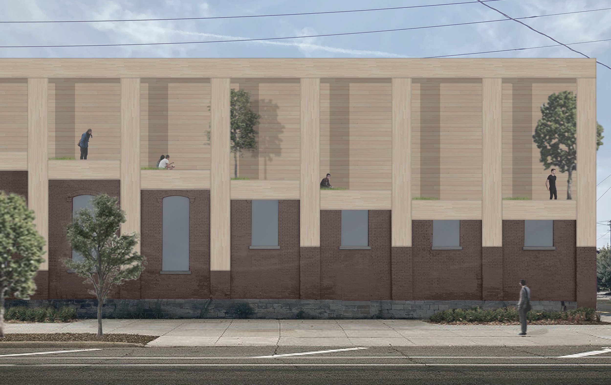
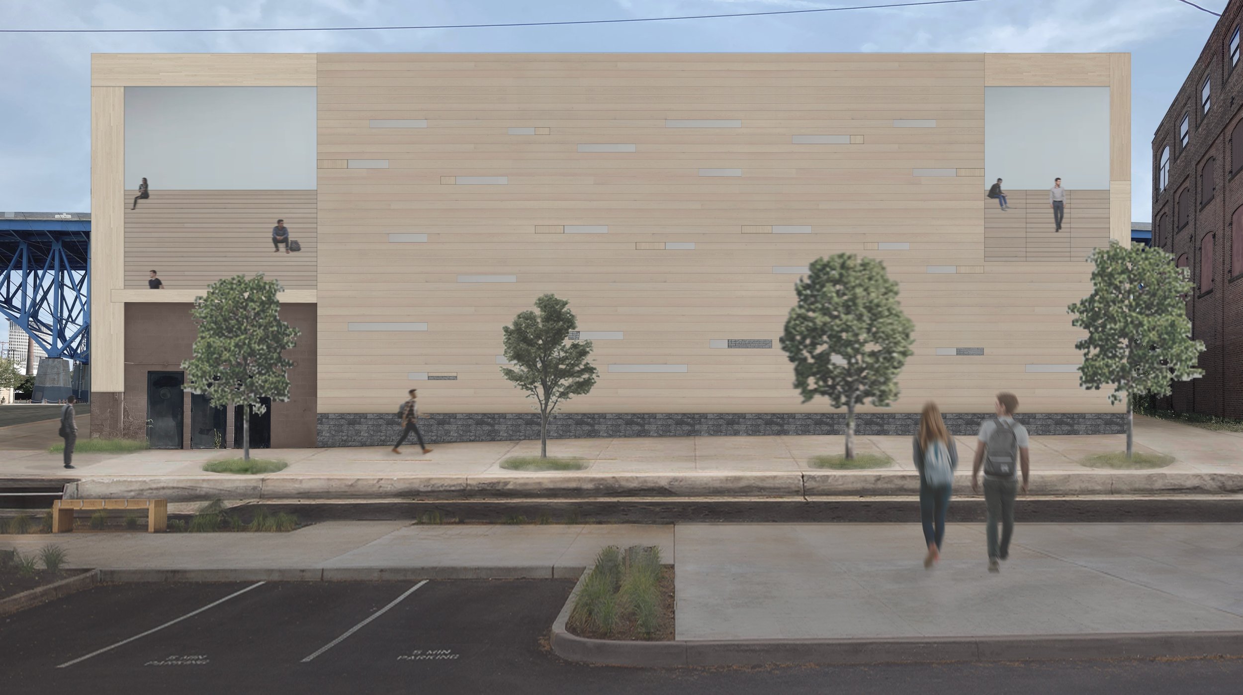
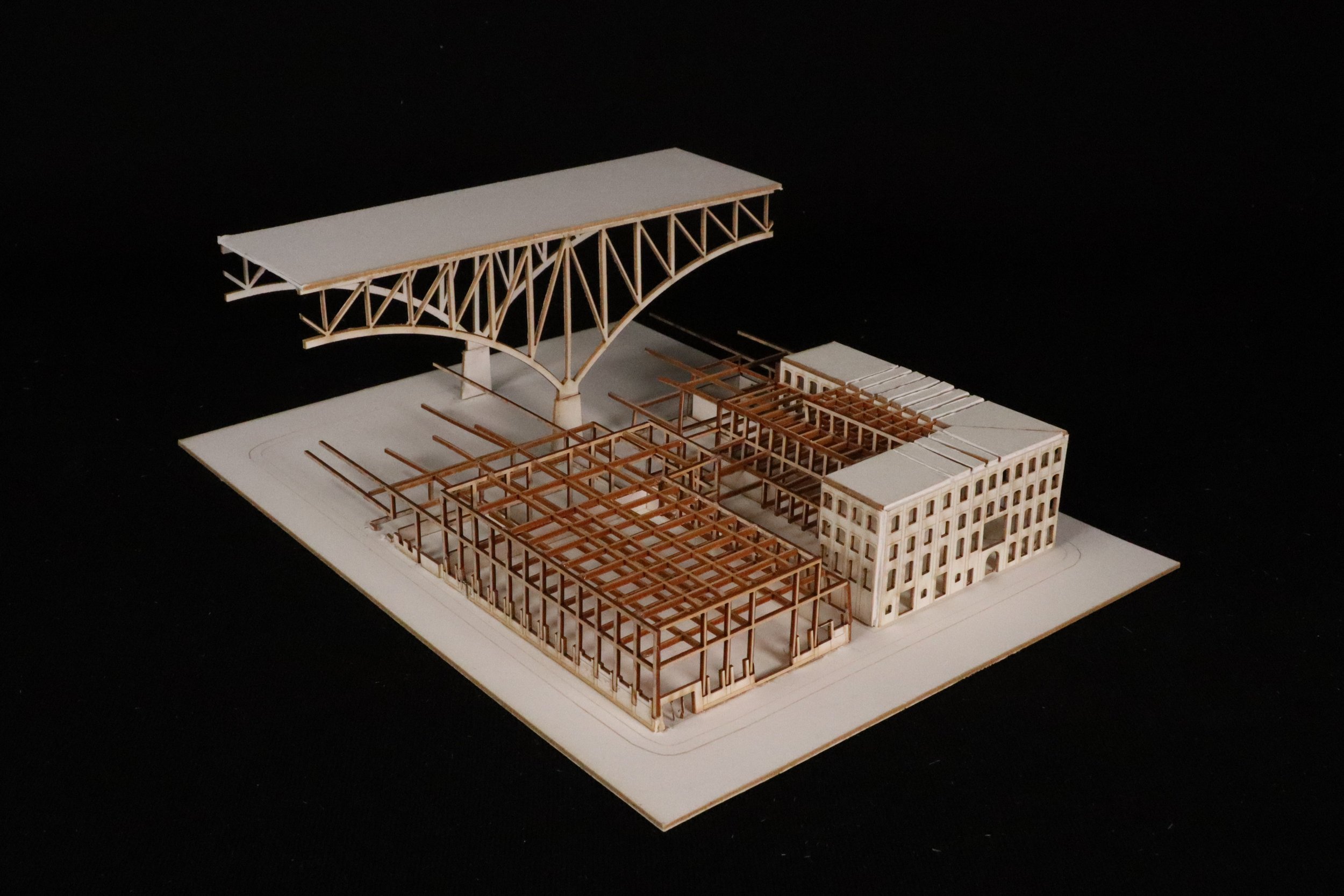
This project uses a material, structural, and organizational framework to unify existing buildings with new construction and create a cohesive tectonic throughout. It also seeks to utilize the unique properties of CLT to interlock and layer both materials and spaces. In the process of replacing parts of the existing, I uncovered an underlying organizational system that I slightly edited to accommodate for certain programs. The material can adapt physically at different scales such as dovetailing between brick columns, finger locking into individual blocks, and interlocking with itself to create furniture or circulation. By using a layered approach, the material can also adapt to achieve certain densities of spaces, sound, and light. The layering of program in different densities starts to create more public areas towards the bridge and more private by the parking lot. From there, wooden panels can be filled in between, over, or onto the CLT to determine interior vs exterior, public vs private, or density of sound and light within a space. The public is drawn in from a digital gallery and then led up the cascading platforms or around the side to the main entrance. The other half of the site filters people from the trail through the middle of the project to an extension of the trail. Or students and faculty can enter from the parking lot to access spaces for learning and producing that work towards performing. The layering of material and spaces allows for the new to conform to the existing, organization of programming, and better control of the density of spaces.

Logan West
Bundles & Passages
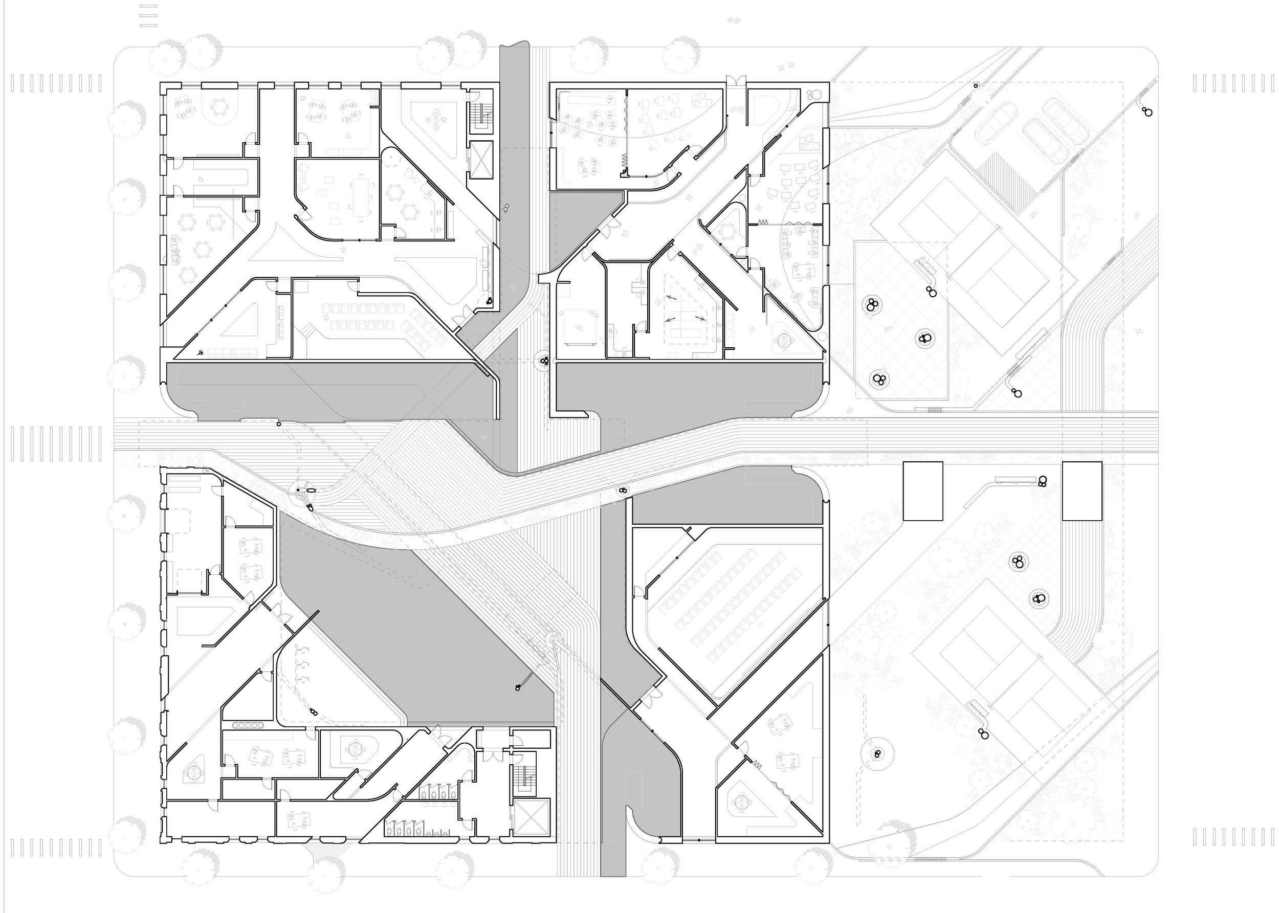
As a response to the renewed demand for city life in popular culture, this project creates an urban scale interior passage bringing a marketplace into the heart of the new media arts school. The passage consists of one larger primary public passage with two secondary passages for more private entry/exit. Spaces shift from the highly public passage to more private spaces as you move towards the perimeter of the existing construction. CNC Tube bending and bundling is implemented across multiple scales to create a unifying and lucid tectonic. Tubes are bundled together as they touch the ground to create a structural system of the new multi-tiered roof scape. From that, spatial nodes are generated throughout the passage at moments where they touch. On the exterior, railings and benches are bundled with street lamps to introduce the public to the playful and tactile nature of the tectonic strategy. As you move to the interior, bundled columns are then bent to create seating, tables, and stairs in some instances and places for display or lighting fixtures in other instances. Bringing a marketplace into the school in the form of an interior passage both introduces a familiar experience to the public audience of Cleveland with an arcade-like typology, as well as meets the renewed demand for interconnectivity.


Jennifer Callewaert
Slide, Shift, Pivot
My project leverages adaptability as a tool to activate reciprocity between the media school and community center program. Adaptability is explored in two ways in the project - First as a tectonic strategy which in turn supports the second - a programmatic strategy. Both operate in the interior of the building as well as on the exterior. Because of existing building constraints, the interior strategy uses a series of sliding, pivoting and shifting partitions to mediate between program spaces allowing for variable use. For example a typical classroom during the day can easily transition to a space for a parent child playgroup in the evening. My strategy of kinetic walls continues into the site as a way to add privacy and division to such a large public area. The site context can house large community meetings, provides a stopping place for the bike path, and has multiple courts for recreation such as yoga, volleyball, and basketball. On the façade of the project, large kinetic panels slide to offer privacy and shading where needed as well as create dynamic exterior spaces that can change seasonally to handle activities such as a café in the summer and a winter garden. Key moments open the project to the community such as the kinetic walls on the 4th floor that open or close to transition from classrooms and offices to skills labs, community meeting spaces, and recreation spaces. The community center is further explored on the roof which is accessible to the public 24/7 through an exterior stair. The roof continues the design language used in the site to create a sense of familiarity for the community. Community members will enjoy this space because it provides an adaptable area for connection, socialization, and growth that is currently insufficient for the expanding area.



Logan Ali
Suspending Volume
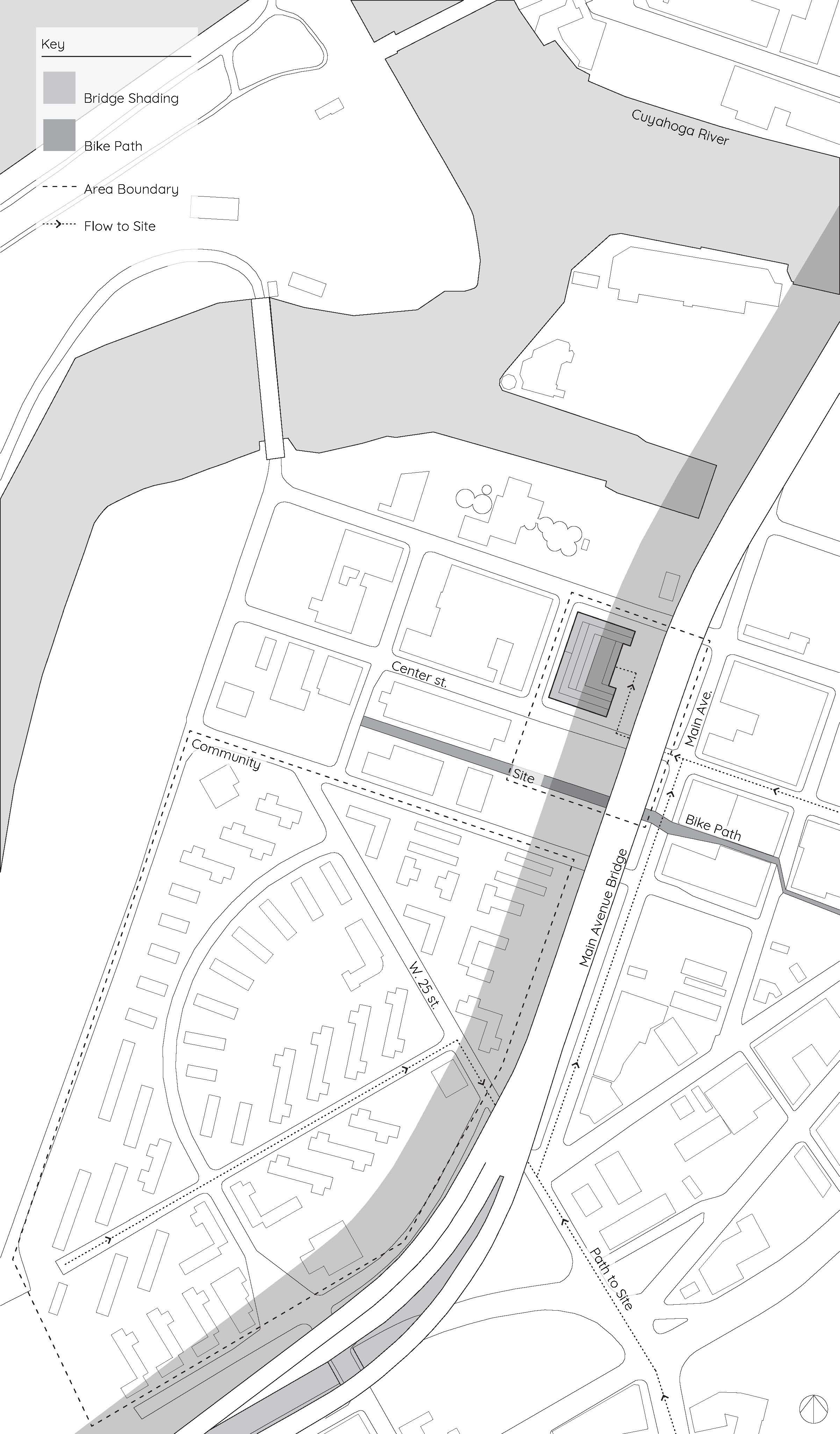
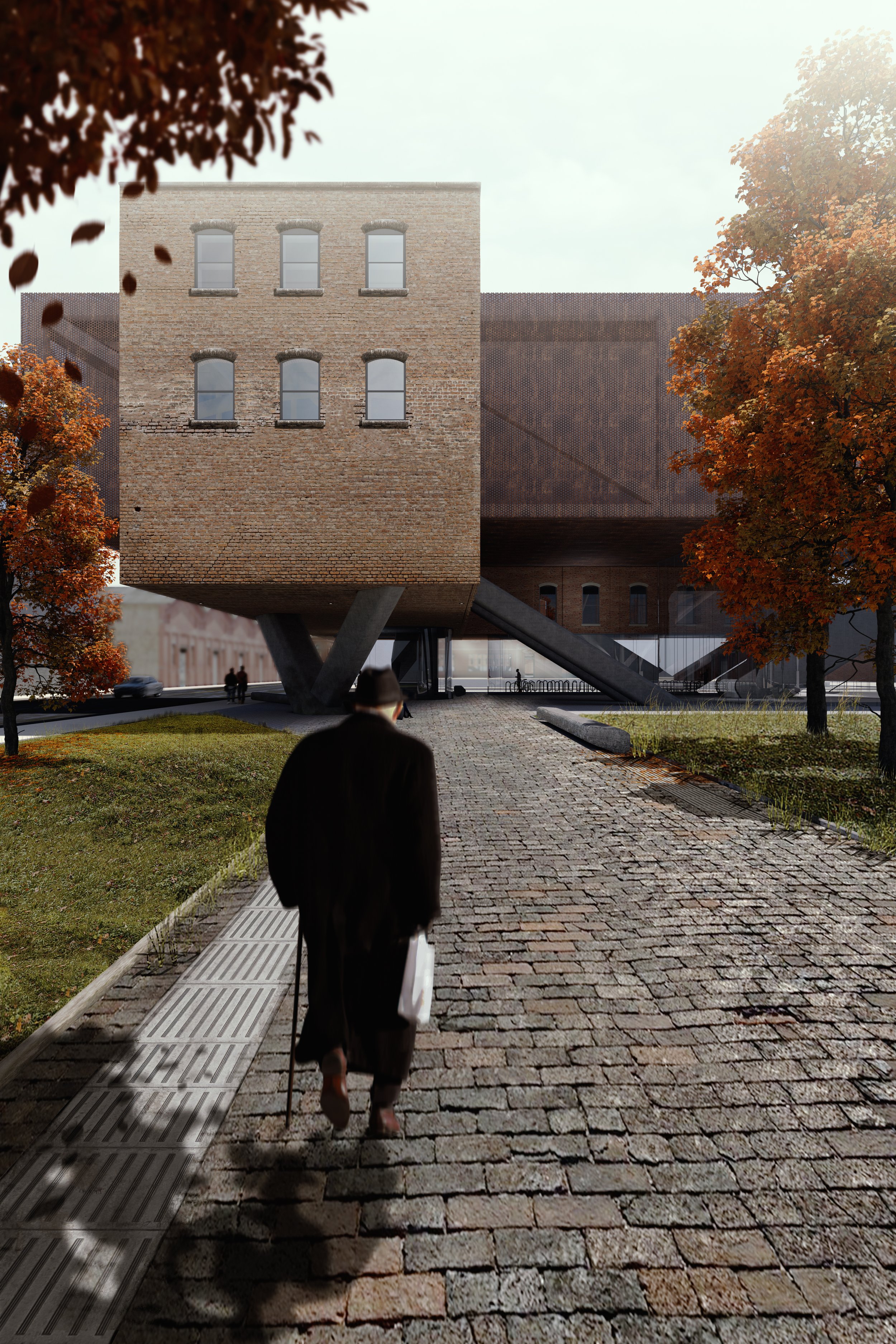
This project takes the idea of ‘Suspending Volume’ as its provocation to create a public datum and a novel experience. To achieve this, two of the existing structures are cut ‘free’ at ground level, seemingly tied together and hung from a new massing. A material and tectonic strategy of reveals between those existing volumes and the new structure, emphasize the effect of suspense. The sweeping gesture at the ground level allows the surrounding urban fabric to extend under and through the project, tying it into its context. The only perceived interruptions are a series of attractor points. The two volumes hanging above this public datum lend themselves toward a spatial organization of classroom based learning and learning by doing, and a new, additional volume hosts shared spaces that act as connective tissue between the two.




Professor Jean Jaminet
This studio recasts the practices of institutional building conservancy through alternative methodologies in experimental preservation. These open-ended processes ask questions about reality by negotiating the territory between tangible building artifacts and the illusory experiences of culture. This domain between the real and the artificial is increasingly complicated by excessive media interference. Our project to adapt an abandoned industrial complex in Cleveland, Ohio for occupation by a new school of media arts sets these debates in motion. The studio will therefore develop experimental preservation strategies that introduce alternative visual and tactile conduits for image-making in architecture. The design project will be explored through independent student investigations within this intellectual framework. Experimental preservation strategies will involve maintaining many existing building artifacts while others are augmented by imagery that amplifies tensions between corporeal form and artificial atmosphere. Rigorous design experimentation and innovative technological tools and methods are essential to developing the requirements of the studio. Student will deploy various tools, methods, and hybrid techniques to make compelling visual and tactile arguments, including digital modeling and rendering, physical construction, hand drawing, computer-aid drafting, laser cutting, CNC milling, 3D printing, decorative painting, handy-craft modeling, and digital image manipulation. Tutorials on digital tools and techniques will be assigned to produce visual artifacts specific to the studio premise. However, students will be responsible for expanding their own understanding of and abilities with tools and techniques beyond the learning opportunities afforded in class.
Katelyn Eng
Disrupted Space
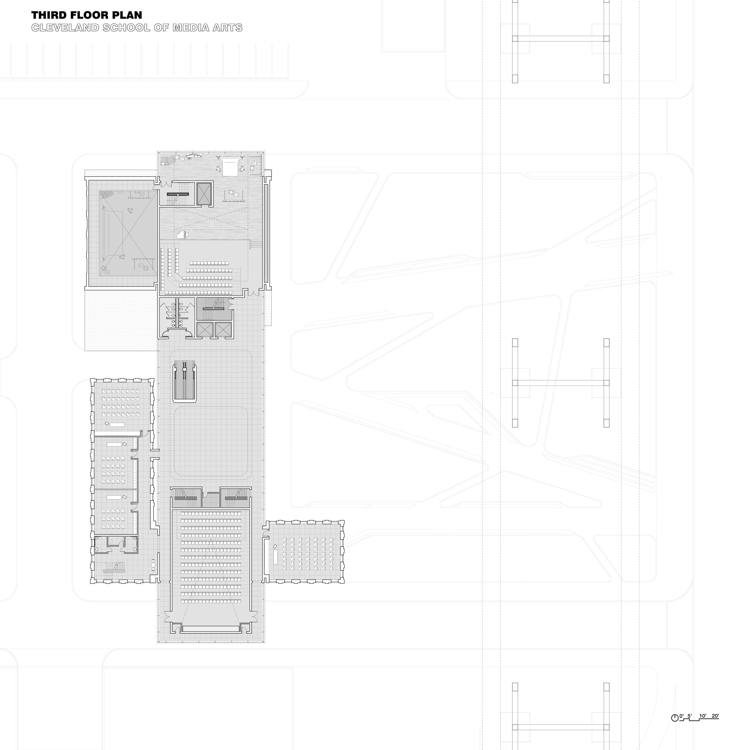
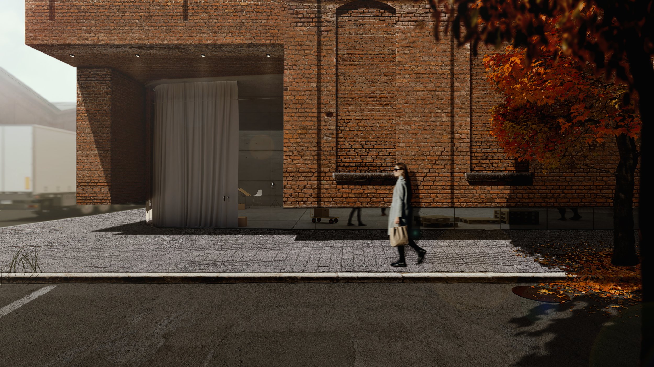
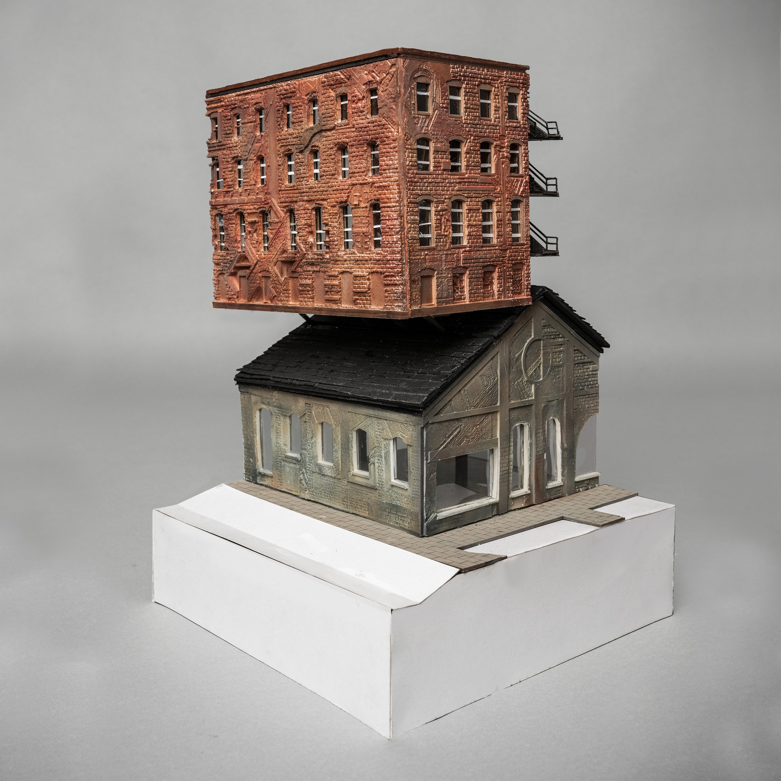
The catalyst for this project was the premise that fire escapes are an inherently disruptive architectural object that creates spatial tension which, in turn, affects architectural elements, enables the inversion of spatial hierarchy, and creates the opportunity for uniquely temporary and charged occupancy. In this specific building, these disruptions, and the effects they elicit, affect massing and materiality differently such that the existing buildings are altered somewhat superficially while the added massing is altered much more substantially. In terms of experimental preservation, this allows an exploration of an intense separation between what already exists and is being proposed and what is being added to make new and further use of the building as a whole possible. This strongly correlates with an exploration of materiality in which the existing brick material is prevalent for both the old and new elements of the building, but there are moments in which layers of materiality and information are added and others in which the materiality is fully subverted into something that, while suggestive of brick, is decidedly artificial. This approach to preservation and materiality also explores broader questions of authorship and what constitutes the realness and legitimacy of materiality.




Nguyen Le
Irreconcilable
The proposition of this project suggests using imagery of steel mills that are prevalent in Cleveland’s post-industrial landscapes which is often a sore object of aesthetic, and the contemporary experimental architecture that utilizes inflatable material. The project consists of surfaces that begin to exhibit misbehavior and are irreconcilable in their original identity as existing buildings on site in the same nature of inflatable objects and structures: “reimagining of traditional forms.”


Justin Levelle
Authroized Decay
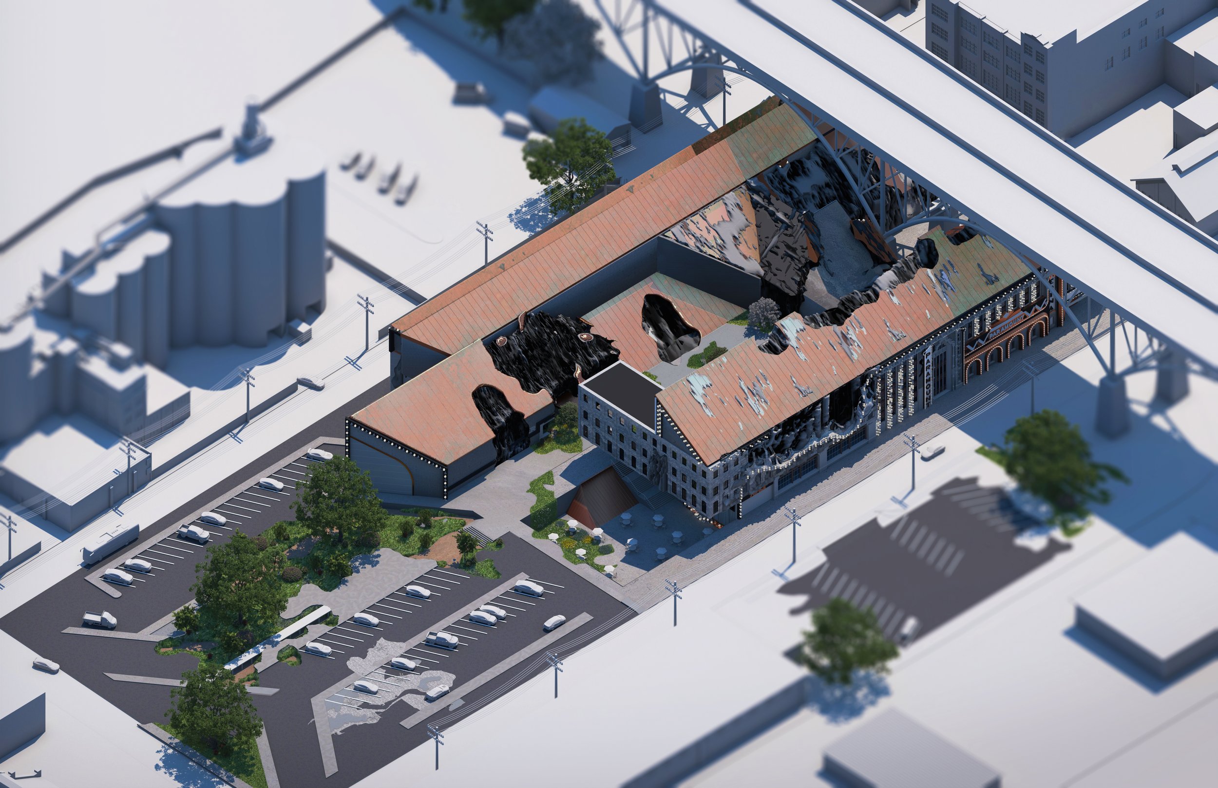
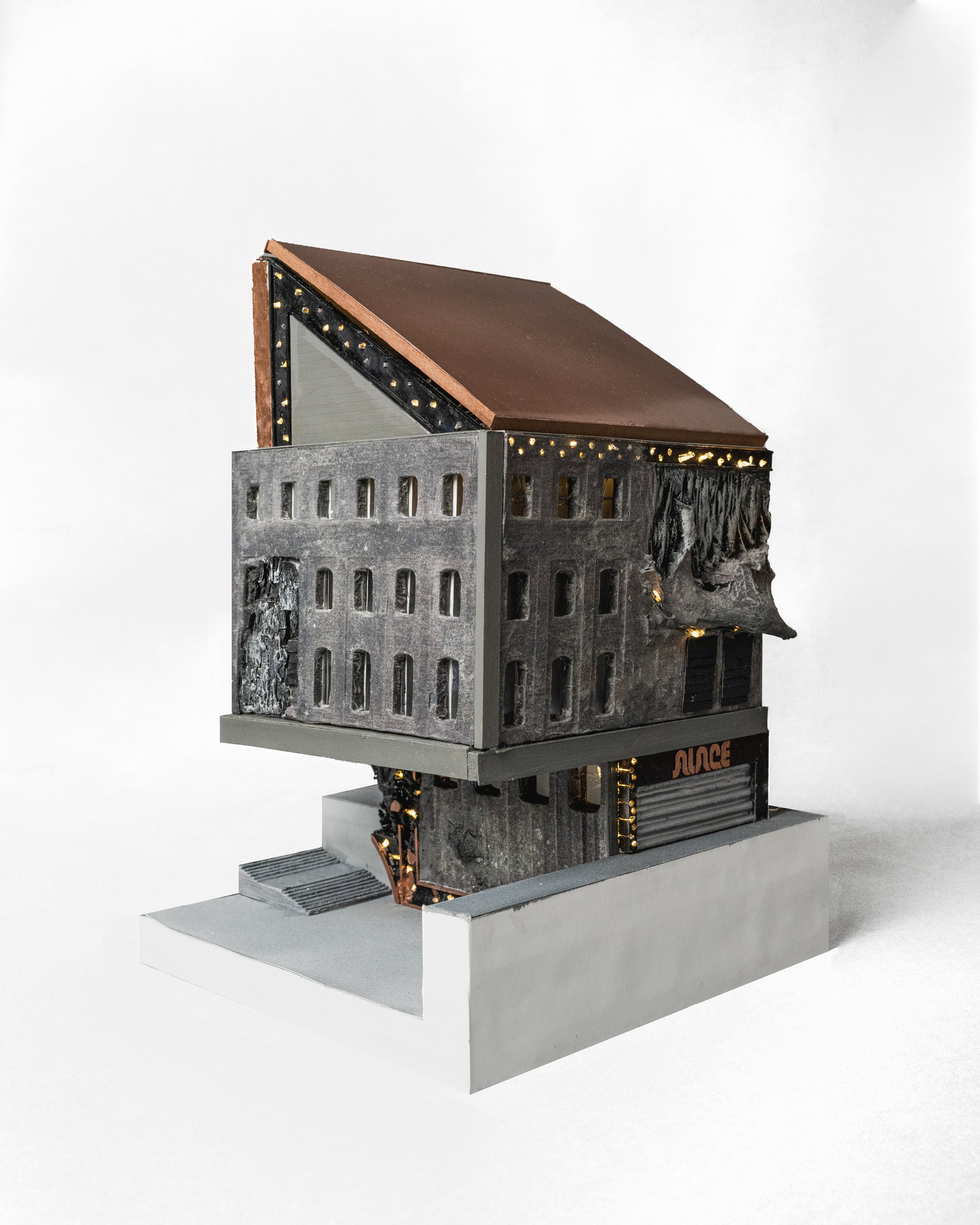
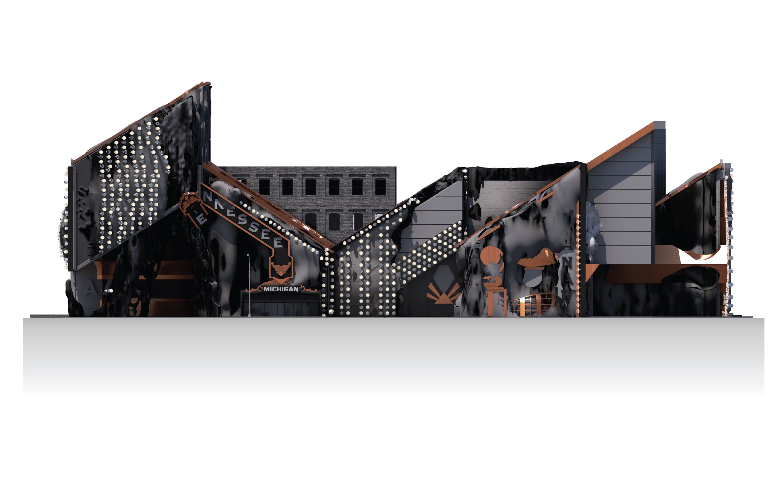
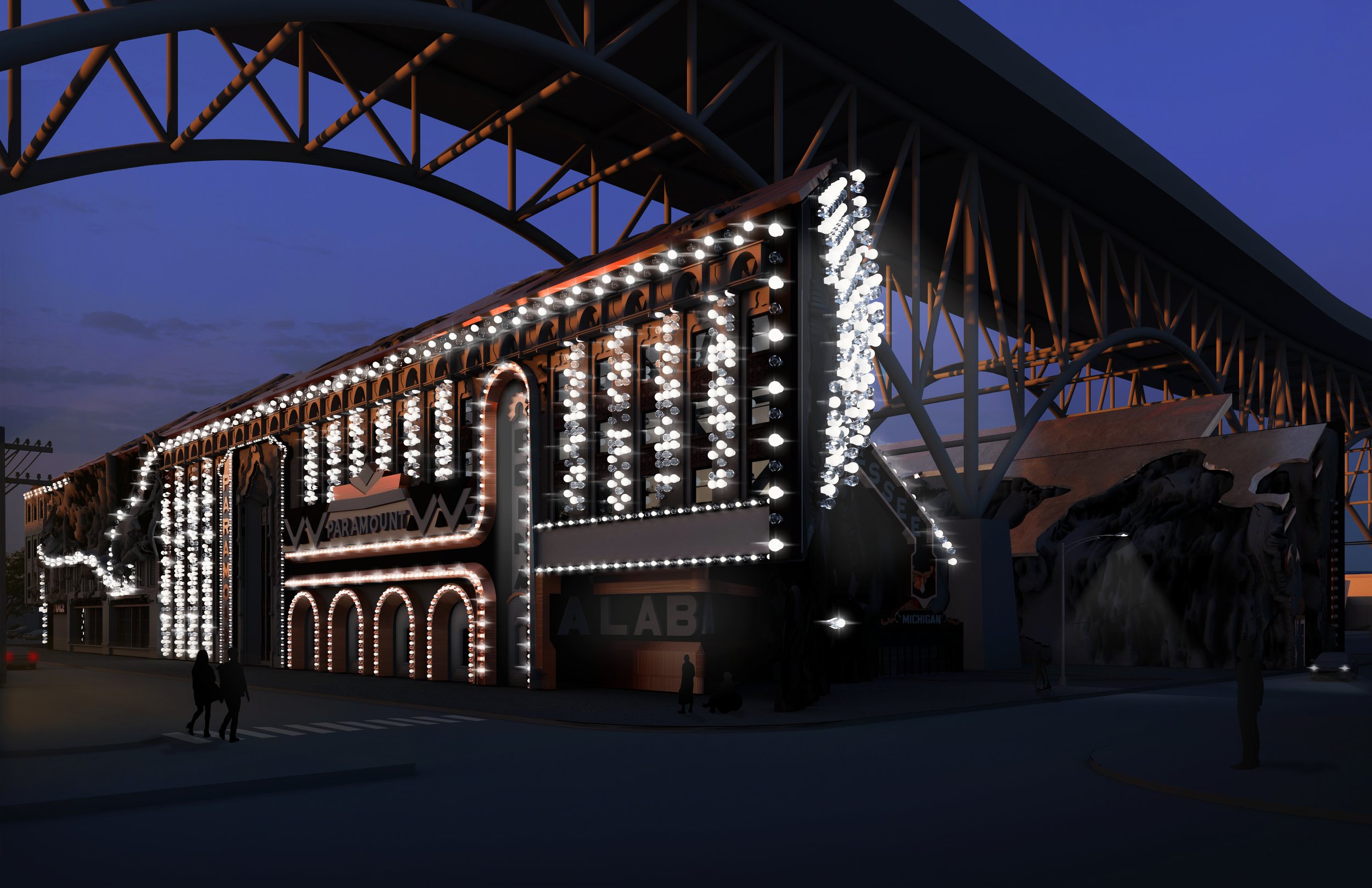
The traditional belief within the architectural discipline considers that the physical state of architecture represents a sense of permanence and prestige unwavering by time or conditions. Yet, in the context of preservation, architecture reveals itself as fragile and susceptible, dependent on those willing to preserve it. Even so, the preservation process relies on documentation and data collection through images and drawings. However, what happens from a lack of preservation or the absence of data in an architectural context? How do these effects result in the paradoxical relationship between neglected and preserved? This project exploits this paradox by exploring the experimental preservation practices at the intersection of these two conditions, resulting in the material effects of procedural degradation. These material effects are defined by a digital process that begins to interfere with the building, resulting in a degraded and distorted image of the built environment. Furthermore, rather than this image being defined by a singular state of the building, this process is defined over time, altering its initial perception. The copper roof will begin to patina, the light bulbs spanning the facades of the building will burn out, and this degradation will decompose the brick walls. The cultural imagery and significance associated with the marquee are twisted and distorted, leaving an algorithmic trail of lights diffused across the facade. Moments of the façade are peeling off to reveal the digital residue from the experimental practice.


Dominic Holiday
Proposed Images
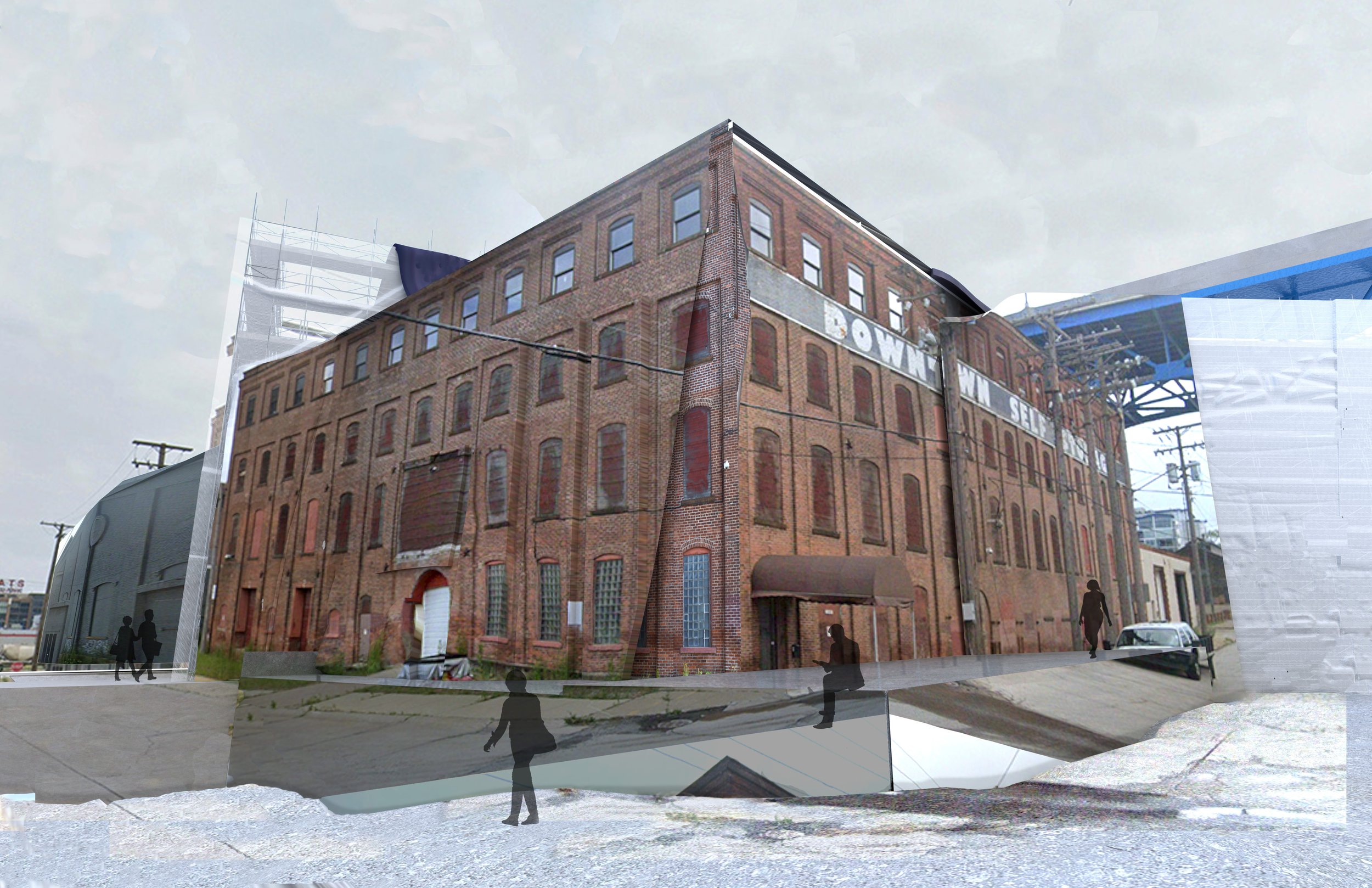
The visual information we consume is projected to be an idealized, objectified, and unabridged truth that inform us on how to navigate the spaces we interact with. Despite this, discrepancies, falsehoods, and misinformation exist outside of this artificially curated frame. Proposed Images demystifies the assumed ideology and representation of a digital environment by interrogating the assumed source, authenticity, and perception of the existing building. In this investigation, the scaffolding components, specifically the scaffolding wrap became the area of interest. In typical preservation techniques, an image of the building is projected onto scaffolding wrap to hide what lies behind. In its essence, it strays away from the source and content associated with the subject by proposing and an idealized image that exists only within the applique of the surface plane. In reference to the context of the existing building, subject and source material are important to define. The content of site is understood through a digital interface that contain large amounts of data information. In this instance, Google Street View was used as a tool to generate views that seem to hold the unabridged truth of the image. Despite this, they are subject to the digital discrepancies that exist outside the proposed view. For the building proposal, these notions of discrepancy, source, and perception are used a tool to re-contextualized and reimage the formal, special, and programmatic requirements of the building. By selecting the 4 source images and projecting their content to the exterior of the building, the subject begins to distort and mutate from the assumed view. Outside of the framed view, surrounding walls bend and disfigure to meet the needs of the prioritized source. As image material strays for the source, it denatures and reimagined as an image artifact that defines space, organization, and use.




Professor Jonathan MacGillis
The studio explored the opportunities of blending existing infrastructure with new programs. Typically, new and old do not fit perfectly together producing moments of misalignments. The studio performed a series of operations to develop an outcome that was not known at the start, but only revealed by the process itself. These types of interactions or collisions have the opportunity to generate new environments that can lead to a more inclusive architecture and education process. Through the program, we investigated shape and material and their direct relationship between the interior and exterior to generate new outcomes of how a media art school functions.
Luke Manning
Big Bubba
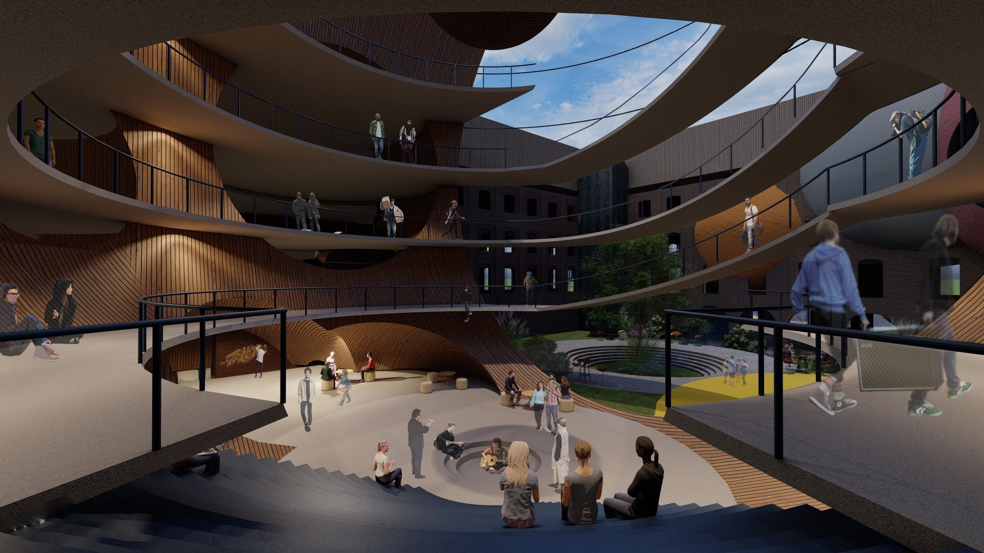
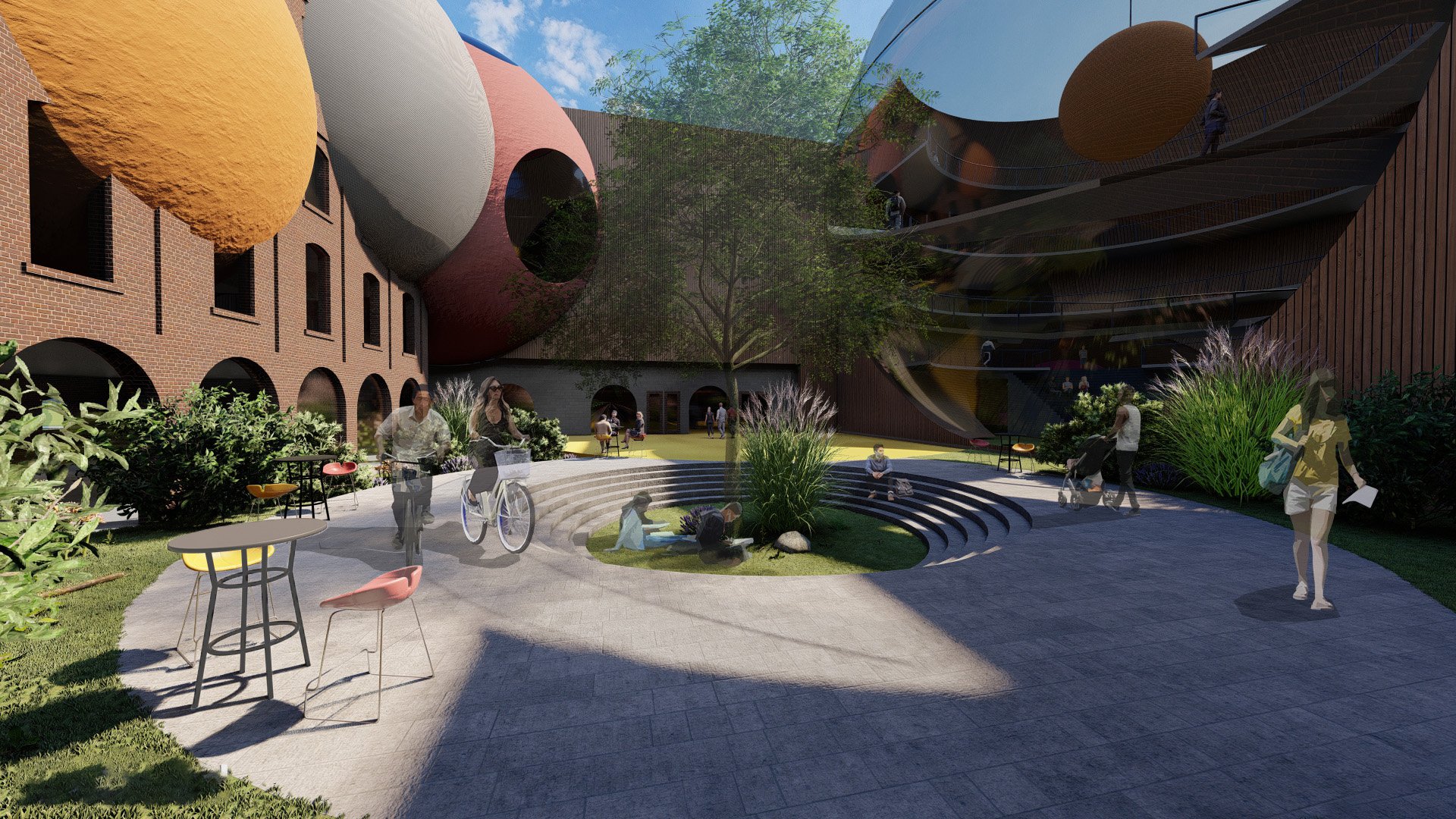
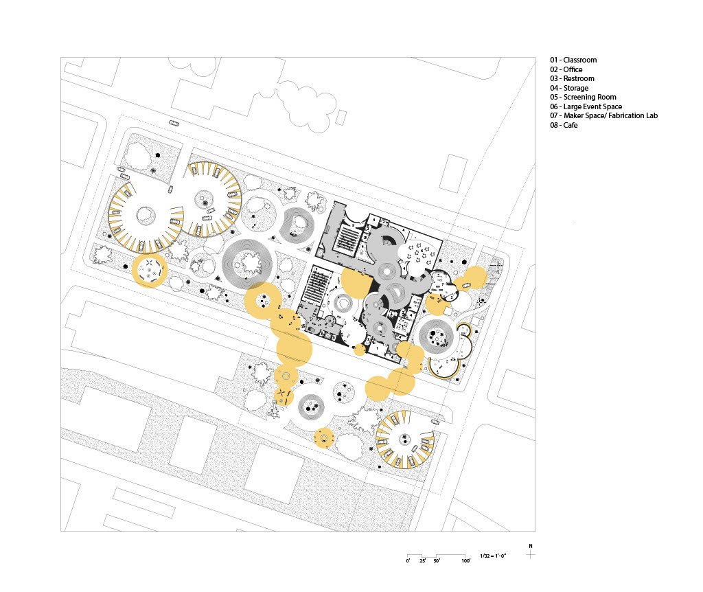
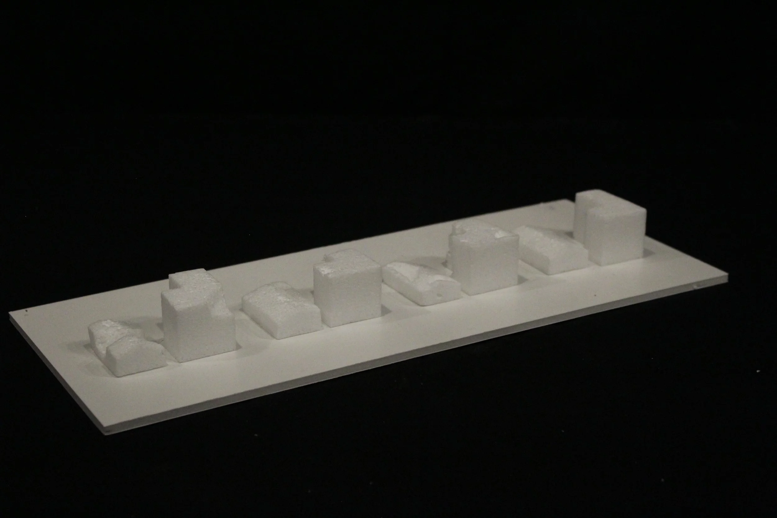
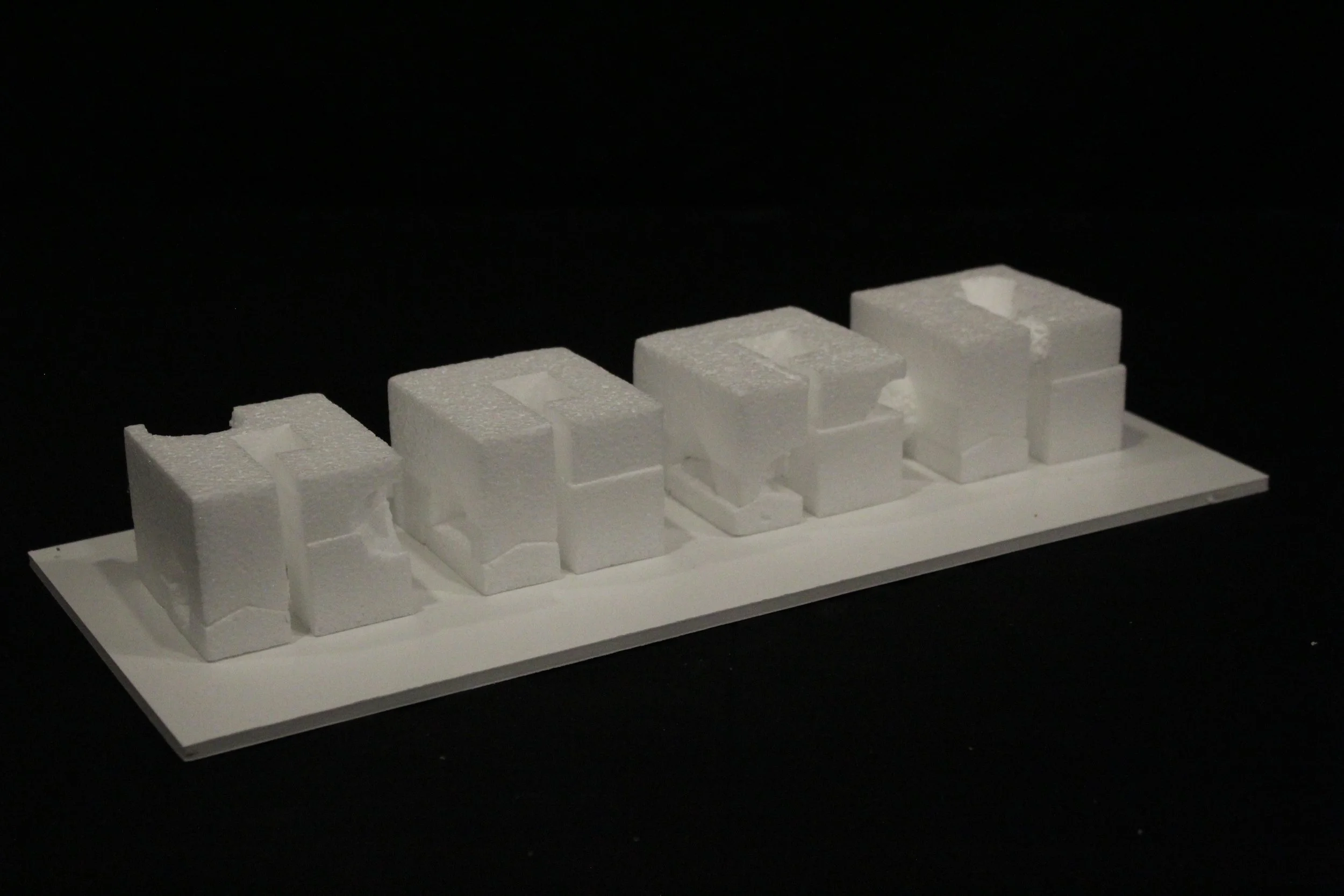
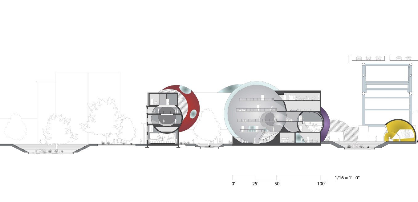
Digital media study is, in its nature collaborative and inclusionary. This accessibility is used as a catalyst for engaging local communities in traditionally exclusive academic spaces. The five overarching areas of media study are: recording arts, animation, screenwriting, and film and television arts, studies, and production. The learning and creating processes present in these schools move through circular processes. These cycles gain physical form in the large spheres of influence. Scooping through and bubbling out of the building, these central spheres cater to each area of study, connected by scooped pathways. The sphere not only lends itself to the media production process but provides open mix-use collaboration spaces. Spatially, the programmed classrooms, offices, and specialty spaces orient themselves around the spheres of influence. Rectangular spaces collide with the sphere in plan, creating storage and support spaces from irregular poche. While the spheres encourage connection within the building… The scoops bubble out into the surrounding area, connecting to the community. Forming pathways and new social spaces, publicly, the scoops form connections to the Metroparks Centennial trail and Lakeview Terrace. Through a series of circular connections of greenspaces, playscapes, outdoor theaters, and conversation pits the new site serves as a new trough-way for the community, encouraging a colorful, engaging new development of the rust belt remnants of the Cleveland Flats. Present in the materiality as well. The warm and bright new materials inspire creativity in a historically homogenous industrial area


Shazia Waggoner
The Cleveland School of Media Arts
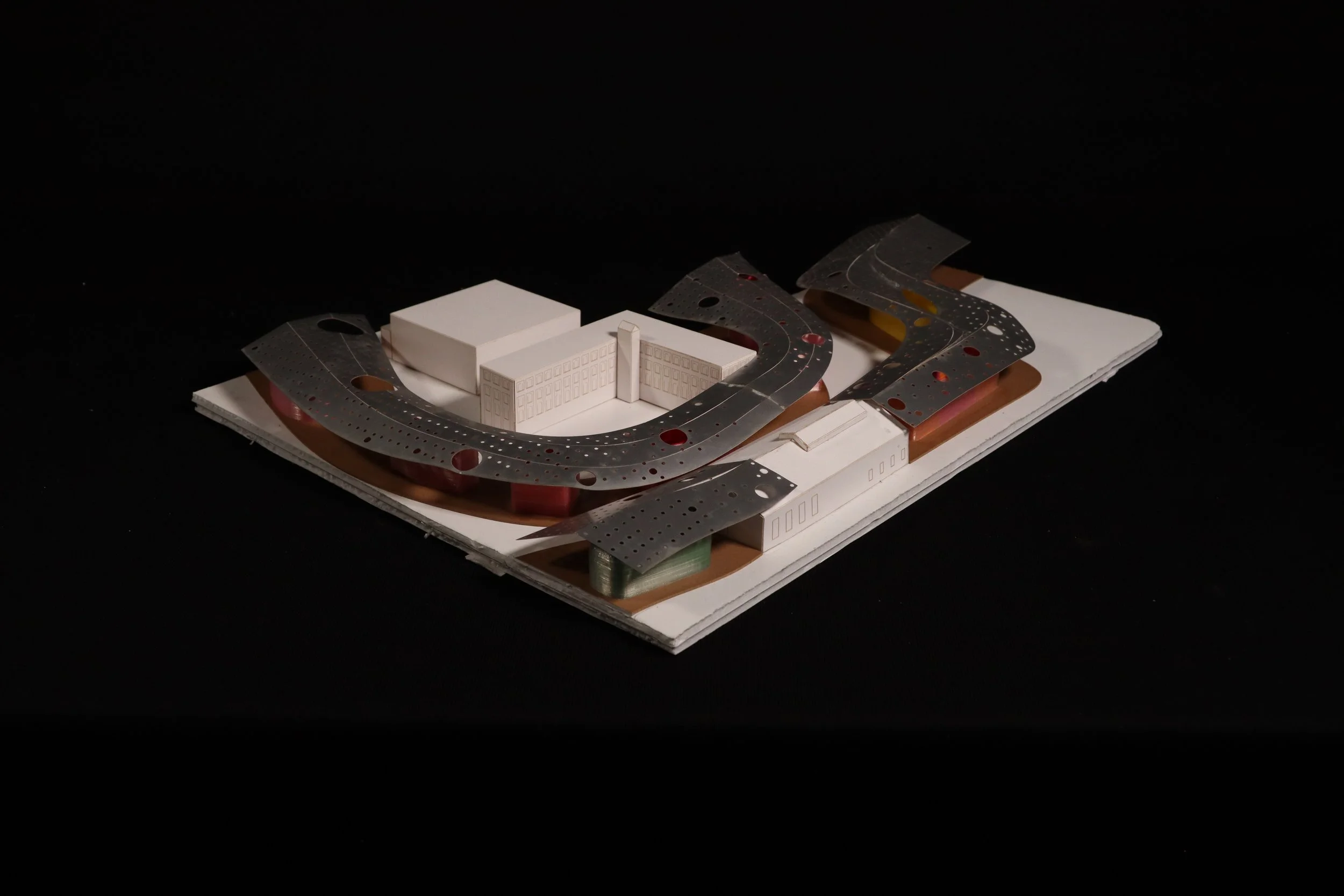
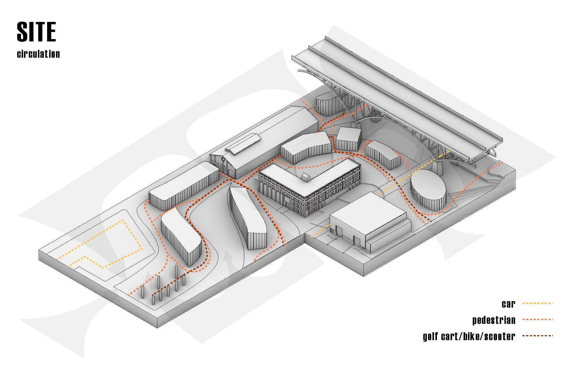
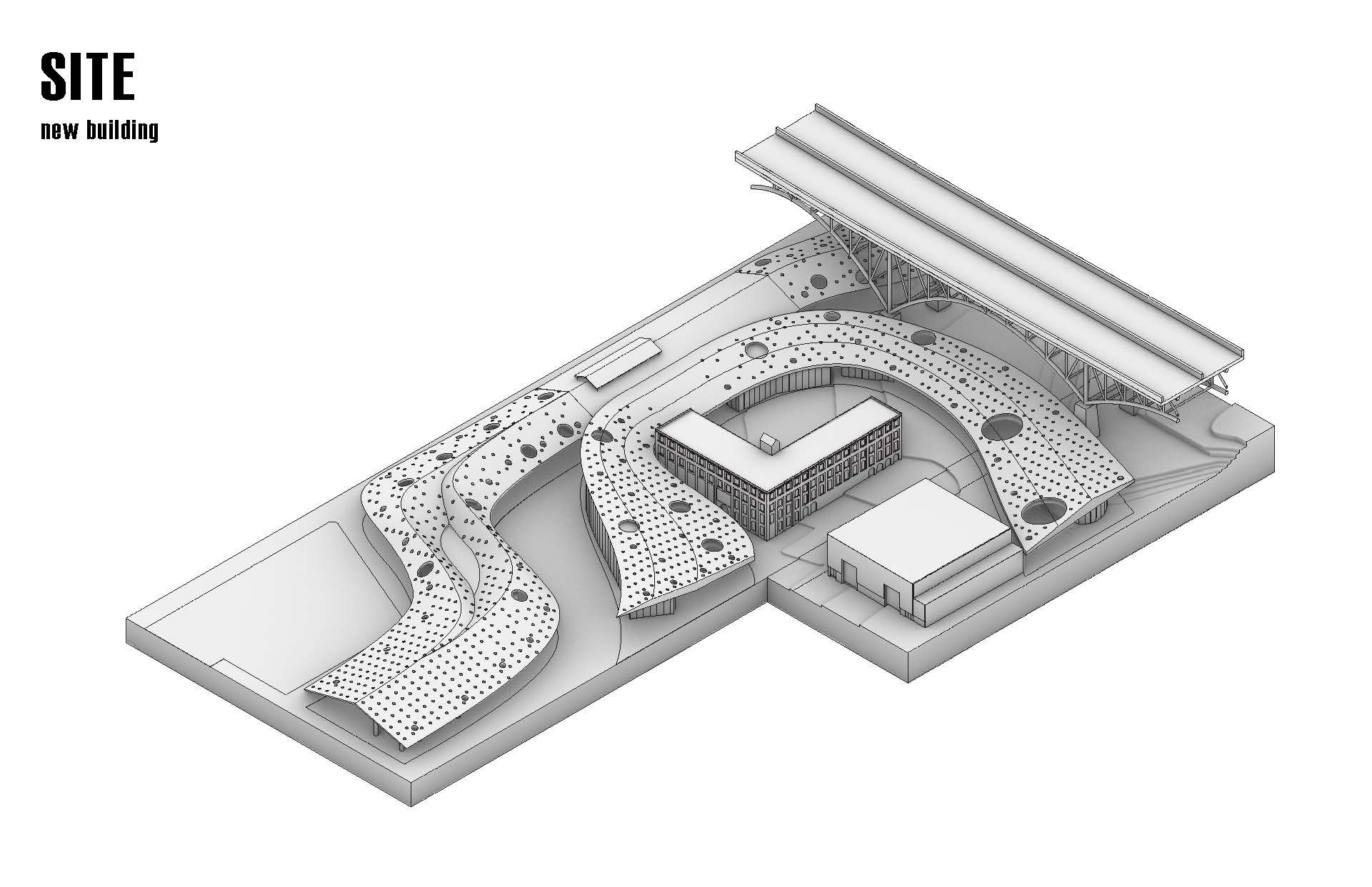
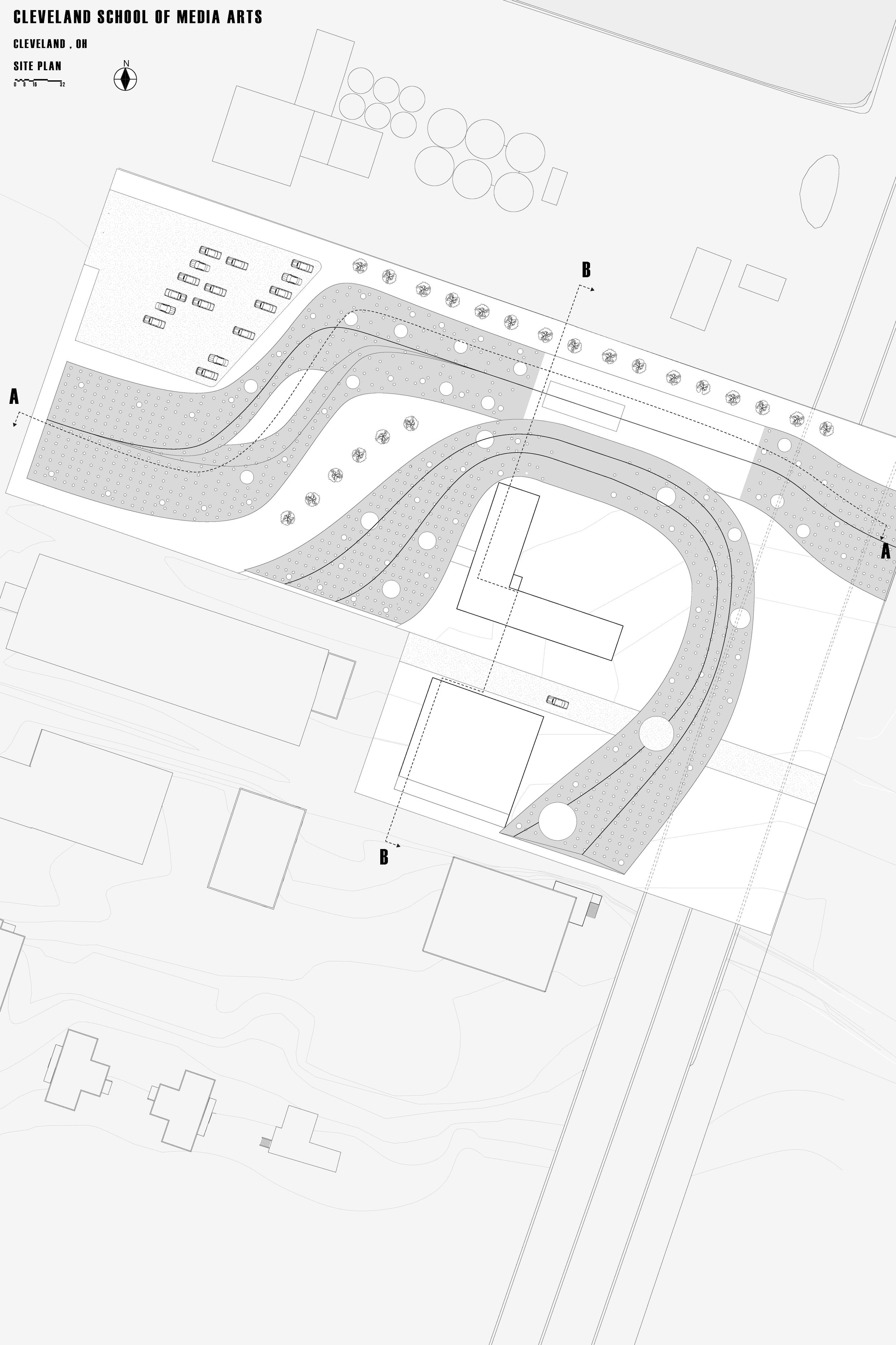
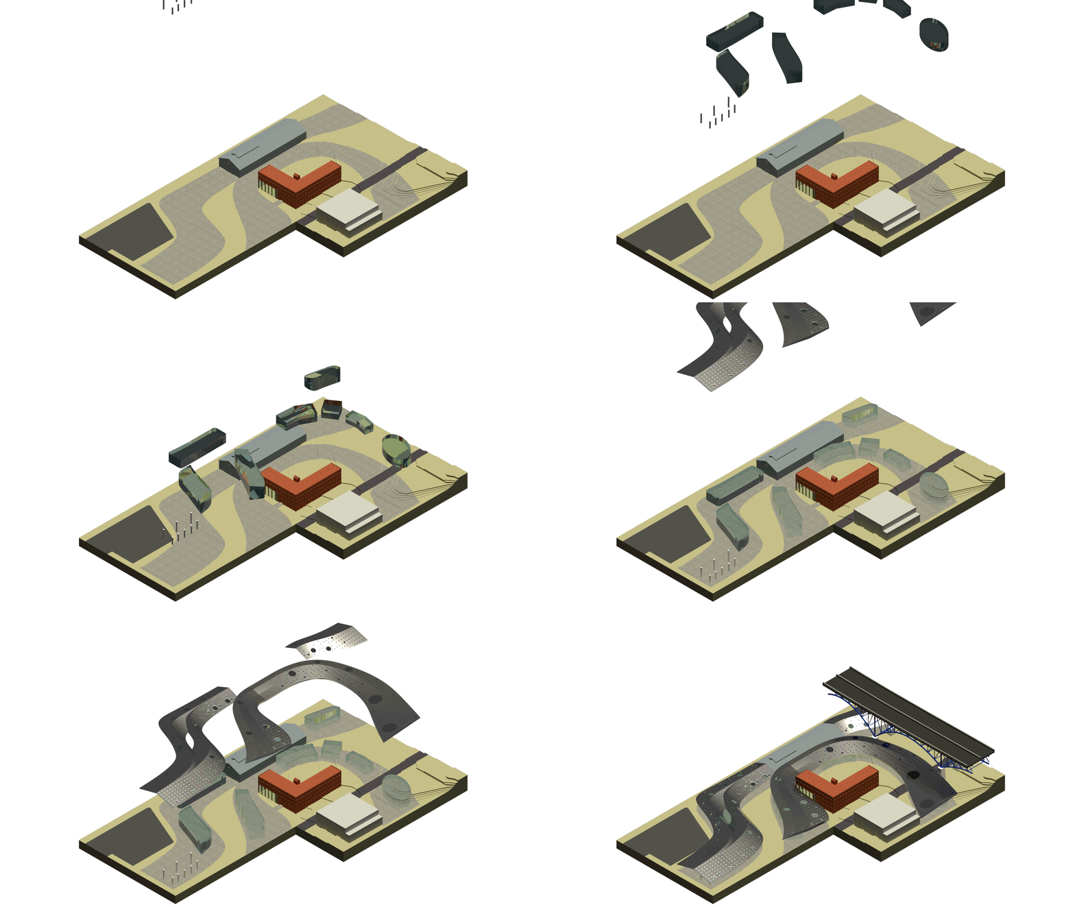
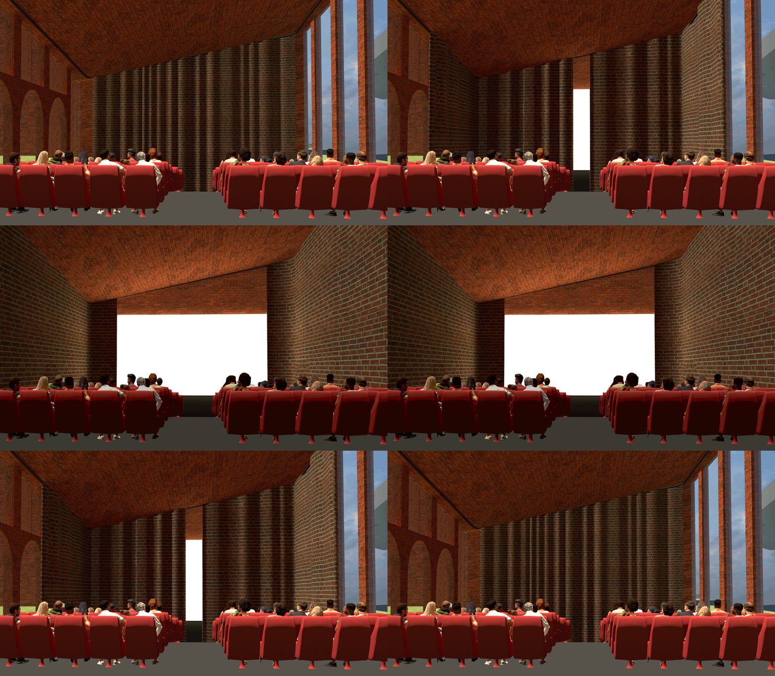
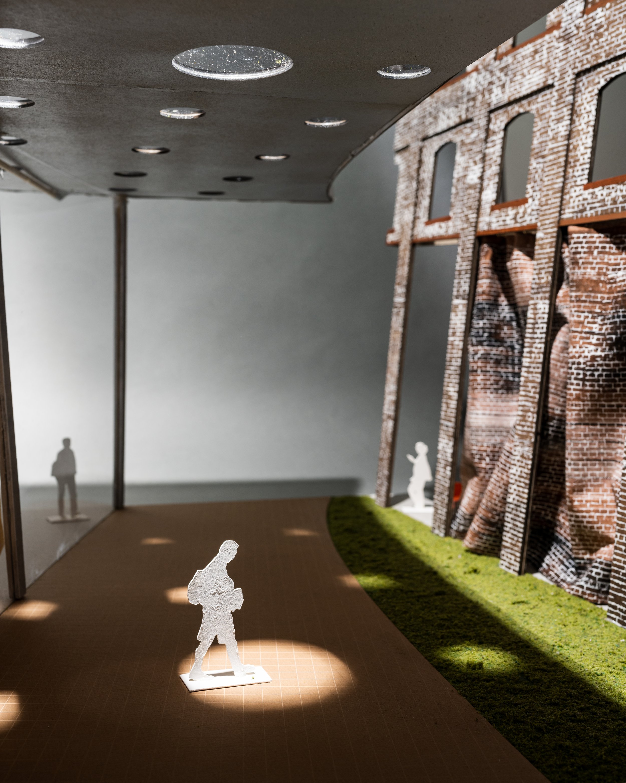
Focusing on being inclusive to the surrounding communities, the new Cleveland School of Media Arts creates a convergence of media, life, and creativity. Here, everyday activities are revealed through collaboration and exploration. Centered around the three main buildings, irregular paths are laid throughout the site connecting the surrounding communities to one another. A gable roofscape was extruded and covered the paths as protection and provided sky lights, with punctured with holes varying in size. Commercial, residential, and industrial communities surround the small campus. The paths provide a safe cover against the weather and locate the walking trail throughout the site. At the corner of the site the parking lot can be found, from there the rest of campus is walkable or accessible through different modes of transportation. Students driving golf carts is very common, and can be seen around the campus. A pick-up/drop-off station can be found at the main canopy entrances. There is one road that cuts through campus and occasionally closes due to campus/community events. Trees and shrubbery can be found throughout the campus to incorporate a natural feeling and provide a comfortable environment for students. They also act as a sound buffer to the surrounding industrial sites. Located under the roof, flexible classroom buildings can be denoted by their curved shape, and fixed classrooms are denoted by their orthogonal shape. These give people the understanding of the program inside without having to be inside the space. In the center of the campus is the ‘L’ shaped building holding the main theater as well as many of the specialized rooms inside. These are located within this building because it met the dim lighting conditions needed for many of these programs (VR, black box, etc...). The main screening room in this building goes underground to help with acoustics and is encased with glass. This allows direct view to see inside and through the screening room when it’s not in use. Inside, there are two curtains that can be drawn around to simultaneously reveal the screen and enclose the space, to provide the best comfort for viewers. The use of curtains throughout the site offers moments to adjust space, lighting, sound, or background conditions. These are all easy to use for students and staff and can become a presentation of student work or local artists. Flexible classrooms use these curtains to create a large classroom space, open study space, or a standard classroom space.









Professor Robert Kobet
The fourth year studio project was an 84,000 sq. ft. Media Arts School that combined new construction and adaptive reuse of existing structures in the Flats area of Cleveland. The project was completed by individuals with support from numerous outside consultants and industry users.
Ramzey Boukzam
CSMA
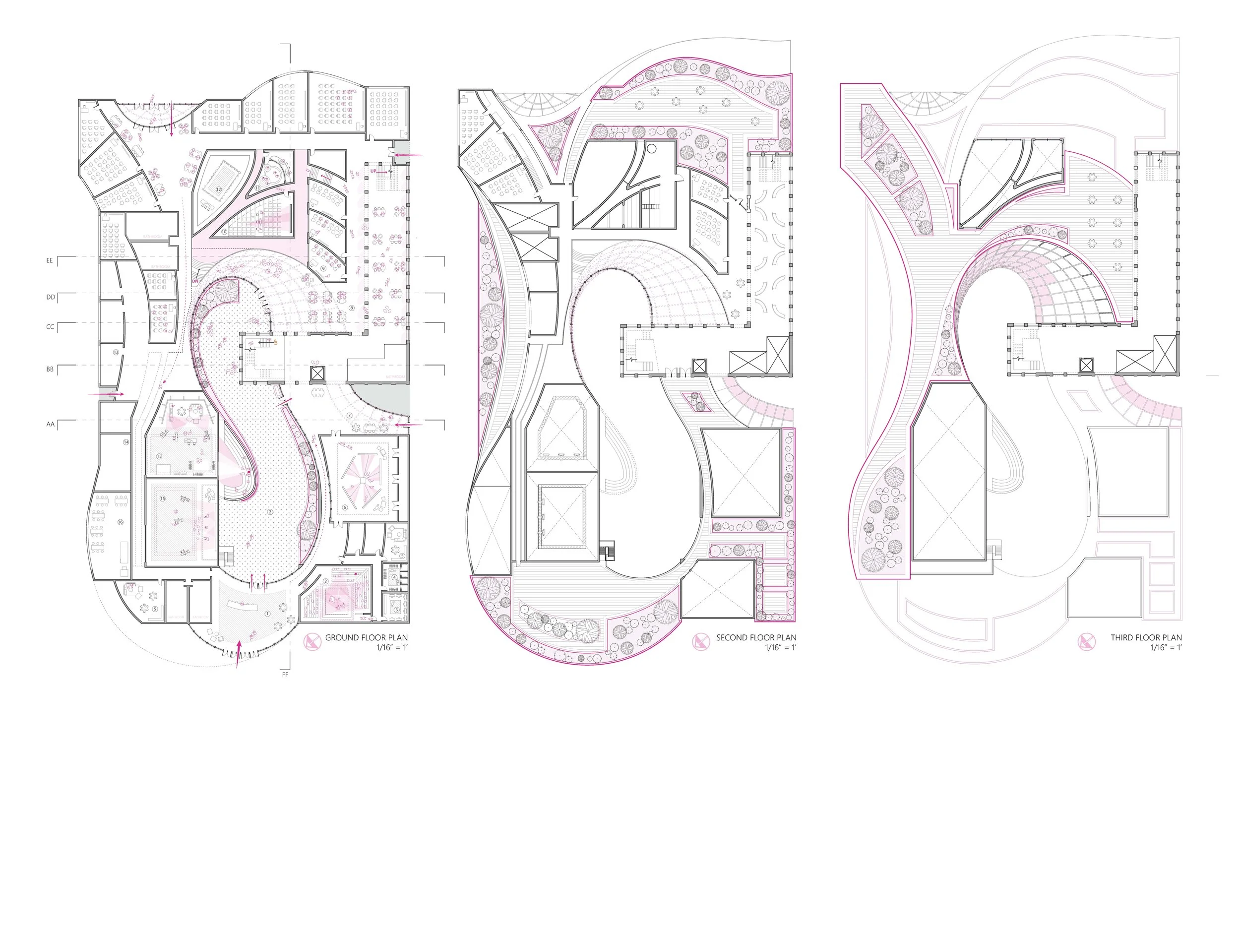
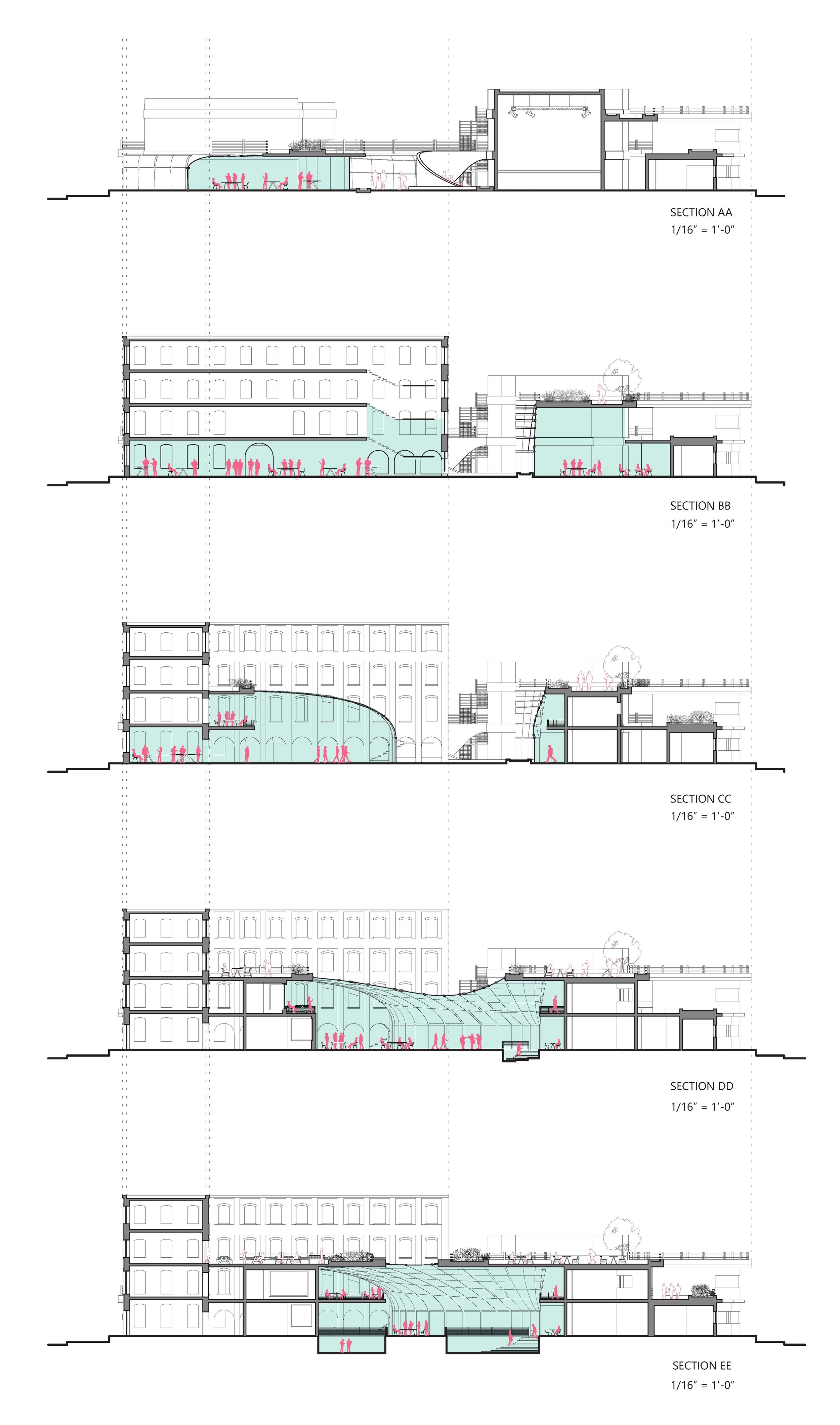
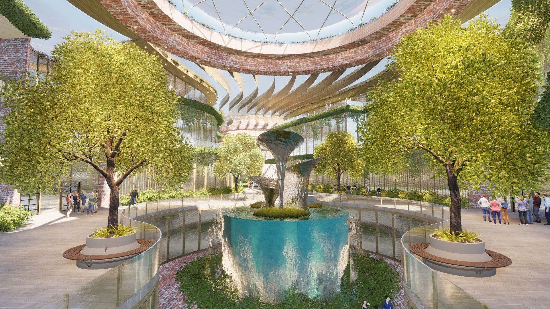
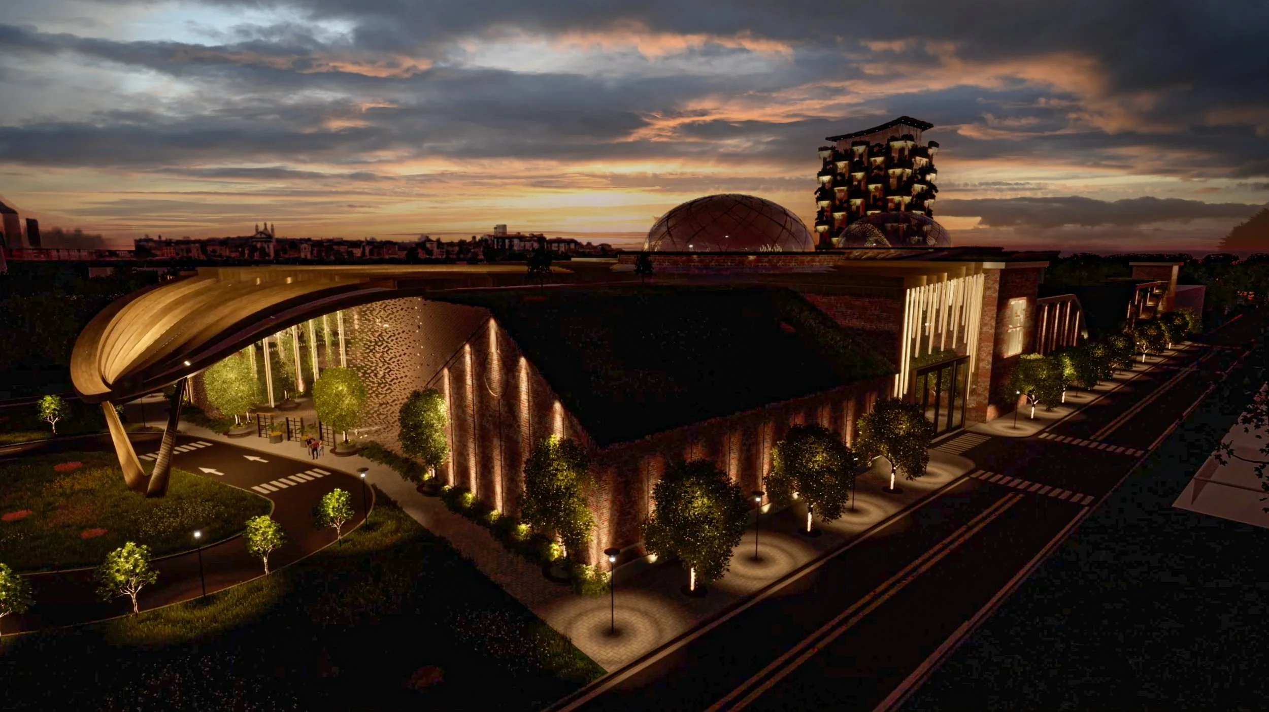
Contriving a media arts school requires a design that responds to the constant evolution of media and technology. Given the site on the West bank of the Flats in Cleveland, the industrial surroundings pose lighting, safety, and acoustical concerns. An academic program consisting of filmmaking, animation, writing, and sound recording introduces the need for a design that responds to the demands of these programs, and addresses the challenges of the site. The design solution to the CSMA (Cleveland School of Media Arts) lies directly in Cleveland: The arcades. The design of the CSMA mimics the qualities of the Cleveland arcades through its large central atrium. Simulating the outdoors, the atrium effectively pulls all site traffic inwards to create a dynamic environment sheltered from the surroundings. Furthermore, program is aligned along the atrium resembling storefronts, which adapt and change with time. Behind the storefronts, the “back of house” programs coexist, thriving off of the controlled lighting and soundproof interior. The atrium acts as a bond between existing site buildings and new construction, using vegetation as a timeless bridge to create a campus that encapsulates the public. The additional student recreation, dining, and housing complex will further produce a growing community, acting as a catalyst for the transformation of the area. Flexibility, creativity, and community all unite through an elegant design to provide the best academia has to offer: The CSMA.

Gwendolyn Darling
The Cleveland School of Media Arts: "Phototropics"
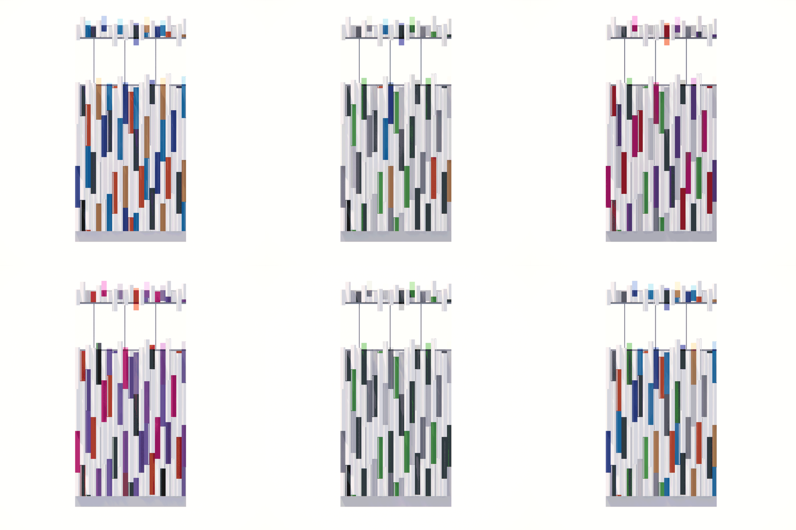
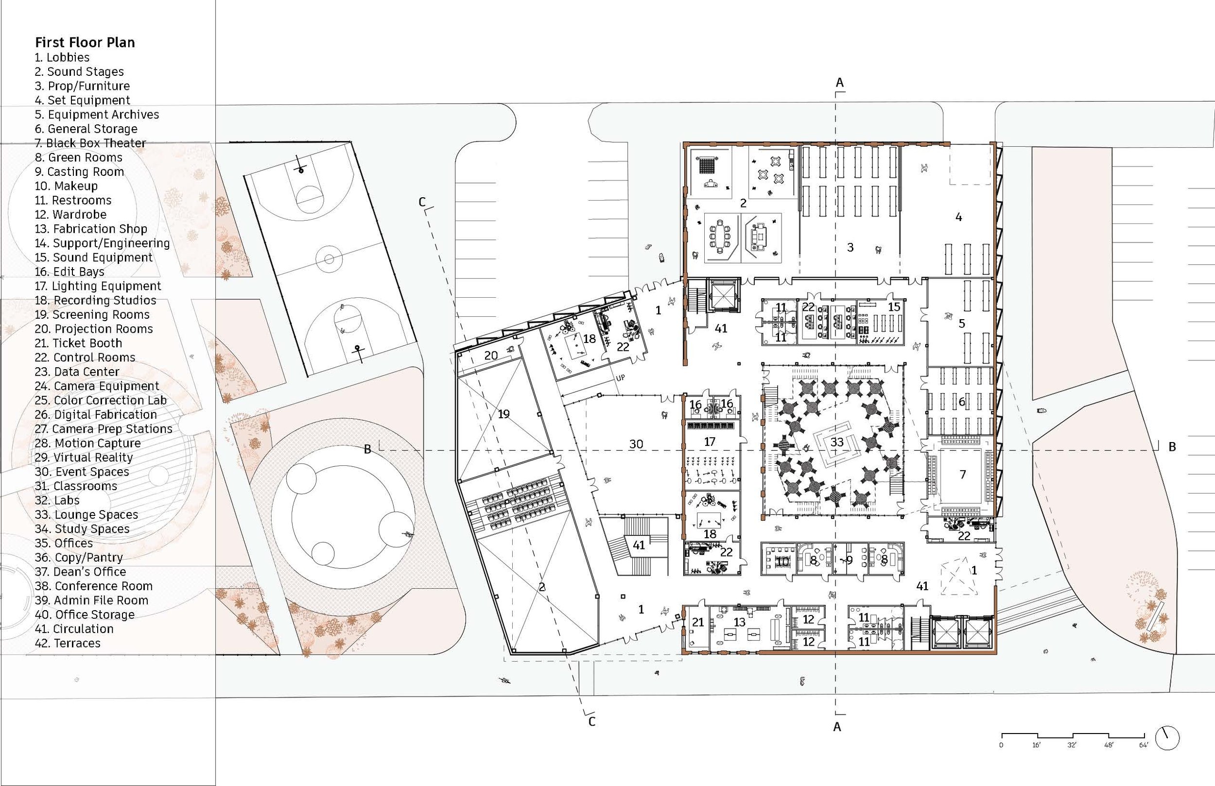
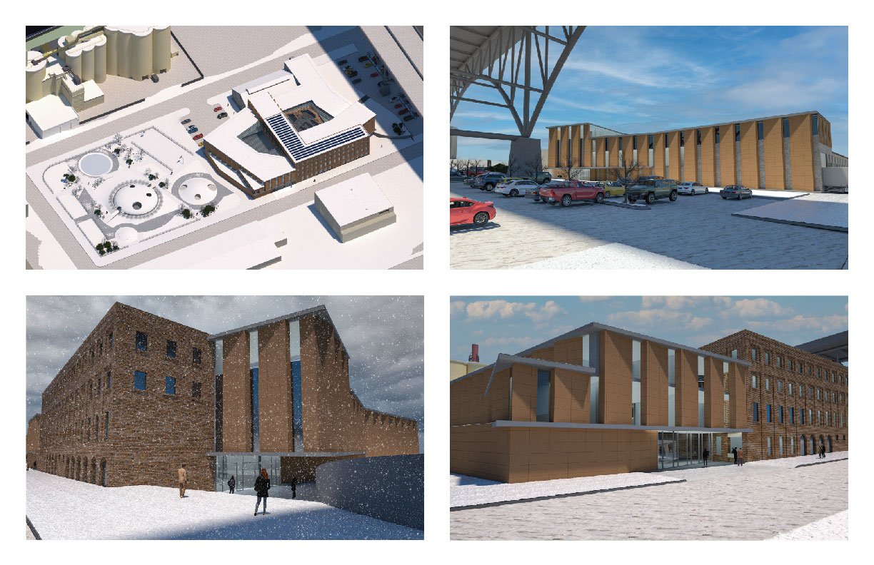
The Cleveland School of Media Arts, appropriately named “Phototropics”, was designed to accommodate all forms of media development and provide an efficient, comfortable, and adjustable learning environment for its students. Every program within the building was analyzed to identify its spatial and environmental needs to support the students in their education. The programs were organized according to their connections amongst each floor, Arial view of the overall site with the community park and the Cleveland School of Media Arts Front entrance of the Cleveland School of Media Arts during a heavy winter snow with easy access and multiple modes of circulation throughout the building. Programs that require engagement or host high foot traffic have removable walls for easy access to interior spaces. The exterior terracotta façade is a phototropic system, meaning that it responds to sunlight, preventing glare from reflecting into the interior, and creating a cohesive appearance on the exterior with the existing brick buildings on the site. Lastly, the community park and the interior courtyards allow a perfect escape from the world of technology and allows students and residents of the Flats to enjoy the space throughout all times of the year.




Eleanor Huntley
The Cleveland School for Media Arts
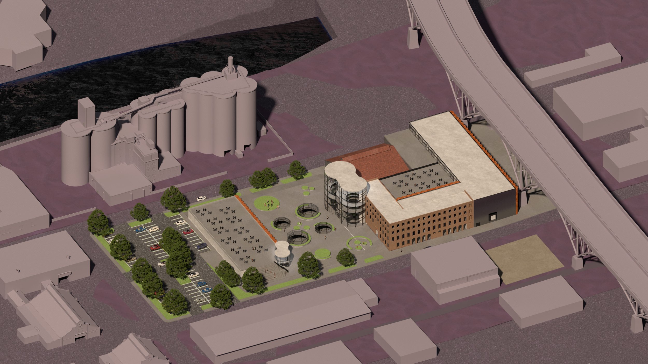
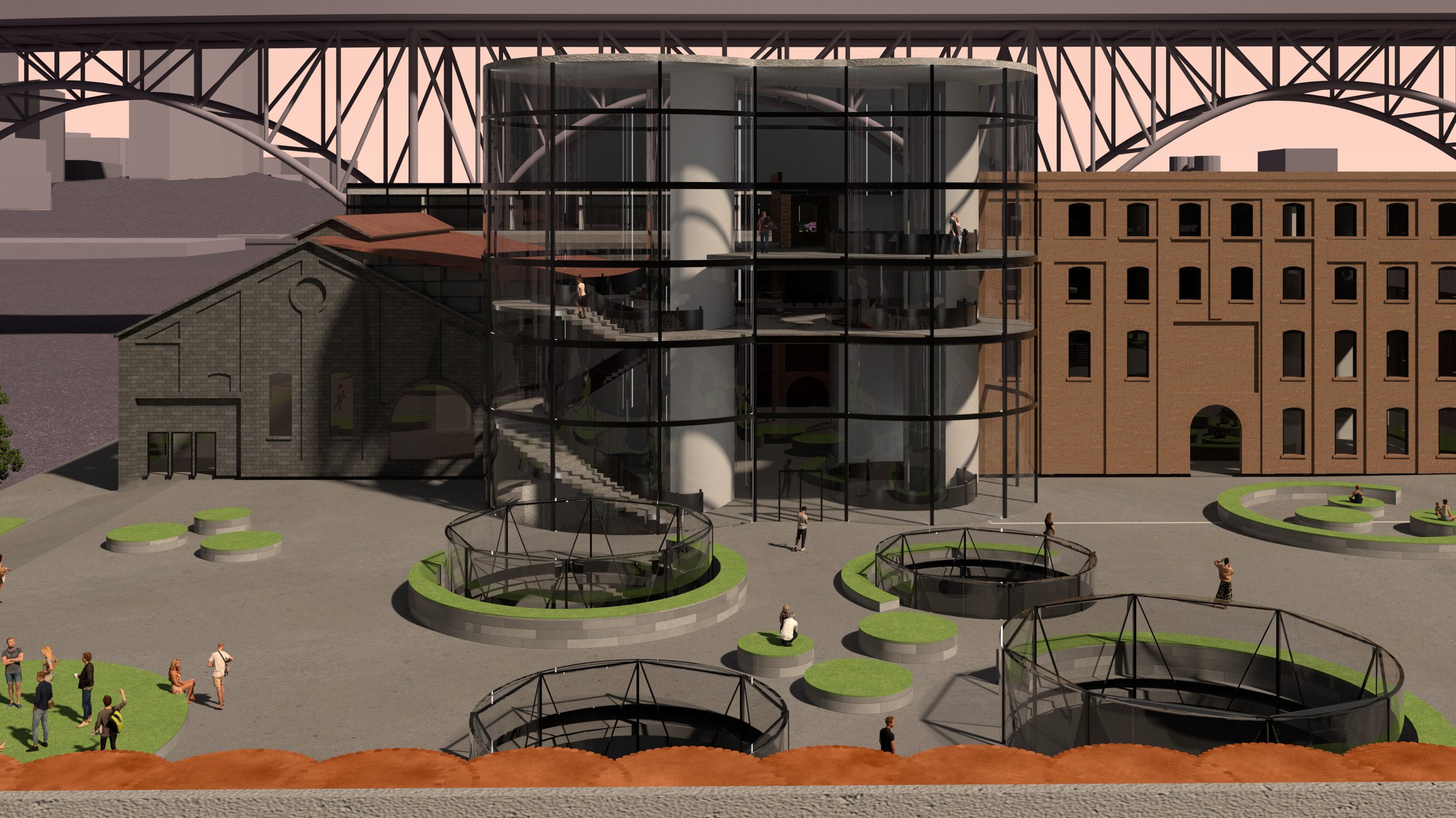
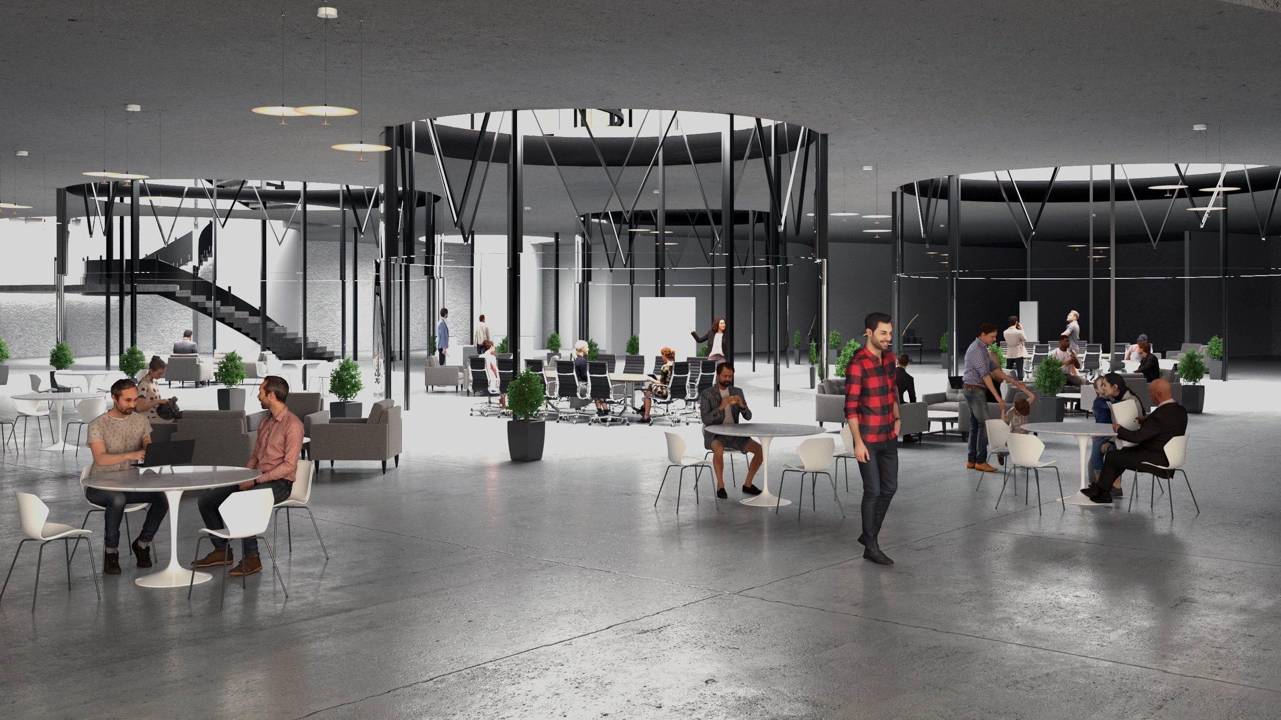
In fourth year architecture studio, students are assigned a large media arts school program to design on a large site with 5 existing buildings. Given the square footage of the given structures compared to the assigned project, new construction was necessary no matter what. In my design, inspired by the adjacent silos of Lafarge North America, I came up with a project characterized by tall glass silos that functioned as entries and methods of allowing natural light into an uncommon space: underground. I added a large collaboration lounge, demolished Spruce Ave, and created a rather heavy, solid complex with a light, welcoming plaza that encouraged an engaging landscape for not only the intended user group, but also the public of Cleveland, Ohio. These silos also act as the kinetic element, connecting the interior underground spaces with the exterior. They drive the project and promote engagement with various landscapes, inside the project and on the site, and with each other, as these spaces are meant to promote collaboration and innovation for the user group.



David Marszalkowski
Generations
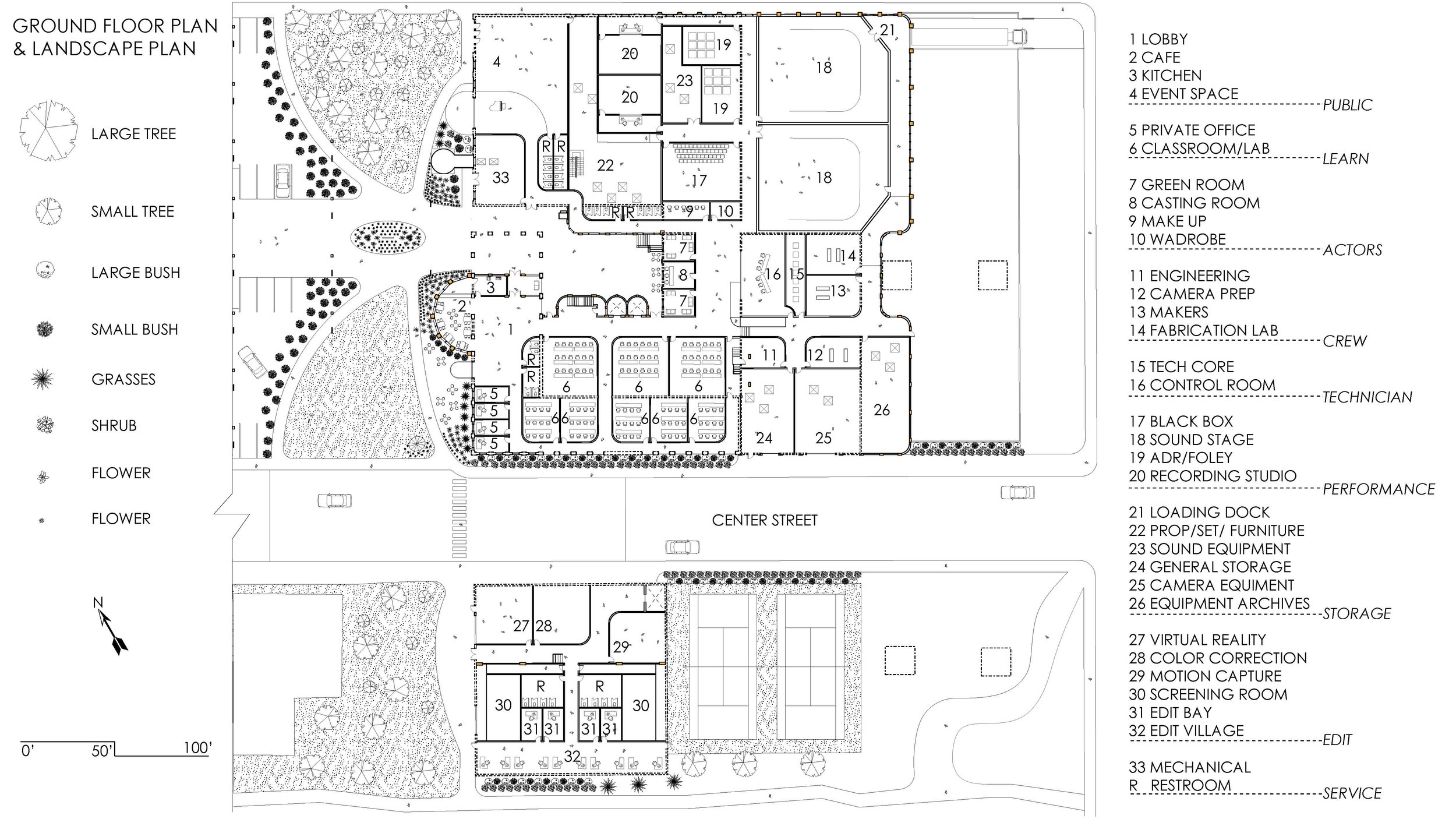
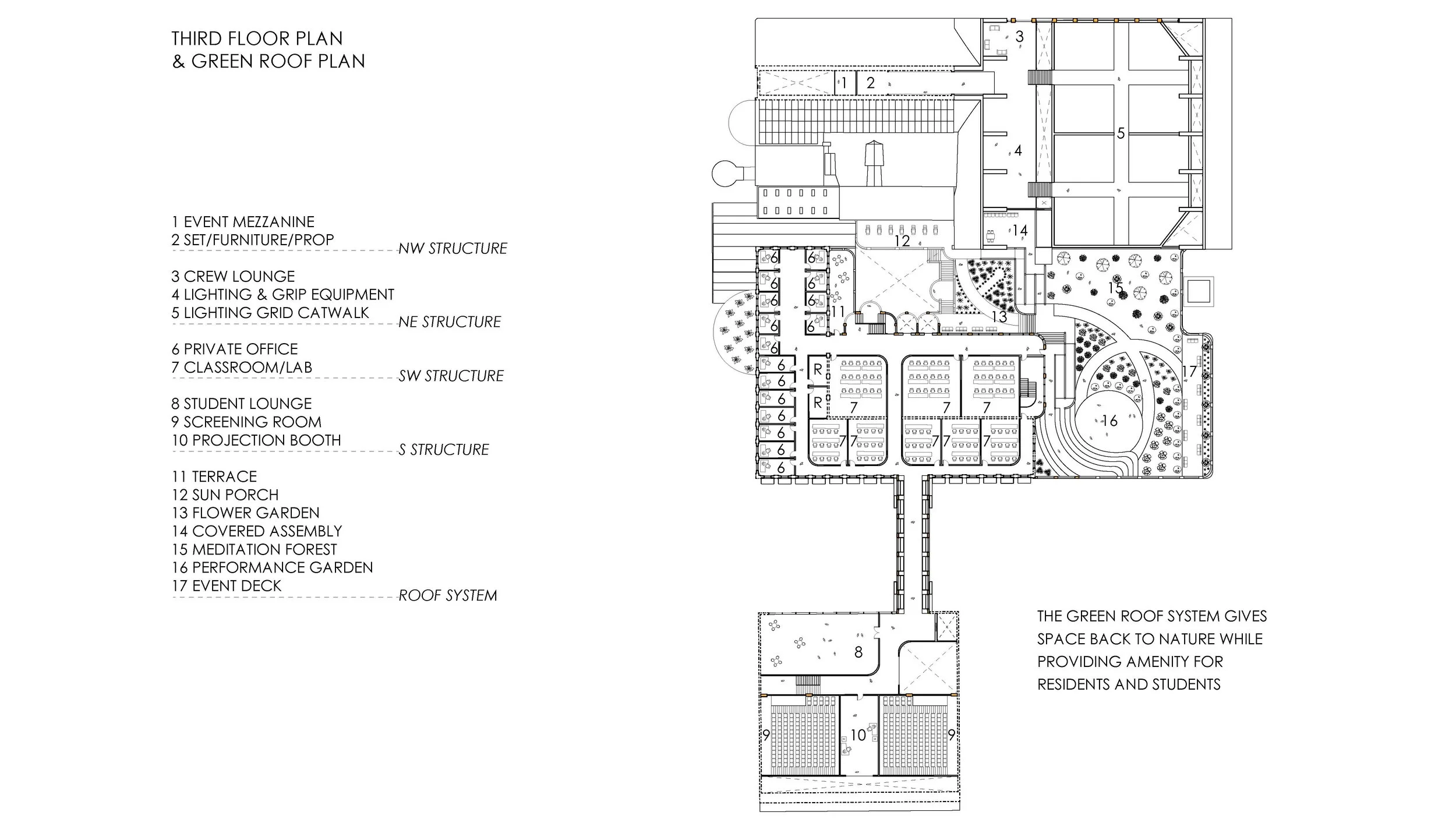
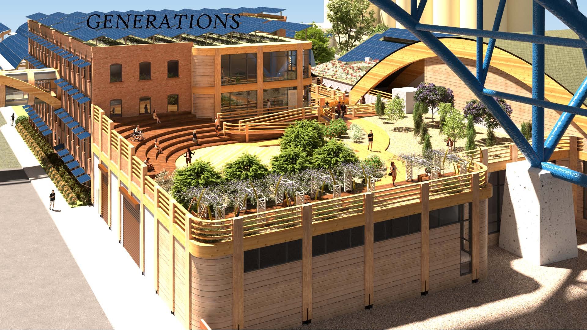
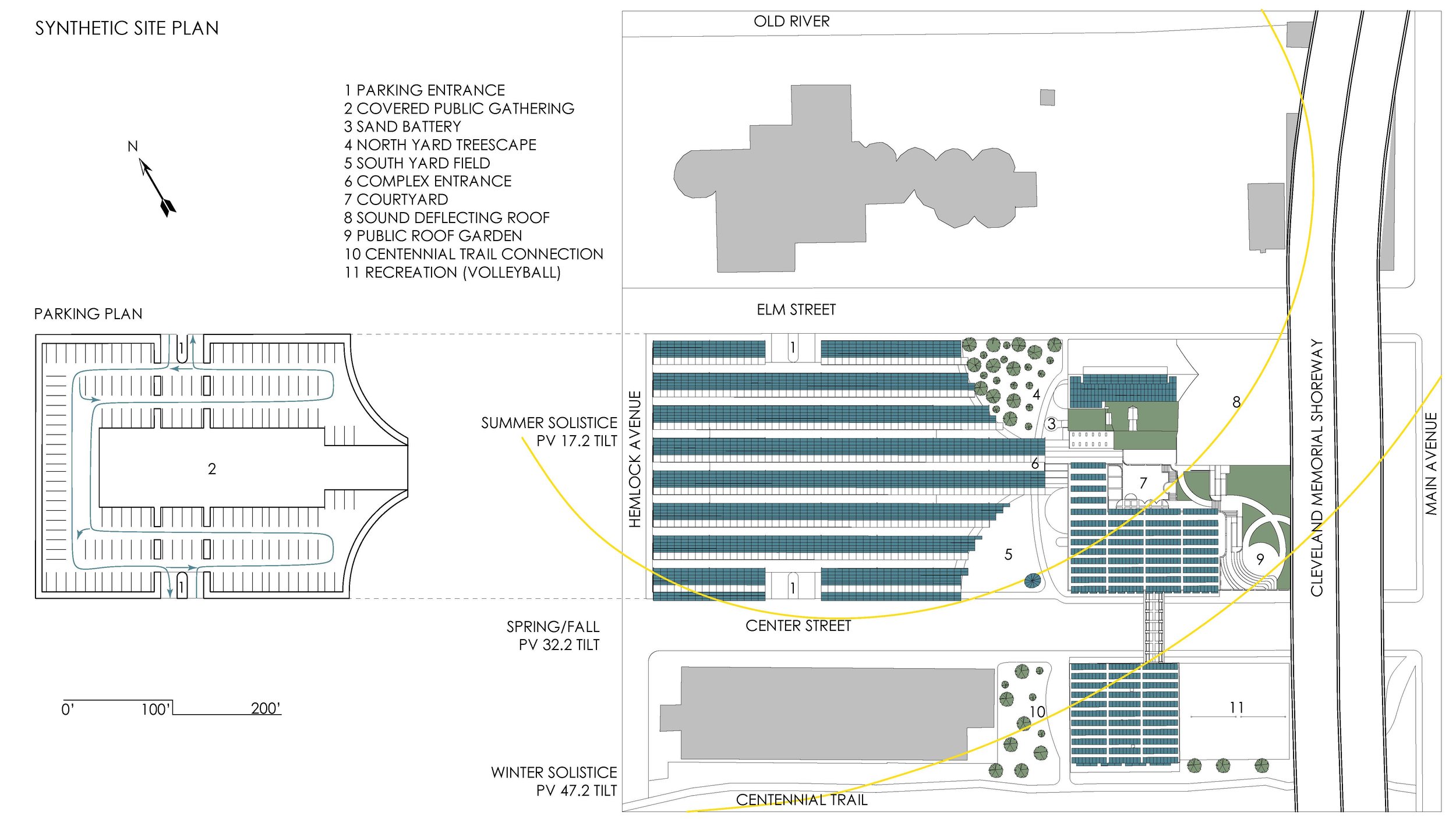
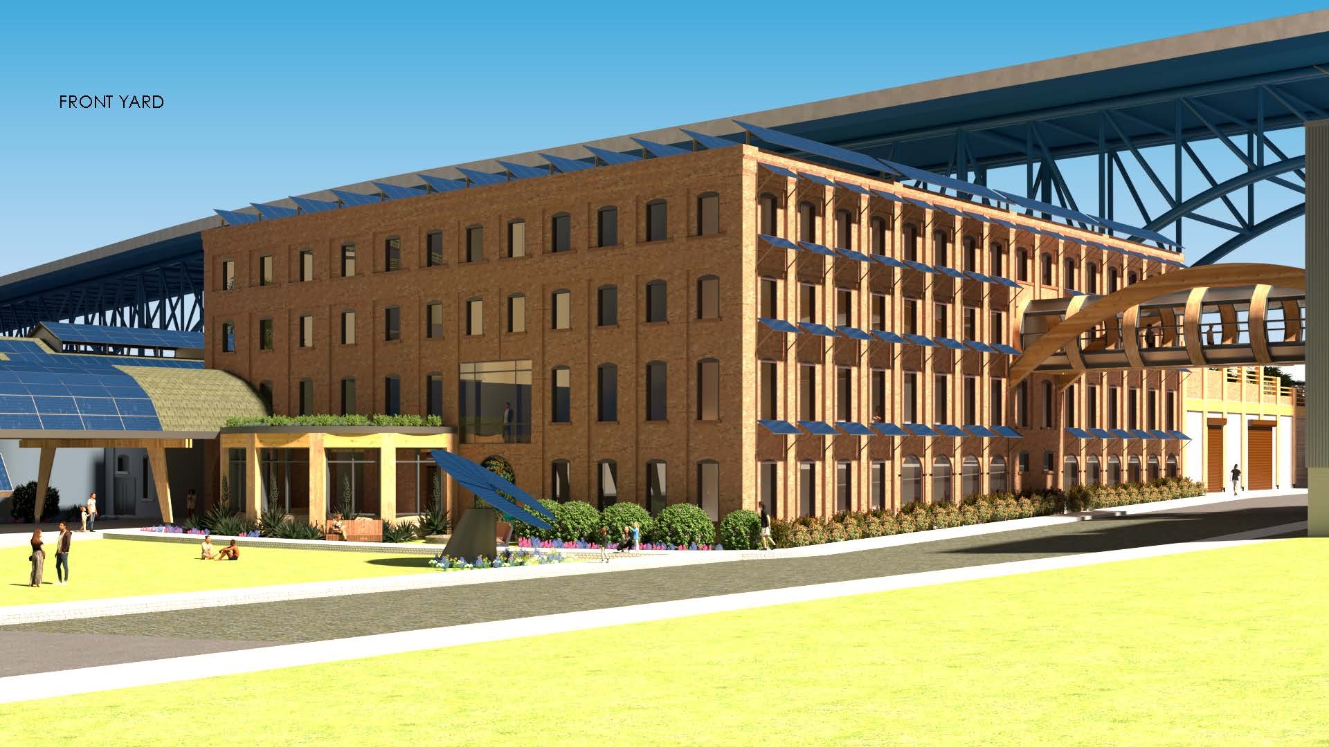
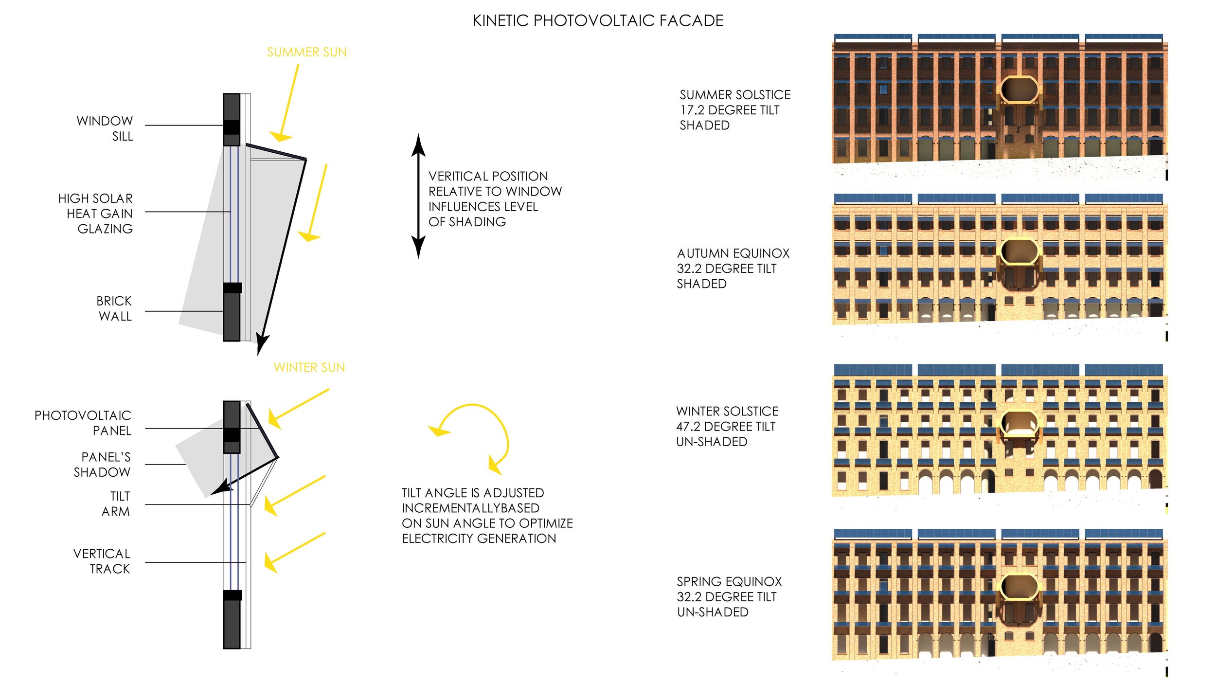
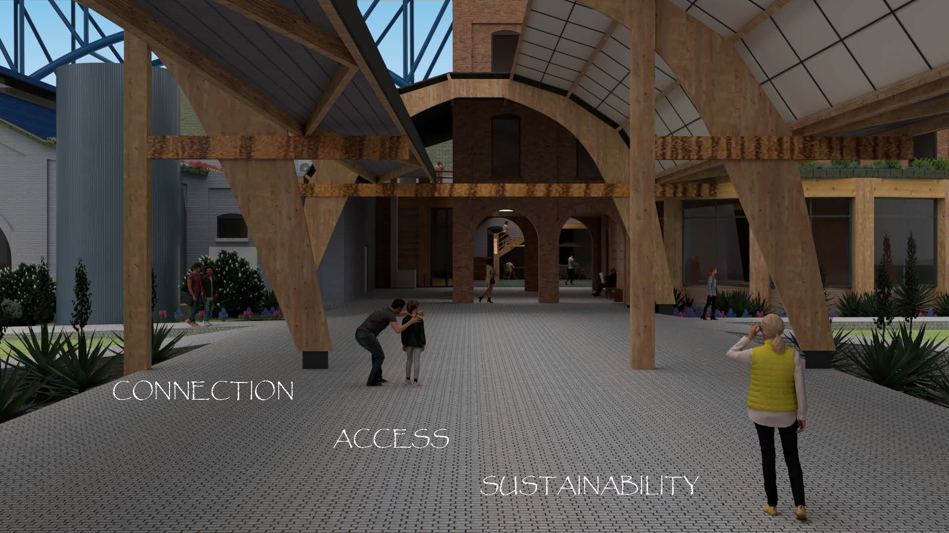
This Project focuses on the integration of energy generation, communal amenity, and student success within one complex. Working closely with adaptive reuse, each of the existing buildings was reworked to house a new program with additional square footage added to the perimeter of the building in the form of mass timber structure. Both accessible and inaccessible green roofs were used to both reduce the building's environmental impacts as well as increase the amount of green space available to both the community and students. This green space is continuous from the centennial trail to in front of and over each of the existing and new structures. The solar parking canopy provides EV charging and shelter for vehicles and visitors as they make their way into the buildings. The ground at the center of the canopy is slightly elevated and unpaved to provide an outdoor community space for events like fairs or farmers markets. The interior of the complex is tailored to the school by moving most programs to the core and circulation around the perimeter. This allows for better thermal and light control of individual programs while simultaneously allowing occupants ample opportunity to be connected with the outdoors as they circulate between programs. The programs are grouped based on their function creating wings that function efficiently. The solar panels on site, in addition to generating electricity, also make a statement about the city's future prospects in sustainability and how it might be integrated into everyday life. The kinetic solar facade on the south face shades the windows beneath them in the summer while allowing for direct solar heat gain through the windows in the winter. A sustainable future is one where building components perform more than one function maximizing efficiency and usability.
